
*NEW*
10 Chocolate
Frog Card List
20
Chocolate Frog
Card List
20
Chocolate Frog
Card Version
Differencies
U.S.A
Warner
Bros Chocolate
Frog Card
U.S.A
Chocolate
Frog Wizard Card
U.K.
Marks and
Spencer Chocolate
Frog Cards
Trader
Links
Email
me:
suspicion_belle@
hotmail.com

Chocolate
Frog Card
Version Differencies
|
<Journal
of Jacqueline Ung, Let me clarify
a few things first. The back of the choc frog wrapper states that
cards are made either in Germany or China, so that explains the
2 types we have found. I say that it's an AsiaPac edition, because
it's exported to M'sia, S'pore, NZ, and also because the translations
on the reverse of the cards. |
|
| The Packaging | |
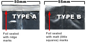
| Type A |
1. Foil wrapper
is sealed with ridges...like in bags of chips? Foil bag looks puffier.
Can be opened by tearing the centre flap down. Measures 5 - 5.1
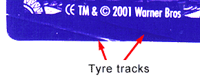
cm across (width), this can be quite uniform. 2. 1st batch I bought had the exp date of 20/09/02 D, which yielded cards of varying quality, ranging from perfects to ones with blotchy images, scratched, or having "tyre tracks" at the lower left hand corner of the reverse side; two lines running diagonally which cut through the cardboard, the result is that the lower right hand corner of the image looks a bit chipped or dented or uneven etc.
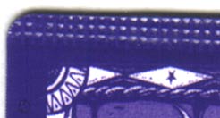
[Note from Mic - Only found one defective card so far - it was a Type A but the stamp mark along the top resembles the matt-pattern from Type B packaging?? - see below]
I got all the
defects from the same batch 20/09/02 D...AND...on one occasion,
I found 2 cards inside one pack! I was thrilled of course..but guess
what? Turned out to be two pieces of junk that are now in my discard
pile :-( [Note from Mic - I bought one pack that was missing the card completely - no card or foil pack - so give them a bit of a feel before you buy if buying for the cards particularly.] 2nd batch exp date 11/10/02 D. No defective ones as of yet. Turns out more Ron Flying than anything else..maybe just plain luck? [Note from
Mic - I have also found packs dated
3. Type As have a bright purple or crystal/violet solution-coloured reverse side. Hold it up against the light and you'll see that the cardboard is rough and not as well laminated and as smooth as Type B cards. Try bending the card, there should be more resistance than a Type B card, meaning that it's made of a thicker material? Oh yeah, I looked really hard...the cardboard for Type A is definitely thicker, maybe only by 0.5mm.
|
| Type B |
1. Foil bag
is flat and measure 5.5 cm across. Look carefully and you'll see
a small "tear me" cut on top of the bag (like those Japanese
tidbits)...and THAT explains why it's so damn hard to open when
I yank at the centre flap!! It's not meant to be opened so brutally,
I guess. :-) No ridges in the sealed ends...just a matted surface. 2. 1st and last batch I bought had an exp. date of 16/10/02 N. Yielded all Type B cards. Quality is ok, none with bad scratches and machine marks, etc. Images tend to be really sharp...no blurred ones so far. Got plenty of Invisibility Cloak from this batch...maybe due to chance once again? 3. Type Bs have a dark blue/purple shade..quite hard to tell. Hold it up against the light and you'll see that it's smooth and very well laminated. Like mentioned above, it bends a tad bit easier than Type A.
|
| The Individual Cards | |
| Centaur |
Type A:
The centaur looks more like a ghost though.. can hardly see him,
needless to say poor Harry, who's clinging on his waist. |
| Diagon Alley |
Type
A: Hedwig looks blurred out, so do Hagrid's and Harry's hands. Type B: You should be able to see Hedwig slightly more clearly. Harry's fingers can be seen..he's reaching out for the cage. Hagrid's hands are clearer too, in the end he seems to be holding Harry's hand? getting payment? can't tell...but I'd take a Type B if i'm given a choice. |
| Fluffy | Only collected 2 Type As. Rather fuzzy image once again...can't make any comparison. Can see lots of slobber though. Wait till I get a Type B. |
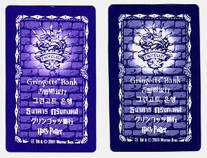
| Gringott's Bank |
The Type B picture is clearer (less-muddy looking). There appears to be 3 frames of animation. In Type A, the frames seem to be out of order - far, close, middle. This is fixed in Type B. |
| Harry Potter |
Type
A: Image is a tad bit fuzzier than Type B, but clear
enough to see Harry's scar, the stars on the underside of his robe,
and the fireworks-like effects that he conjours up though ;-) Type B: Just a sharper version, given a choice, I'd choose Type B. |
| Hedwig | Type
A: Too much black under the wings..and Hedwig looks really
white, can't see the contrast between her and the background. Type B: Just right, colour tone is fine, scroll is visible, good contrast. I'd pick this one. |
| Hermione Granger |
Type
A: What's Hermy's trademark? Her front teeth you say? Well..if
I were her I'd pick Type A because her bunny teeth shows
up real good in Type B!! Type B: Also gives a clearer view of her facial expressions. Her left hand shows up clearer in Type B too. Everything appears brighter, the feather she's levitating doesn't fade away like in Type A. Given a choice I'd pick Type B. |
| Hogwarts | This
is a tricky one... Type A: Castle and clouds don't move. The boat comes in from the left. Pretty in its own way, resolution of image is better. Type B: Starts out with the boat on the far left, the castle on the far right. Clouds and castle shift left after boat comes into full view. Ending in the boat and the castle in the centre, just like a Type A. I'd keep both if I'm given a choice :-) |
| Invisibility Cloak |
Type A: Ron and Harry are hiding under the cloak. Harry's
got his hand on the door handle. Both of them look frightened when
the door is ajar, and Harry clutches his cloak tighter (probably on
the verge of being discovered). When Harry closes the door behind
them, Ron puts his finger to his lips in a "hush" sign. Can't really
tell about Harry..looks like he's biting his lips or gritting his
teeth to me. BUT...this may not be the order..it could be that they were opening the door instead... what do you think? Closing the door or opening? Type B: As usual, Type B offers a better view of all this and I always use it to observe the details. :-) But if you ask me I'll say that Type A makes them more invisible than Type B. |
| Mirror
of Erised |
Unfortunately this seems quite rare, and I only have one with the tyre marks...boo hoo. Image looks fine to me, I can see Harry's dad and mum, and his tiny hand reaching out to touch the mirror. Feel kinda sad when I look at this scene... |
| Norbert | First
thing I notice is that Harry seems to be pursing up his lips? That's
in both types. Type A: Norbert in egg and Norbert bursting out of egg is quite clear cut. Hagrid's finger doesn't move (much). Can't see Norbert's wings or Norbert himself properly. Type B: Norbert can be seen flexing his wings more clearly. Hagrid's finger moves oh so slightly..may be my imagination...hah. Will choose Type B. |
| Quidditch | Type
A: Relatively clear, can see Harry moving forward to catch
the Snitch. Type B: As usual, Type B is clearer. Harry's scar is more visible, and when his hand stretches to grab the snitch, you can see his fingernails clearly. But...his movement can be observed more clearly in the Type A...weird huh? |
| The Remembrall |
Ah
ha! Now this is an interesting one...firstly..why is it spelt as "The
Rembembrall" in Type A? I should have known...I mentioned
it to you and you didn't respond...so what you have should be a Type
B? So...who's more liable to make spelling errors..the germans...or
the chinese? ;-) Now's the fun part..pay attention... ;-) Type A: You should be able to see 3 Harrys. Top left - he's got this determined look on his face. Centre - He looks anxious and his hand is underneath the ball. Bottom - He looks elated and he's got the ball in his hand. Type B: You should be able to see 4 Harrys. Far left - see a bit of his face and his outstretched left arm. Top left - like in Type A, but his expression is funny...like he's exasperated or something? Centre - Like Type A but he looks elated. Bottom - He's got the ball...but he looks anxious?? Looks like the expressions are all mixed up to me! So what's the logical order? |
| Ron
Flying |
Can't see much..maybe only the soles of his sneakers?..only have Type As. He's carrying something red though..dunno what. Will have to wait. |
| Ron
Weasley |
Type
A: First his mouth is agape, then his lips flatten when he
lowers the hat, like he's taking a deep breath and then expelling
the air. Finally when the hat is completely over his head, his mouth
goes into a pout, like when you're imitating a fish or trying to blow
candles out. Make any sense? Wonder what he's thinking? I'm trying
to practise some psychology here ;-) Type B: Like always, Type B offers a clearer picture - except that Ron's expressions can be better followed through in Type A. |
| Rubeus
Hagrid |
Can't see that he's carrying a baby in both types (had to refer to the stickers). Once again Type B has a clearer image. His beard looks darker...Type A makes him look older...like he's got a grey beard! He zooms better...as in you can see his progress..maybe because the image is not that sharp? Sometimes we need a compromise :-) Somehow I'd choose Type A. |
| Scabbers | Type B differs from Type A only by the quality of the image. Type B is sharper, you can see Scabbers facial features clearly and even his ruffled fur (if you stare hard enough). Like always, I'd choose Type B :-) |
| Severus
Snape |
This is one that I find nothing to comment on. Everything looks similar. Some highlights though: look at Snape observing Harry...he raises his eyebrow, and then curls his lip, just like in the book! And Harry's two buds turn around from whatever they're doing after Harry empties his flask into the cauldron..he must have made a loud "whoosh" or something :-) |
| The
Sorting Hat |
Type A
- His mouth is open before he lowers the hat...during the process
he seals his lips? May be my imagination.. The Gryffindor banner
shines brighter. Type B - He doesn't seem to open or shut his mouth. That's the only diff..except the banner thingy |
| The Troll | You should be able to see the rim of Harry's glasses more clearly in Type B. The mirrors and wash basins look better in Type B. Would choose Type B. |
THE END!!