Tra
|
CSS3 Transforms(Fg. 1) With CSS3 transform, we can move, scale, turn, spin, and stretch elements.
Internet Explorer 10, Firefox, and Opera support the transform property.
Chrome and Safari requires the prefix -webkit-.
Opera does not yet support 3D transforms
|
Fg. 1 (CSS3 Transforms)
div
|
|
Fg. 2 (2D Transforms)
div
|
2D Transforms(Fg.s 2) In this part you will learn about the 2d transform methods:
You will learn about 3D transforms in the next part. |
|
The Translate() Method With the translate() method, the element moves from its current position, depending on the parameters given for the left (X-axis) and the top (Y-axis) position:(See Fg. 3.1) 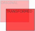
The value translate(50px,100px) moves the element 50 pixels from the left, and 100 pixels from the top. |
Fg. 3.1 (The Translate() Method)
div
|
|
Fg. 4.1 (The Rotate() Method)
div
|
The Rotate() Method 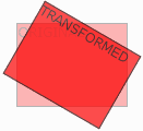
With the rotate() method, the element rotates clockwise at a given degree. Negative values are allowed and rotates the element counter-clockwise. The value rotate(30deg) rotates the element clockwise 30 degrees. (Fg. 4.1) |
|
The Scale() Method 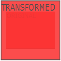
With the scale() method, the element increases or decreases the size, depending on the parameters given for the width (X-axis) and the height (Y-axis):(See Fg. 5.1)
|
Fg. 5.1 (The Scale() Method)
div
|
|
Fg. 6.1 (The Skew() Method)
div
|
The Skew() Method 
With the skew() method, the element turns in a given angle, depending on the parameters given for the horizontal (X-axis) and the vertical (Y-axis) lines:
( See Fg. 6.1)
|
|
The Matrix() Method
The matrix() method combines all of the 2D transform methods into one.
|
Fg. 7.1 (The Matrix() Method)
div
|
|
(CSS3 3D Transforms)
div
|
3D Transforms CSS3 allows you to format your elements using 3D transforms.
|
|
The RotateX() Method 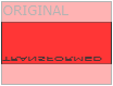
The matrix() method combines all of the 2D transform methods into one.
|
Fg. 8.1 (The RotateX() Method)
div
|
|
Fg. 9.1 (The RotateY() Method)
div
|
The RotateY() Method 
With the rotateY() method, the element rotates around its Y-axis at a given degree.( See Fg. 9.1)
|