SCHOOL OF ART
OTAGO POLYTECHNIC
PHOTOGRAPHIC DEPT
in association with
Lloyd Godman
present
Processing B&W photographs to Archival standards
for basic camera information try..........    
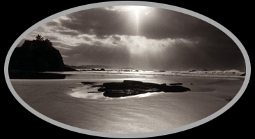
a project of enigmatic Black &
White Photographic prints that present the relationship of the body and
the elements
Fine Art Printing
When we think of black & white photographs most people
think of an image that has monochromatic tones with no colour variations
or subtleties. The richness inherent of colour photography is impossible,
the wide colour range is entirely beyond the medium. It is an honest and
modest medium it is only black and white.
The tones that we see on the paper are actually made from
black/grey metallic silver and the white is the paper base. But this medium
has its own syntax, its own special colours, tones and textures: a photographer
can learn to control them; an educated eye learn to recognise them.
It is learning to recognise them, select and control them
that we are concerned with.
The photographic paper base can be manufactured in numerous
textures, tones and surface finishes. The emulsion layer alone can make
the silver images look warm or cool, sharply contrasted or softly modulated.
Despite the fact that the emulsion is B&W, colour
variation is possible since not all grey is simply grey. While the changes
are subtle, the silver may appear to be neutral black, blue-black, warm-black,
brownish, reddish or greenish. These variations reflect the size and structure
of the of the developed silver grains.
A photographic emulsion composed almost entirely of silver
chloride or silver bromide produces the coldest tones (blue Black).
A mixture of both silver chloride and silver bromide produce warmer
tones
(red/brown). Emulsions in which silver chloride predominates are not very
sensitive and are mainly used for contact printing.

Click click
|