Canadian Graffiti 2
Many of these don't look as good as the originals due to my scanner having serious issues. With the exception of the digital inkings, all of these were drawn on paper and darkened a bit in Photoshop. Click on the thumbnail to view the larger version.
Click here for Part 1.
November 12, 2002
Yet another copy of one of Edward Aldrich's sketches. I've drawn several of his pictures from his book Drawing and Painting Animals, which I would highly recommend to anyone looking to delve into the realm of art. Aside from the vasy array of incredible pieces of art (along with a number of guest pieces), he outlines how to get started, what materials to use, and even includes several demonstrations of how he goes about painting a piece. It's very informative and even a good read.
April 30, 2003
This one was supposed to be Nikita and Michael from the TV show Nikita, but it turned out to be two random human-looking creatures. I was going to do it all over again (like I have with a couple of other attempted people), but I got lazy and moved on. The original is here.

June 3, 2004
Another drawing of an Edward Aldrich painting.

June 5, 2004
Yet another Edward Aldrich painting. Last one [for now], I promise.

June 6, 2004
For some reason I was bored of drawing birds, and I wanted to do something different. I don't know where I got the idea, but I decided to draw one of the bad guys from Diablo2. You can find the original here.

June 7, 2004
This one is coming soon, depending on permission from the original artist.

June 9, 2004
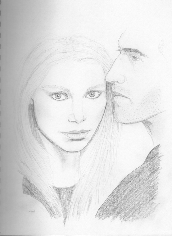
For this one I tried something quite different. One of the [many] major problems that I have with drawing people is my inability to properly capture their faces (as shown with Peta Wilson and Roy Dupuis up there). This issue lies greatly within symmetry problems (ie: I have a hard time drawing symmetrically), as well as a difficulty with connecting different portions of a drawing properly. A while ago a friend suggested that I try creating a grid and work using that as a basis. I thought I'd give it a shot, and what better subject than the most technically beautiful woman in the world, Elizabeth Hurley.

June 13, 2004
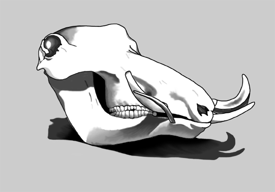
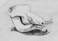
After the semi-success of my digital inking of Elizabeth Hurley above, I thought I'd give it another go, this time with the warthog skull at the top there. This one I found to actually be more difficult, since the majority of the picture wasn't bathed in black like the other one. So I had to use a lot of overlays and different brush opacities to try to replicate the different levels of shading on the skull. I did, however, learn from my newbie mistake when drawing Ms. Hurley: this time I used layers. Lots and lots of layers. While what you see looks all stuck together and everything, it's actually a combination of six different layers: one for the white background (which gives the skull its white, and serves as a basis for the shading); one for the majority of the lines of the drawing, and also some of the shading before I remembered to use layers; one for the majority of the shading; one for the teeth lines; one for the teeth shading; and one for the shadow. Another big difference between the two inkings is that for this one I had the original sketch on another layer altogether, so unlike the Hurley inking, here the sketch was simply used as an outline, and wasn't incorporated into the inking whatsoever. In fact, if you look at them side by side, you'll notice a number of differences, some drastic, some not so drastic. Enough talk, onto the drawing.

June 26, 2004
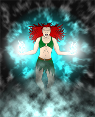
This one isn't quite done yet, but I haven't had the desire to do anything to it over the last few days, so I'll post it for now and if I come back to it I'll change it. This particular one was drawn essentially entirely in Photoshop, with only rough sketches of bits and pieces of body parts used for reference. For instance, I had to use my face and arms as references (see: lack of available female to stand in weird poses for me), which explains why they look somewhat manly and over-sized. That is one of the things I'm hoping to fix, but I'm not looking forward to it.
July 6, 2004
I remember reading somewhere that by studying the bone structure of a subject, it will give you a good idea as to its anatomical characteristics so that you can more accurately portray them. I suppose that doesn't really apply to me, but it gave me an idea nonetheless. Unfortunately it didn't scan very well, so I had to try to fix it up a bit in Photoshop. It didn't work so well. I really need to stop drawing so close to the binding rings, it screws everything up. I also started a digital inking of this one, which I may or may not follow through on.

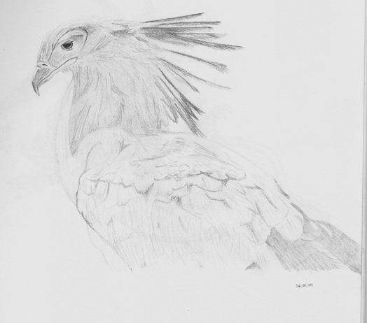
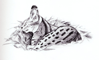
October 19, 2004
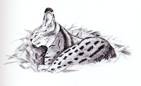
While the three month stretch between the skull and this serval was not completely devoid of drawing, none of the things I tried worked to my liking. In fact, drawing took a back seat to pretty much anything for a while there. A recent drawing session with Riss and Pat inspired me to pick up a pencil again, though not at that exact moment. Drawing in front of those two is like trying to play hockey in front of Wayne Gretzky. They're going to be nice about it, but inside they're laughing and poking you with sticks.
This is another drawing of one of Edward Aldrich's pieces.
Fans of the new Battlestar Galactica series will [hopefully] recognise these next three. The graininess of pencil shading on paper, especially when the paper is not super smooth, can often make or break a drawing. And while I'm not saying that without that hinderance these drawings would be perfect in every conceivable way, I do think that it takes away from the look a lot. Riss suggested I get some of those smoother-outer-thingies (which is Latin for "I can't remember what they're called), but in the interim, here they are.
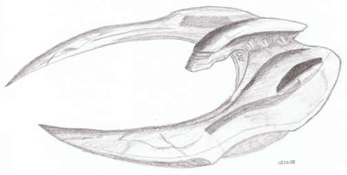
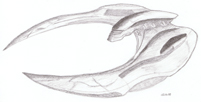
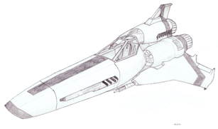
March 10, 2005 - the new Cylon Raider
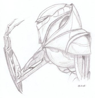
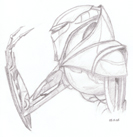
March 11, 2005 - the new Cylon Centurion
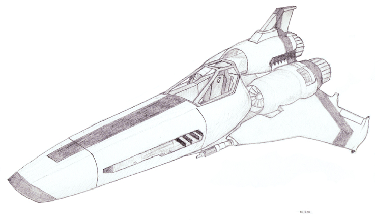
May 15, 2005 - the new Colonial Viper Mark 2
Click here for Part 1.