Paint Shop Pro Advanced
Week Three
Objective #1 Correct a Grayscale Image
Method #1
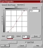
Method #1 - Here I used an adjustment layer for curves. I know from Photoshop that when the curve is steeper, the image has more contrast. I also saw from the histogram that the image was not in tonal balance. Above is how I set my curve.
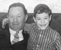
Original Image
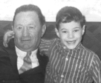
Method #2 - I learned this trick from Photoshop. I first created a levels adjustment layer. I did NOT reset any of the numbers, I just clicked OK. I then changed the adjustment layer mode to Multiply and changed its opacity to 45%. This made my overall image much darker. In Photoshop we call this a Multiply layer. Then I created a second levels adjustment layer above the first adjustment layer. I set its mode to Normal. I changed the Input number to 8 - 1.09 - 194 and then made this layer's opacity 100%. Now you can adjust your image by playing with the opacity of the 1st adjustment layer and the settings (especially the white point and gamma) in the second adjustment layer. Using a Multiply layer in conjunction with another adjustment layer allows you to bring out more of the detail in an image.
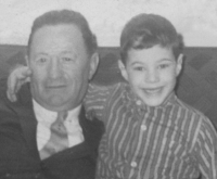
Method #2
Objective #2 - Improve color images, Use Adjustment Layers
Original Image
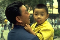
Yellow Cast
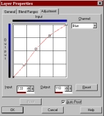
Blue curve
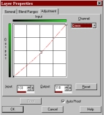
Green curve
In this instance my picture has a very strong yellow color cast. I know from color theory that if I want less yellow, I need to add blue. I created a curves adjustment layer. I went into the blue curve and made the following adjustment. This adds more blue to my image. I then went into the green curve and tweaked the image a little more.
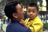
Corrected Image
Original with blue cast and poor contrast
Corrected Image
I was able to do the same thing to this image in several different ways. I increased the contrast by making the curve steeper. I adjusted the curves for blue and green to take the cast out. But below is a way I did it with levels. I created an adjustment layer for levels. In the levels dialog box I made the following settings:
RGB composite - Input settings - 6 - 1.00 - 249
Green channel - Input settings - 3 - 0.98 - 255
Red channel - Input settings - 7 - 1.04 - 254
Blue channel - Input settings - 31 - 0.98 - 241 (note the greatest change is in the blue channel)