Week 4
I did the first logo in a greyscale. It ok but to me it was blahhh...

| Designing Logo's Week 4 |
||||||||||||||||
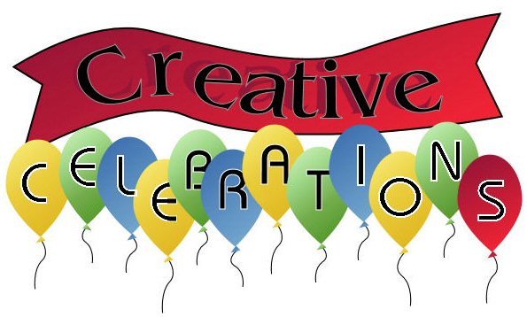
| Assignment: This logo is for a retail store that sells party supplies It sells everything from balloons to party favors, cake decorations, costumes to games. It is family oriented. I did the first logo in a greyscale. It ok but to me it was blahhh... |
||||||||||||||||
|
||||||||||||||||
| This one has bright colors that are eye catching. I figure no matter what your party is about, you want it to be fun and festive...true? | ||||||||||||||||
|
||||||||||||||||
|
||||||||||||||||
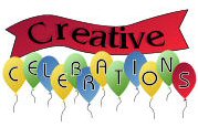
| This one is scaled down to 30%. Its not that clean looking but I think its because I compress them for web space storage | ||||||||||||||||
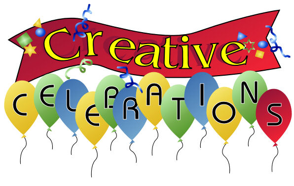
| hummmm?? after looking at this logo awhile it seemed boring..was missing something. This last one has a text color change to a yellow for a more cheerful feeling. The red banner I kept for its boldness..THE PARTY STARTS HERE sorta thing. Confitti shapes in various colors for more festive feeling. Who wants to attend a blahh party? Not me...And why just one red balloon?? Why not. It breaks up the monotony of the color line. Makes you wonder why, therefore makes you remember it better. Its also the top item that holds the design together with the bottom item..the red banner. ..........also.all logos are done in all vectors. | ||||||||||||||||
|
||||||||||||||||
| HOME BACK NEXT | ||||||||||||||||