 |
|
|
|
|
|
|
|
|
|
|
|
|
|
|
|
|
|
|
Designing Logo's
Week 3 |
|
|
|
Assignment 1: Create a logo for a high-end wedding florist who's clients come from weathy familys and with strong historical backgrounds.
I made the first logo using mostly vectors, the flower backdrop is a raster image though.. I kept it as simple as I knew how. :) The company name is a script font with a gradient to give it a elegant and professional feel. The slogan is a nice contrasting font. The heart lines are in a double form that connect at the ends for unity and love. The colors are red, white and black. |
|
|
 |
|
|
|
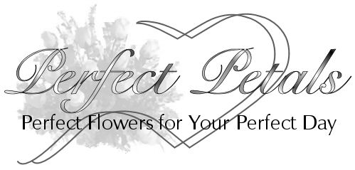
This version is done in greyscale for newspaper ads and black and white prints. |
|
|
 |
|
|
|
This version has been rasterize! :) I figured since this company caters to the rich and famous they can afford the extra ink it takes to print out shadows and bevel effects. This version would also look best on a website too. |
|
|
 |
|
|
|
This is just a alternative they could use also. |
|
|
 |
|
|
|
 |
|
|
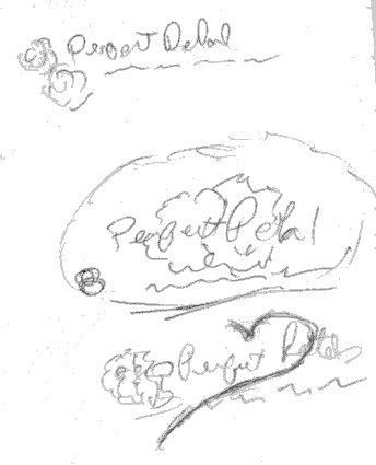
These are a few of my very "rough" rough drafts. :) |
|
|
|
|
| HOME BACK NEXT |
|
|
|
|