Assignment 1: this week I analized a site from a guy I talked with in a chatroom a few years back. He did websites and graphics and was nice enough to give me some free pointers. The site is dave simon. I find his site to be very simple and basic. He's uses food and eating in relationship to web design, which I thought was humorous and catchy. He uses very few colors in his site but his pages are consistant. His over-all layout is centered down the middle, while his text info is left aligned, that seems to be his only balance. Maybe more contrast in his grouping titles would have been good but he just used a different color and alignment for his text headers. He has white space in abundance which makes it very easy to scan, skim and scour. Over all, I liked the simpleness of the site. It shows you can get your point across without useing alot of words, space or visual aids. I also looked through some of his other work he has done for other people. I was jealous..lol :)
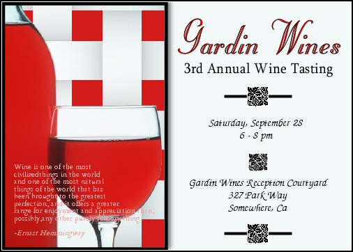
Assignment 2: This is a invite for a wine tasting event. In my opinion it's the more sophisticated and social type people who attend these type of events, so I used a near symmetry balance... a graphic on one side and the information on the other side. Using the rule of thirds I places the company name at one point and what the company is..wine..at another point. It has plently of white space and its alignment, rthym and unity are simple and appealing. *toast!* :) |
|