|
||||||||
| WEEK 3 | ||||||||
| Assignment 1: This is one of my favorite websites. Domestications . I have spent many hours just browsing through pictures and playing here. The homepages colors are warm and earthy feeling. ( if earthy is a word) Its easy to skim and scan and its direction lines are easy to navigate and find just what you are looking for. I like the visual blocks of artwork giving you the option of pictural links. You also have word link options to find what you want. They pack alot of information into their homepage but it's still has plently of white space and doesnt feel over crowded. It's use of text and font is simple and consistant. By changing the font size and style they emphasize the different title headers and catagories. This is a fun site and you can even pick your own matts and frames and really get a visual idea of different color scheams. | ||||||||
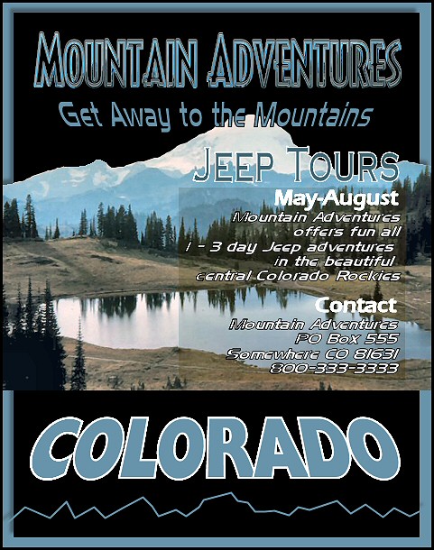
| Assignment 2: I tried to give this a bold and adventures feel. I used textured text and different angles to make it stand out and grab you! The flow of the text lines gradually lead to the right and then make a right edge margin. The information is layed out in-line and easy to skim and scan. | ||||||||
|
||||||||
| HOME BACK NEXT | ||||||||