|
||||||||||
| For assignment 1, I choose Illuminations home page. I think its a great scan, skim and scour page. With your first scan you know its a site for candles and gifts. The colors are soft and welcoming. The layout is easy to navigate at first glance. You can skim the page and know whats on sale and what their specials are. Once you are interested in their page you can scour it and easily find links to all the different areas with in their website. The site also has good use of white space and balance. :) | ||||||||||
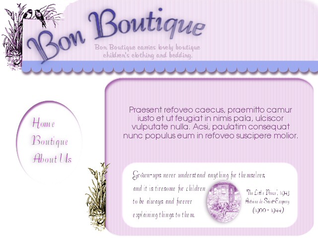
| Assignment 2. I tried to make the design appear to be a little more elegant then your usual childrens stores with bright bold colors. I kept this more to the peaceful, quiet, innocent side of children. I used several shapes and textures with added depth and soft muted colors. You can scan, skim and score it easily and it has plenty of white space. This is one of those stores I can't afford to go into but Brook Shields can....lol :) | ||||||||||
|
||||||||||
| Home Back Next | ||||||||||