Online Gallery
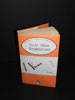

My final object to commemorate Jan Tschichold is a Penguin book jacket. It is a fusion of Penguins' latest book cover with Tschichold's first revised Penguin book as a celebration of the classics and the modern.

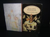
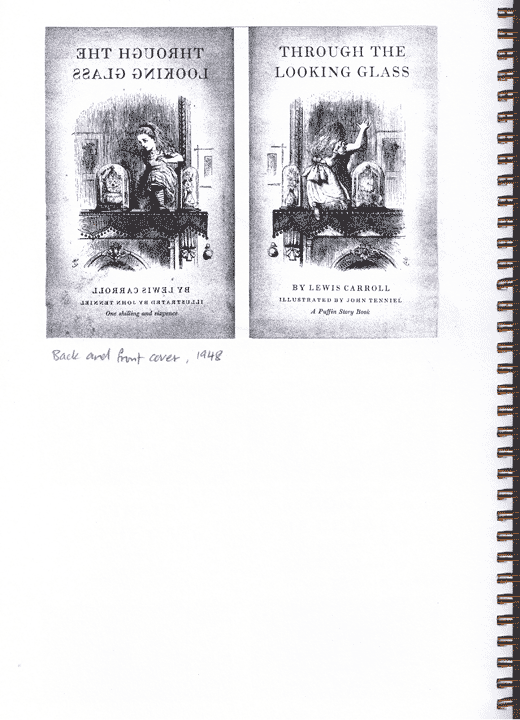
original cover
Why a book jacket? Tschichold was responsible for over 500 designs of Penguin books. He once said, " I could be proud of the million Penguin books for whose typography I was responsible. Besides them, the two or three luxurious books I have designed is of no importance. We do not need pretentious books for the wealthy, we need more really well-made ordinary books.
From this statement, we know that he is pro-education. He has written many typography books over his career. He was a teacher for some part of his life.
The title of the design is painfully written with Sabon font. Sabon is something that Tschichold wants to be remembered for. It was a breakthrough as it was a typeface that could be used for both linotype and monotype printing.
The main design is, in true Tschichold style, is just good typography. I decided to do this as the book is a Shakespeare, a name synonymous with the English language. What is more suitable to describe Shakespeare's than using words that describe the main themes of his stories. The design itself is a remake of one of Tschichold's work.
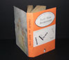
The back cover is a back view of the original book's front cover. Tschichold has used this technique in one of his books. This also serves as a reminder as Tschichold's childhood ambition of wanting to become an artrist. His parents were against his ambition and decided that he should become a teacher who teaches art instead.