PORTFOLIO

Concierge Physicians of Westport
CPW is a primary care office that breaks away from traditional healthcare by promoting a holistic and more personal approach.

Upper Crust Bakery
Upper Crust is a new bakery taking the traditions of French baking to new heights. Their company identity is wrapped in the use of whole, natural ingredients while still connecting to their French roots.

Dabster Designs
Dabster Designs was looking for a current and bold logo that could be applied to promotional materials. Their company spans many different fields so it was important to create a logo that was neutral rather than trendy.

Fashion Magazine
Fashiom Magazine was looking for snappy, bold, and timeless cover designs for their 2022 issues. Mock-ups established an initial layout with a heavy concentration on typography.
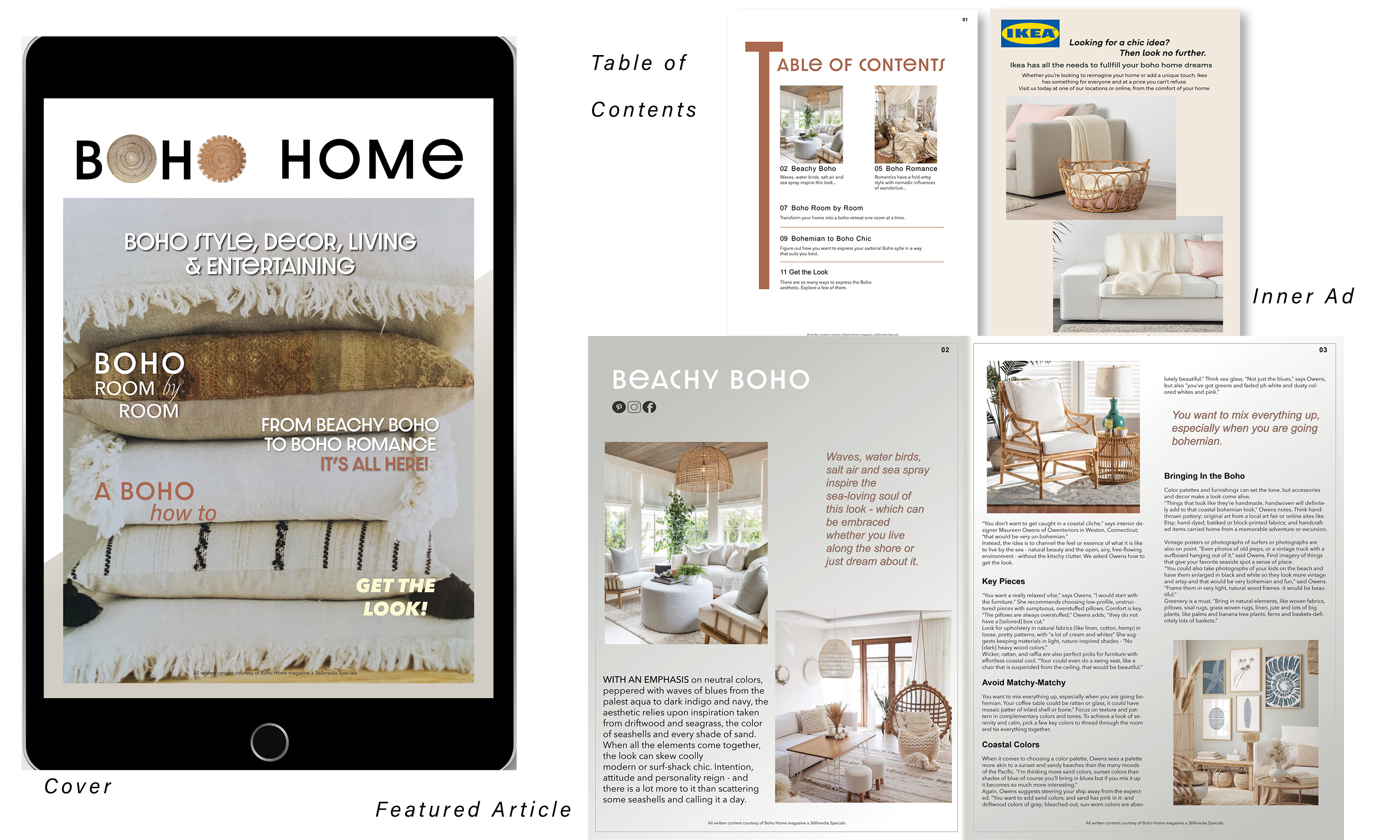
Boho Home Epub
Boho Home needed to transition into the digital world so creating an EPUB was a critical move to make. By keeping the integrity of the brand intact the transition was fairly painless and simple.

Music Talks Magazine
For the Music Talk magazine article, two different layouts were requested as the magazine was not sure what direction they wanted to go in.

Java Been
Java Been is an established cafe that was in need of a responsive website that was not only accessible but allowed access to their new online ordering system. A branding guide was provided with a logo, approved typfaces, and color palette.

Pasta Amore
Pasta Amore is an established Italian restaurant that was looking to overhaul their menu and promotional pieces. With a more traditional and family oriented aestethic in mind, a branding guide was provided including a logo with approved usage, colors, and typefaces.

Amethyst Bay
Amethyst Bay is a luxury resort that needed a new ad campain for their new promotion. A very specific look was reviewed with the client and a style guide provided with approved logos, fonts, and colors to guide the design process.

Marilyn Typography Portrait
This Marilyn Monroe typography portrait was meant to take the essence of Marilyn and put it into typographical form. A font was first chosen that mirrored Marilyn and who she was as a woman and an actress.


