
Portfolio
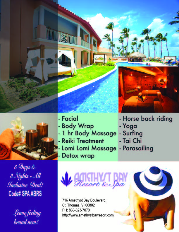
Amethyst Bay Spa BrochureThe image I chose was bright and gave an impression of being able to relax with massages and beautiful views. I used Adobe Photoshop to change the hue and saturation of the image I chose. I adjusted the contrast to give a light and bright detail of ocean at the beach to the overall image.
Cats Magazine
The ad is focused on a valid concept that my target market would be concerned with and has a need. There is a clear focus of sale that reinforces the brand and concept. I wanted a call to action in the ad that tells the reader what I want them to do--mail something in , sign up, call for more information or buy something etc.
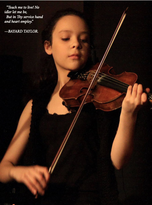
Music Ad
The one I like the best is with the little girl playing the violin. There is a look of concentration on the childs' face tells the story.
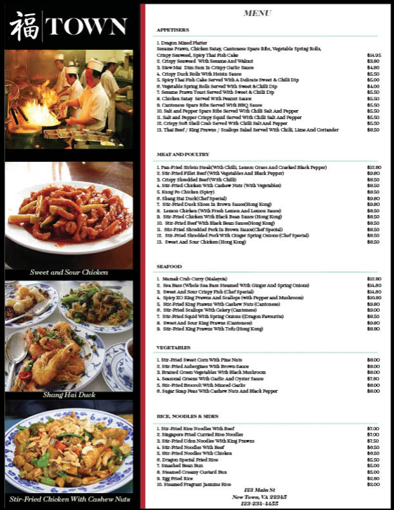
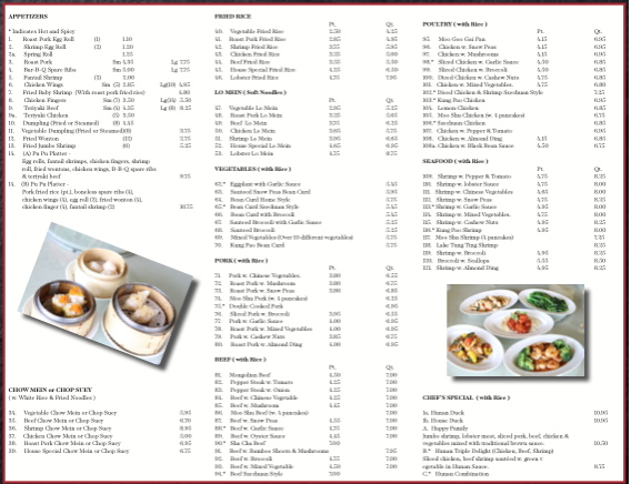
Town Menu
The Brand Style Guide was followed in order to ensure consistency of both image and text usage. All of the colors utilized were swatches taken from the Brand Style Guide and implemented into the design.
Town Brochure
I chose ones that were elegant but had a white background to create a cohesive look and flow. I shortened the menu items and added a white rectangle to the next to last panel and added a border stripe with the firecracker red with a 3 pt stroke.
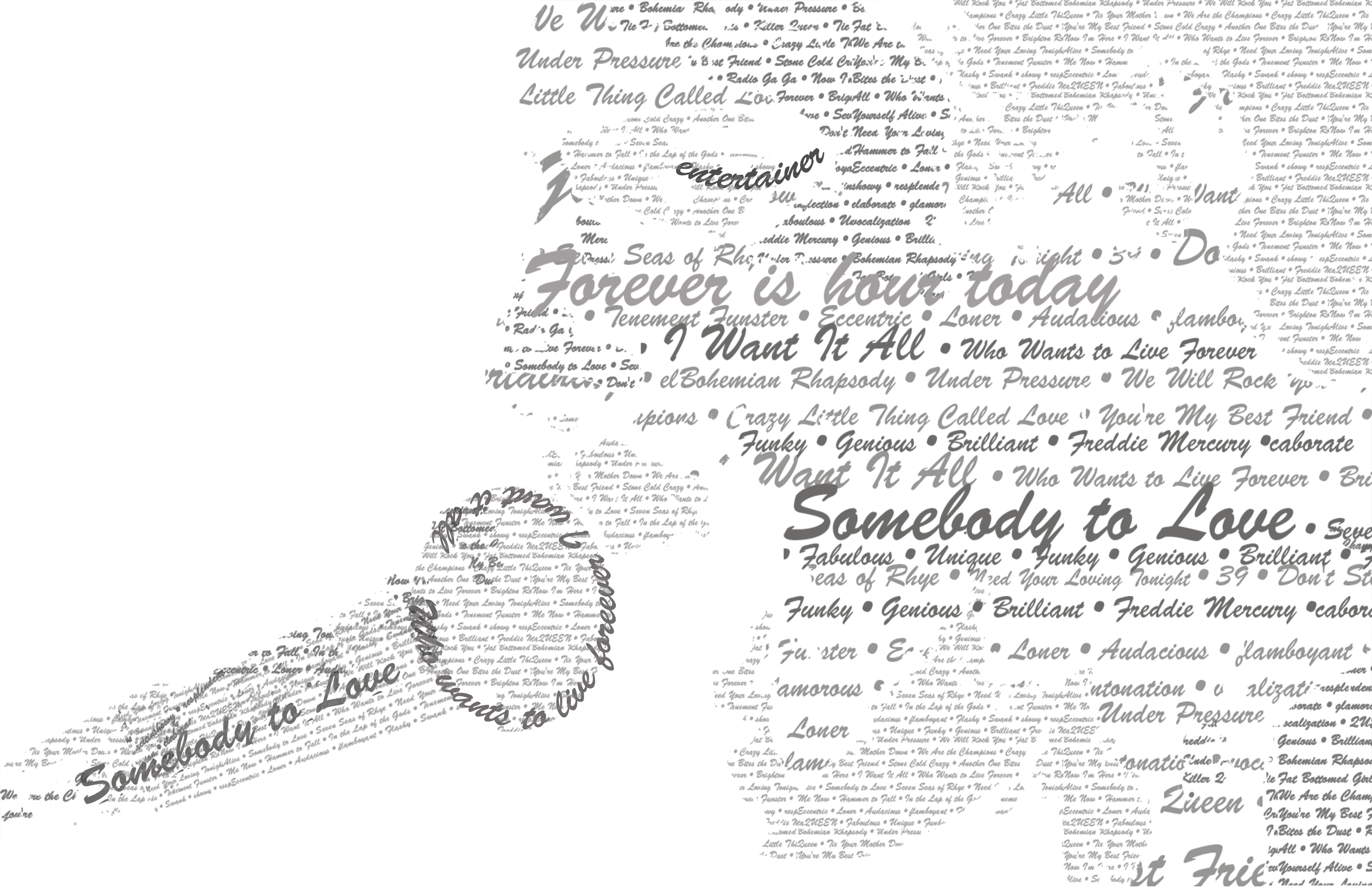
Freddie Mercury Typographic Portrait
I chose Brush Script STD for the font to be used on the typographical portrait of Freddie Mercury. I selected the font to represent the bold personality of Freddie. Freddie Mercury was audacious and flamboyant. He was an entertainer who wanted the audience to be a part of the music.
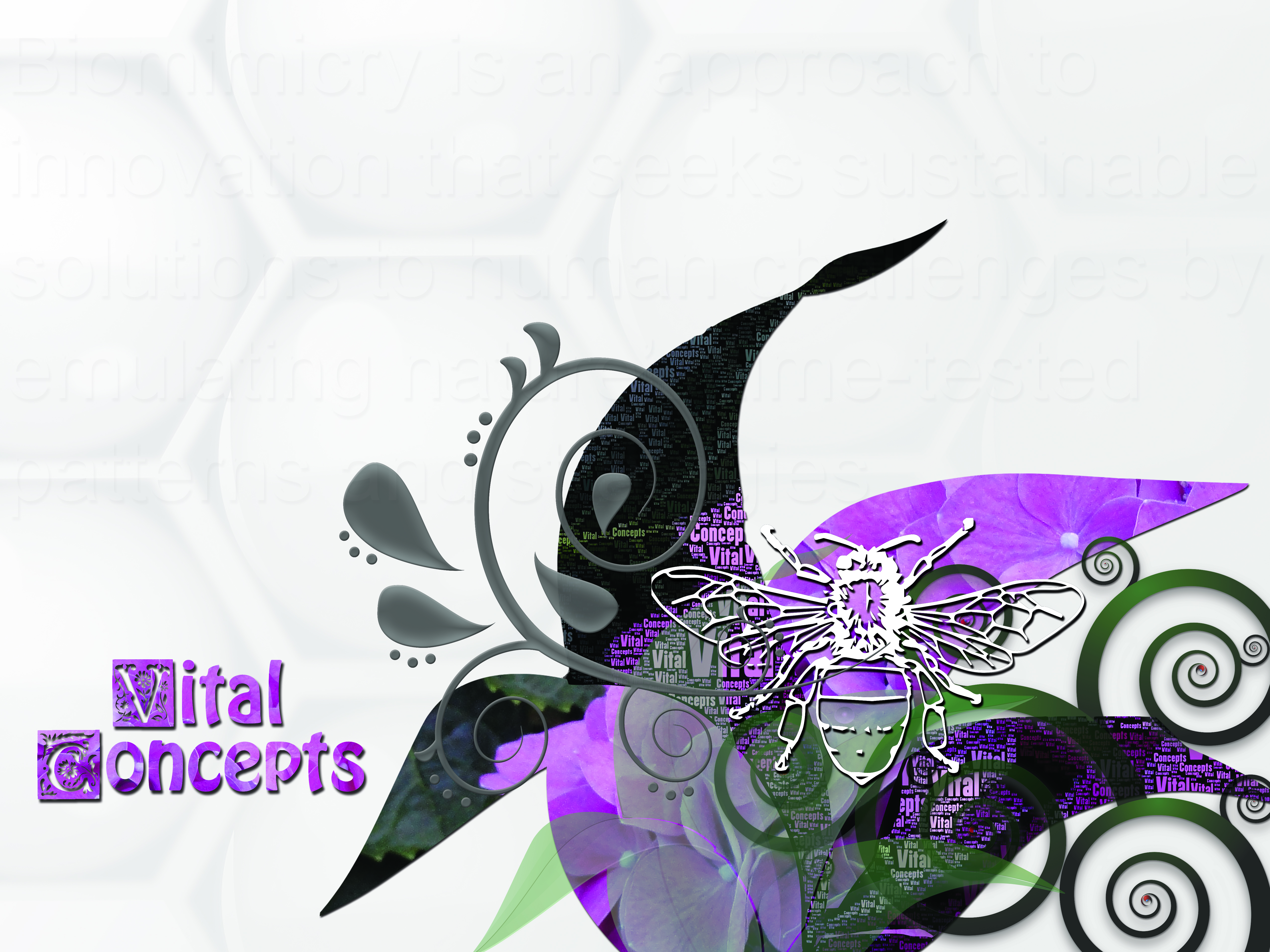
Vital Concepts Collage
I was hoping to achieve an organic feel to the design with symbolism pertaining to the interdependence between honey bee and flower. I studied for a while the concept of healtheology which is a type of homeopathic medicine. I liked that it was preventative in style and not disaster recovery similar to the methods used in medicine today. Healtheology is macro focused.
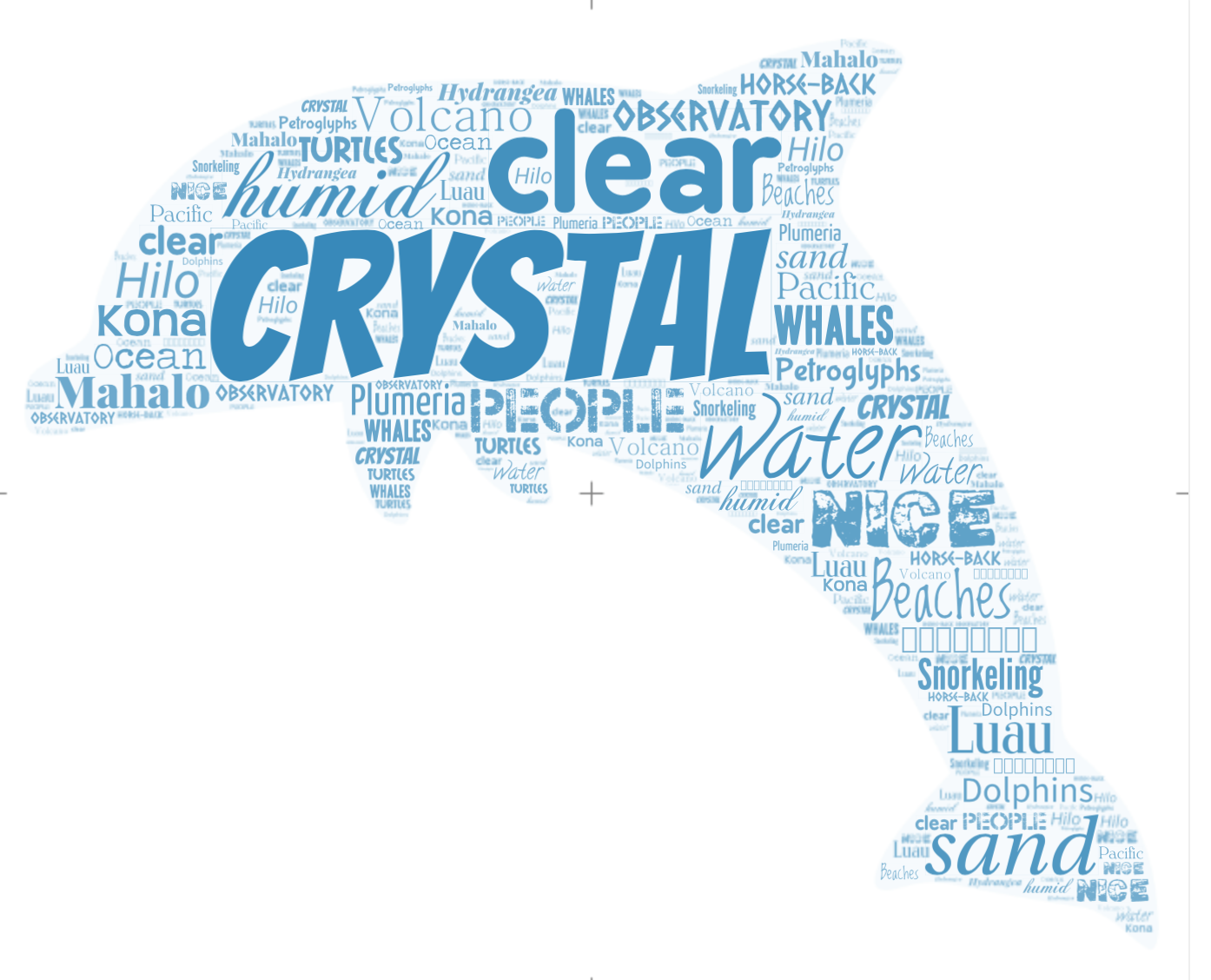
Word Cloud
I chose Hawaii. I thought a dolphin shape would work with the theme. The color selected is a turquoise to reflect the ocean. The words in the cloud are words that were selected to describe the Hawaii.
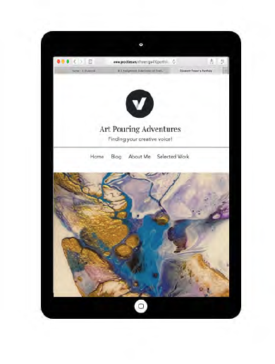
Website Device Prototypes
The prototyping for my portfolio website shows the responsive design and how it looks on different devices. Each breakpoint is demonstrated for the phone, tablet and laptop.
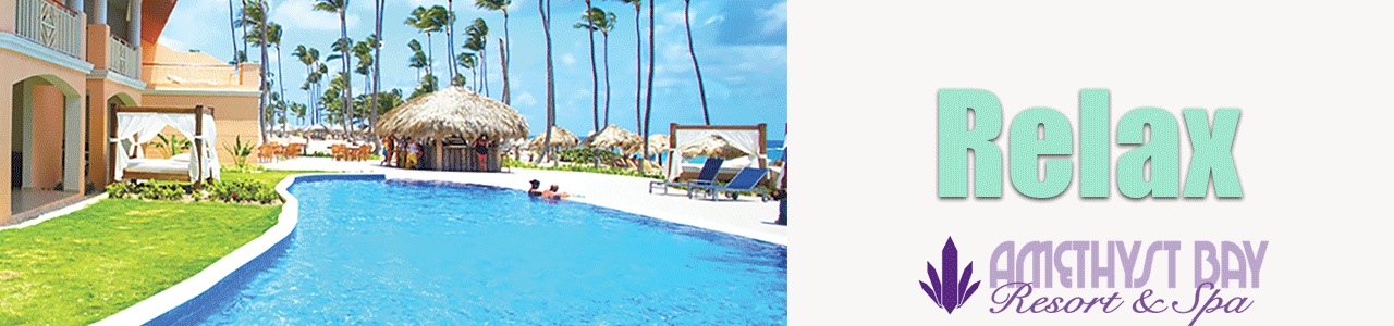
Amethyst Bay Spa Banner
The image had been altered when the magazine ad was created by changing the hue and saturation. I also changed the contrast of the picture to make it more vibrant.I used the same logo as the magazine ad.