
Letterhead and Business Cards
Brief:
Create a brand and marketing items for a design company to promote your voice to potential customers or employers.
Info:
Developed a brand logo, letterhead, mailing envelope, business card and branded giveaway items that could be mailed in a cardboard box.
Response:
After feedback from instructors and peers, the brand and items created were a success. The colors and font choices were carefully picked for this brand and compliment the voice or theme for Daniel Designs.

SPIROL Product Catalog
Brief:
The customer needed an informative and comprehensive product catalog to demonstrated the use of the product and what SPIROL can offer to the customers for sizes.
Info:
Product images and CAD style graphics were used to put together the 24 page document with tables and charts and engineering style information. The products are made out of metal and are for engineers to design into their consumer products so I added metal textures and grids for a technical appeal.
Response:
SPIROL was satisfied with this catalog and distributed it via print using 100# Endurance paper and an AQ coating. The information was sent to thousands of engineers and promoted leading to higher volume of sales and constant orders for the products.

Trade Magazine Ad - B2B
Brief:
Customer required a 1/3 page ad for standard size paper that would be in shown in the early pages of a manufacturing trade magazine to showcase their flagship product, the Coiled Spring Pin.
Info:
The product being the top of the hierarchy with features and benefits of the product, I used an example of an application to educate the audience and mentioned the complimentary engineering support that they offer to customers and non-customers. The footer being a call to action to visit their website and the contact information.
Response:
Upon a yearly customer survey, several new customers mentioned seeing the ad and responded to it. This lead to consistent orders of standard products that their engineers were able to assist in the consumer product design.

Exhibit Banner
Brief:
SPIROL again needed to continue to promote the same product from the catalog, but this time at a trade show, and required a standard size roll-up banner for their booth space.
Info:
Using some of the same elements of the catalog - the pictures and the grid - I was able to assemble this using their branding colors and adding emphasis for complimentary engineering support, which is a key strength of the company that helps them stadn out from other fastener companies. Not only did I supply them with good artwork, but I saved them money by using a slightly wider roll-up but it was able to change out the graphic so only the print would be needed moving forward and not the full roll-up stand.
Response:
This banner was placed at the front of the trade show booth. SPIROL was satisfied with the layout and noted that several people were able to see the banner from the down the isle and were drawn to it.

Exhibit Backdrop
Brief:
Another item for SPIROL was to create a general "about" SPIROL exhibit backdrop for their trade shows. The task was to showcase the range of products they can product and their global locations for customers to see the global strength of the company.
Info:
Using a vectored map and removing Greenland to balance the size and space of the map, I centered the map to be the largest item as the top of the hierarchy so the customers would know of the global presence. Because of the numerous products and their long and thin nature, I stood them up along a horizon using a secondary brand color as a base. There is a lot of copy on this and I did try to reduce it as much as possible, but to me the layout couldn't have come out any better.
Response:
Great feedback from SPIROL on this. They ended up order several more in various languages to send to their sister companies around the globe for use, the first being in France.

Restaurant Flyer
Brief:
Create a tri-fold flyer for a new and up-and-coming restaurant to promote its food, fine dining, and entertainment.
Info:
Working with the colors and logo provided, I kept a columnar tri-fold look to this to match an Asian aesthetic of characters written vertically. Each third of the tri-fold holding different information about the menu options, entertainment, environment, special event needs, and the restaurants vision. Added a visual elements by producing a vectored image of chopsticks laying over the rim of a bowl.
Response:
A great success. Many were printed and mailed to the residents within a 5 mile range for the announcement of the restaurants opening.
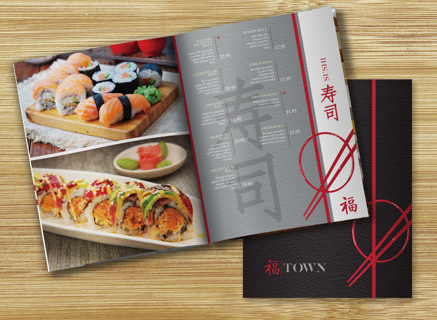
Restaurant Menu
Brief:
Produce a menu to showcase the food ranges of TOWN restaurant. The customer needed the look to be professional and inviting but did not want the cost to be too extravagant with it appearing cheap.
Info:
Convincing the customer that the paper type was most important, I was able to reduce the costs of the print by keeping the menu as a saddle-stitch binding while still using a highly textured paper to compliment the authentic Asian cuisine foods. I wanted to keep this menu feeling less heavy so I removed some of the pallet colors from the tri-fold brochure.
Response:
The customer loved the idea of using an authentic feel for the menu paper, adding the sensory elements they are using to impress the customers.
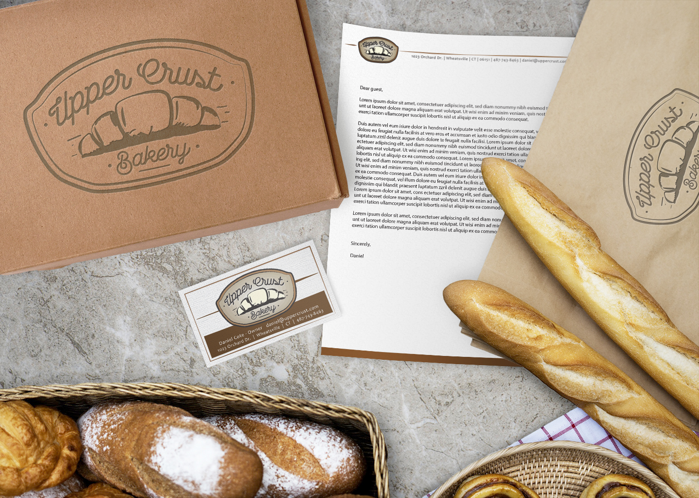
Bakery Branding
Brief:
A new French Bakery called Upper Crust Bakery moved into town and they required a new logo and marketing items with business cards and branded packaging.
Info:
The most important thing here is the logo. Using an unmistakable French Croissant as the symbol of the logo, I added a thick border around all of the elements to frame the logo, giving it enough space. I also used shades of brown to compliment the grain and baked items appeal. For the font I used a single thickness script typeface that would be easy to ready when placed on other branded items and was easily scalable.
Response:
The customer really enjoyed the branding suite provided to them and especially enjoyed what the logo looked like when embossed onto the box for their breads and treats.

Magazine Spread
Brief:
Produce a layout for a scientific article about life being on other planets.
Info:
Used a three column layout for this spread and added some planets. The title to me was what needed to stick out the most, making "inhabited" bolder and more prominent, other than the large sun with a text wrap.
Response:
Clean and easy to read for the customer base with plenty of white space to not be to crowded.

Rewind Magazine Cover
Brief:
Create a cover design for an upcoming issue of Rewind Magazine. The cover will introduce the main topic of Childish Gambino and his new single with several other articles listed on the cover as well.
Info:
With Childish Gambino being the main article of the magazine, I took the lyrics from his new hit and turned them into a typographical portrait of Donald Glover. I also created the masthead for the cover of this issue of Rewind Magazine using 100% of all of the cyan, magenta, yellow, and black values to represent all possible color combinations to reflect some of the issues brought forward in the song "This is America".
Response:
The editor was please with the cover. The song being such a hit and the use of the lyrics in the cover/type portrait was highly received to where they asked for a spread insert to be added to the issue of the full type portrait.