I can't promise a speedy reply, but you can send remarks to me
at: [email protected]
Ron Feigenblatt's remarks on
Microsoft ClearType(TM)
Index to entries:
I have been discussing the issues
raised by the introduction of ClearType by Microsoft at COMDEX since that event
with persons who shall remain nameless here. I have not worked on
these problems since 1989, but I hope the inquiries and
literature searches I have made in the past couple weeks qualify
me to speak usefully again. Of the various non-Microsoft places
on the Internet ClearType has been discussed, I find the
discussion on UseNet's comp.fonts the most useful, in glaring
distinction to places where much of the discourse consists of
ignorant fools venting their irrational hatreds and showcasing
their intellectual failings. (I particularly recommend the
insightful remarks of B. K. P. Horn. I am not surprised to offer
that assessment - his “Robot Vision” has long sat on my
bookshelf.)
My research into the problem of rendering on color mosaic matrix
displays took place in the late 1980's while I was a research
scientist in the employ of IBM. I resigned from IBM at the end of
1990, but a few years later the company was assigned a patent
based on my work there. That particular patent focuses on the use
of time to supplement space in diffusing amplitude quantization
error wrought by a display with a limited physical greytone
precision. It is of interest in the present context because
rather than treating the color mosaic as consisting of an array
of identical multicolored superpixels, it explicitly accommodated
the fact that there is what one might loosely term "color
misconvergence" in displays that use color mosaics. I am
pleased to report that the patent has been cited as Prior Art ten
times in the last two years, but I think, gentle reader, you
would be better served by first reading a copy of this related
paper instead:
R. I. Feigenblatt, "Full-color imaging on
amplitude-quantized
color mosaic displays", pg 199ff., SPIE Volume 1075,
Digital Image Processing Applications (1/89)
which I shall call the "SPIE paper" hereafter. My work in this area took place
in a historical era when pixel intensity quantization error in
real displays was very severe (typically binary). Nowadays color
mosaic matrix displays routinely achieve five or six bits of pixel physical intensity
precision, and
attention can finally focus on rendering strategies which exploit
that new found ability, such as the use of antialiasing to better
render fine geometrical details in imagery.
I did not attend COMDEX and see the ClearType demos. But in
digesting the various reports of it, I think we owe Bill Hill and
his colleagues at Microsoft our hearty congratulations for a job
well done in advancing display technology. At the same time, Mr.
Hill does those noble labors a disservice in asserting that:
"We discovered a new technology to
unlock the true resolution
of the color LCD screen, which is actually three times better
than anyone ever realized, because we've always assumed the
pixel was the smallest unit we could effectively address."
A
decade ago, when the SPIE paper was published, there was general
awareness Mr. Hill's "subpixel" could be addressed to
potential advantage. The SPIE paper itself, as well as work it
cites, e.g. the studies of Silverstein (then at Honeywell, now at
Xerox) and colleagues, makes this abundantly clear. And maybe a
decade before "personal" color mosaic displays were
faced with this issue, it was of concern to those building color
mosaic stadium displays out of giant pixels. See, for example, Mitsubishi's DiamondVision system and how it exploits a "dynamic pixel."
I don't necessarily imagine there is an intention to deceive.
When one deals with specialized technical problems, and relies on
machine-unreadable paper journals and proceedings with very
limited circulations to "publish" such work, in a world
where there are countless numbers of such venues, it is not at
all surprising innovators are often innocently ignorant of Prior
Art. I have seen this happen time and time again. How wonderful
we are now in an era where there is a World-Wide-Web and
excellent search engines. The scientific and engineering
literature cannot come on-line too soon for the sake of making
"public" knowledge universally accessible. US patent
law could help this along by denying new non-patent documents the
legal status of records of Prior Art, if they are not available
on the Web for free, and at adequate service quality levels.
My own work a decade ago was focused as much on mitigating the
limited physical greytoning of displays then of primary practical
concern as on mitigating the effects of color misconvergence. All
the same, the SPIE paper envisioned that a technique using the
principles which underlie ClearType could well be developed. I
quote from it now:
"Thus, we do not [here] discuss how to
render exact
abstract geometrical objects [e.g. fonts, RF 1998] using
algorithms peculiar to amplitude-quantized mosaic
color arrays... [However] real or simulated images
of natural objects usually demand better color fidelity,
advocating use of the low-pass filter, whereas the line
drawings and text in some computer displays require more
spatial fidelity, and [this type of] low-passing may be
ill-advised. Indeed, since in the latter case color is used
mainly as a one-of-few tag, it may even be worthwhile to
allow some crosstalk between the color primary images
constituting the same original pixel."
Let me expand on this last sentence. It is well-known that the
spatial acuity of human color vision is far inferior to that of
human luminance vision. This is the basis of many types of
"lossy" image compression algorithms. Save for
anomalies like "Wired" magazine, humans tend to color
their printing with no more than one color per letter, or even
word. On a mosaic color display, one can render a letter
respecting the spatial displacement of the three primaries in the
color reseau when dealing with its edges, degrading LOCAL color
fidelity for the sake of LOCAL luminance fidelity, while using
more "interior" pixels to give the letter the
appropriate mean color. Icons are not always of single or even
preponderant color, which is why I imagine Mr. Gates said
applying ClearType to icons is more problematic. The optimum
mapping would take account of not only the particular mosaic pattern in use, but also the relative maximum
luminance intensities of the three primary colors.
(Aside: I regret that executive management changes at IBM in 1989
resulted in my charter to do such work being vacated, as I was
explicitly directed to exclusively focus my efforts on devising
means to assist the manufacture of TFT-LCDs. I grew very unhappy
and left IBM at the end of 1990, immediately upon fulfilling all
the promises I had made to it about work in progress. I suppose I
will always wonder what would have happened had I continued to
work on color mosaic rendering. Nice going, IBM! )
Of course to assert that Fermat's Last Theorem can be proven is
not the same as offering a proof. And a given rendering scheme is
not a matter or true or false as much as a matter of
psychophysical "better". If ClearType is better than
simplistic alternate schemes, then one or more of the following
should be better for many or most of a representative sample of
users: aesthetic preference, reading speed and accuracy, and
fatigue aversion.
Some critics have offered the opinion that ClearType is
derivative of work done about 20 years ago in conjunction with
the Apple II computer. This may be a confusion between
introducing a problem and solving it. I will argue against this
viewpoint after I summarize the common elements. The Apple II
used a conventional broadcast-style (e.g. NTSC) COMPOSITE-color
video CRT display, leveraging the low price and huge installed
base of such an appliance -a very sensible compromise, and a
universal choice among video-game makers of the 1970's.
Unfortunately, such an election came at the expense of image
quality.
When color was introduced to previously black-and-white broadcast
TV, the installed base of sets was so huge it had to be done in a
way which did not make the old sets useless, which included not
altering the size of the frequency-space window which a broadcast
channel used. TV engineers know, in excruciating detail, how this
was done, and few naive readers would have the patience or
interest in learning how here. Naturally numerous reference books
are readily available. Suffice it to say, the result emerges that
one cannot arbitrarily specify the position and coloring of an
object on the screen independently. (Don't wear fine-striped
clothing while on TV.)
This unfortunate difficulty is immediately and completely removed
by the substitution of the composite-color CRT display with a
so-called "RGB" CRT display (such as is all but
certainly used by your desktop PC today). Regrettably, due to the
small-scale of production compared to that of the composite
display used for the TV mass-market, the cost of such displays
was comparatively prohibitive two decades ago. (And ironically,
the composite-color display is convertible to the RGB display
more by removing electronics than by adding them!)
So like the color mosaic matrix display, a raster display using a
composite-color CRT shares the common characteristic that if we
want to illuminate a small spot of the screen, at a precise
location, we cannot arbitrarily specify the color as well. But
this does NOT mean there is an EXACT isomorphism between the
problem domains of the two types of devices.
LCD color mosaic matrix displays have the problem of "color
misconvergence". But at least a given pixel preserves its
color independent of how brightly it and its neighbors are
illuminated! The rendering problem on a display using a
composite-color CRT display is even WORSE - the color (i.e. hue
and saturation) of a pixel depends on how intensely nearby
horizontally displaced pixels are driven as well! Double yuck!
Beyond similar, if non-identical, problems is the SEPARATE
question of IF and HOW each problem can be MITIGATED by an
appropriate rendering algorithm. Microsoft claims that ClearType
is such a specific technique for the color mosaic matrix display.
Were there any such solutions presented in the composite-color
CRT case?
I do not have detailed knowledge of the Apple II display
architecture, but I believe there were many essential points of
comparison with the CGA display adapter introduced by IBM half a
decade later, if the latter was used to drive a composite-color
display (rather than the RGB monitor which it could also drive.)
The binary-amplitude video signal intensity pulse train was
sampled at a pixel rate four times that of the NTSC color
subcarrier frequency in the 640x200 CGA mode. The full freedom
such a sampling scheme allowed was not exploited by widely
available PC software. (I did unpublished, unconsummated hacking
in this area independent of my IBM employment.) I am open to
evidence that documents otherwise was true for the Apple II, but
I have not seen such as yet.
No doubt part of the magic of ClearType is the use of methods
RELATED (albeit not identical) to the "fuzzy font" or
"antialiasing" techniques used to render geometrical
edges since the early 1970's. So therefore, surely the full
ability to do something like ClearType on the Apple II was
additionally crippled by the economic inability to provide full
greytoning amplitude precision within the video memory.
For those who are naive enough to suggest that "Apple knew
how to do ClearType two decades ago on the Apple II", I ask
why haven't Apple color laptop computers using color matrix
displays always done what ClearType now achieves? Too much pot in
Cupertino? Sorry, I don't buy that. The guys who created
QuickTime? Nah.
By the way, the problem of "color misconvergence" on
color mosaic flat panel displays is not simply a matter of money,
like the composite-vs-RGB color monitor issue in the case of the
Apple II and IBM CGA display adapters. The color mosaic problem
CAN be obviated with a scheme that optically magnifies the images
of three LCD displays, each of one primary color alone, so that
the three images are coincidentally projected onto a common
screen, avoiding the misconvergence problem entirely. But such a
system cannot be made as flat as one desires. (cf. Ronald I.
Feigenblatt, "Electronic Projection Displays", Society
for Information Display, Seminar Lecture Notes, volume II
(1987)). Some suggestions exist for flat-panel matrix displays
whereby every pixel can have multiple colors (cf.
"Frame-Sequential Electronic Color Display Filters", R.
I. Feigenblatt, IBM Technical Disclosure Bulletin, vol. 28, No. 6
(11/1985), pp. 2696-2698), but practical TFT-LCD alternatives to
the color mosaic are not in the near future of laptop PCs.
If Microsoft has a technique to render text on color mosaic
matrix displays which significantly improves image quality over
that achieved with the naive methods now in use, I think they can
defend patentable claims. Congratulations to them for a job well
done.
Ron Feigenblatt
Remarks
on 1998 December 7
For the sake of accuracy, I will
leave the remarks I posted on 1998
December 5 as is,
save to hyperlink to a paper for which I have now been granted
the indicated reproduction rights. Since I made that post,
additional material, such as John Markoff's second relevant article in the "New York Times" has been
published, which prompts me to make additional remarks here
myself. First let me explicitly state, as have others, that I
have no Microsoft-proprietary information about ClearType.
Let me quote some material I
communicated privately a week after the ClearType announcement:
"I have
always believed in digital convergence and have long maintained
an interest in video on computer displays. The IBM booth at the
1988 ASME convention won an award for its excellence. It used a
tool called PCMOVIE (with a conventional CRT display) which I had
authored to show modest animation in real-time(*) on the
laughably slug-like PC hardware of its day. A pedestrian
application like the display of fonts was not the only thing on
my mind back in the late 1980's. This was especially because the
limited pixel count and grey response of TFT LCDs then meant
there was little opportunity to consider
"anti-aliasing" dense text on the displays of those
times. That is why I tended to concentrate on things like video
of real and virtual worlds.
"That is not to say we
never gave any thought to displaying fonts on TFT LCDs. By 1989
IBM publicly announced prototype TFT-LCDs which were the product
of a partnership with Toshiba. Demo units were shown publicly, at
places like Educom 89 in Detroit. I designed and coded the system
software and composed a suite of third-party "DOS"
apps, including Microsoft Flight Simulator and Microsoft Windows.
Attendees at the Educom demo could see the display used a
repeating quadruple of red, green, blue and white pixels which
could be turned either on or off.
"But there was more than
just a dog and pony show going on. Back in the lab we were
interested in the critical rendering problem. Naturally, I cannot
disclose industrial secrets, but there were many public artifacts
to which I can refer. I had the privilege to work intimately for
a year (ending 11 years ago) with Professor Vincent Cordonnier of
the University of Lille in France where today he is
vice-president of international relations and director of a
multi-institution "smart card" initiative. During his
visit to the US, Cordonnier worked on the problem of choosing an
optimal color mosaic pattern. He wrote a paper titled "An
Evaluation of Some Three-Color Tiling Patterns", which was
read in some form at a European congress, a copy of which I do
not now own. He also worked on the problem of rendering letters
on matrix displays in a better way than accomplished using
conventional "anti-aliasing" techniques, and read a
paper in a conference session I chaired at a 1988 [Society for
Information Display] congress in the US. Surely you could say the
good professor was involved in both color mosaic design and
optimal character rendering issues within the same year.
"Before I left the issue
of image rendering on mosaic color displays I did simulations of
hypothetical LCDs, similar in spirit to that described by those
outside IBM in reference 1 [F.E. Gomer, L.D. Silverstein, R.W.
Monty, J.W. Huff, M.J. Johnson, "A Perceptual Basis for
Comparing Pixel Selection Algorithms for Binary Color Mosaic
Displays", Society for International Display International
Symposium Digest, 435-438, Anaheim, CA (1988).] of my 1989 paper.
Notice that inescapable in the issue of choosing a mosaic design
which to use for text and graphics is the WIDE OPEN CHOICE of
rendering algorithm. Thus I began work of the type which could
have led to a development like ClearType.
"I regret that the studies
were highly unscientific, for by that time the once-extant group
that methodically studied human-factors issues in electronic
displays had been disbanded, a change I had looked on with
expressed contempt. The new guiding philosophy was that any
relative improvement should be obvious to anyone at all if it to
be entertained. Sometimes advances can be dramatic, but often
science and technology proceeds with uncertain and tentative baby
steps and the change delegitimized this incremental point of
view."
I'd like to observe that
object-code shrink-wrap applications like Microsoft Windows had
no knowledge of color mosaics, so one has to posit some
astounding assumptions to infer that the Educom 89 demo
"used color sub-pixels to enhance resolution", in
real-time no less.
(*) My favorite use of PCMOVIE was
to loop digitized video of a burning Yule log. Season's
greetings, everyone! ;o)
I regret I had little information
on the (Xerox family) Dpix seven-million-pixel display not
provided by the Wall Street Journal article of March 11, 1996,
titled: "Xerox to Market Display Technology That Produces
High-Resolution Images". But it seems the color mosaic
pattern in that LCD is the same as the Mitsubishi stadium display
about which I already wrote (cf. above) in my first post to this Web site on 5
December. That is not to say that the two firms use identical
RENDERING algorithms, but they both do evidence awareness that
advantage accrues to exploiting the divisibility of a
white-averaged superpixel.
I am not surprised that Xerox has insight into this issue. I have
very high regard for Paul G. Roetling, whose course on digital
halftoning I had the privilege to audit in the late 1980's. I now
learn that in creating their new "Digital Imaging Technology
Center" in 1994, Xerox shared my admiration, as evidenced by
the fact Roetling was placed in his OWN department as
"Senior Fellow".
Oh, one small point of correction comes to my attention within
the last day, the institutional affiliation of Lou Silverstein.
US Patent 5703621, assigned to Xerox, lists him among the
co-authors. The patent was filed July 12, 1996 and issued
December 30, 1997. But a 1998 SID paper shows him with VCD
Sciences in Scottsdale, AZ.
Now to the discussion of the Apple
II in places like Mr
Gibson's Web site.
There is useful information there for the novice to understand
why precise positioning is important in typography, and details
on the specific architecture of the Apple II display I did not
have before. As Mr. Gibson points out, two decades ago Microsoft
was well aware that color and position could not be independently
specified on the Apple II and I can't imagine their patent
applications are simply a rehash of what they knew then. (Of
course I agree that makes hyperbolic talk in 1998 of
"finally splitting the pixel" ironic.) But ClearType
surely recognizes and exploits the details of greyscale as much
as it does of "color misconvergence". So I would
disagree with Mr. Gibson's assessment of Mr.
Tamahori's Web site,
which seems to share my opinion that grey scale plays a key role
in optimizing ClearType. And Mr.
Tupper's Web site
eventually (November 20) realizes there are issues that one might
not at first appreciate.
Before I leave the domain of the composite-color CRT display, let
me observe what was old is new again. Microsoft's WebTV division
sells a turn-key system which uses a conventional TV set to
provide end-users with a lower capital outlay price point for
World Wide Web access than even today's remarkably cheap PCs.
Looking at the WebTV
developer Web site
today, I've learned that a system has a nominal spatial
resolution of 560 x 420 pixels. (544 x 378 for the Web page). I
have not found conclusive information about grey scale, but there
is a vague suggestion the 216 browser-safe colors are supported
without dither (even if use of the highly saturated ones are
discouraged for good reason). Anyway, it seems Microsoft now has
a composite-color CRT-based platform where there will be the type
of messy interaction between color and position which Steve
Wozniak and his colleagues like to recall. But now significant
pixel grey scale will be available, because memory is dirt cheap.
While near-neighbor pixel interactions make the composite-color
CRT case more problematic than the mosaic color matrix LCD, as I
discussed above in my post of 5 December, an application of
ClearType technology or some variant using the ideas by which it
functions may prove of use here too.
A more important point of disagreement is the question of whether
the Microsoft work is patentable. First of all, let me first make
my opinion of software patents manifest by quoting from a post I
made to the mailing list of the Atlanta Linux Enthusiasts only a
week before the ClearType announcement:
>Date: Wed, 11 Nov 1998
20:10:58 -0500
>To: [email protected]
>From: R I Feigenblatt <[email protected]>
>Subject: software patents: violation or protection of
property?
http://www.techweb.com/wire/story/TWB19981109S0022
"Microsoft Saw Linux As Copyright Threat" (11/09/98
5:16 p.m. ET)
...discusses the so-called Halloween memos attributed
to Microsoft staff concerning Linux. One quote is:
"The effect of patents and copyright in combating
Linux remains to be investigated."
It is not my purpose to incite the rabid Microsoft-haters
in raising this issue, but to foster discussion of the
larger issue of software patents. The magnitude of this
problem is discussed on line in places like:
http://newmedia.com/Today/95/09/20/Patent_Absurdities.html
While I approve of copyrights for software, I think
software patents are a bad idea. Not that long along
the so-called "materialism doctrine" was used to turn
aside ALL claimants of software patents. But in recent
years they are becoming a large and growing business.
A cogent set of arguments against software patents is
offered by Stallman and Garfinkle in "Against Software
Patents" (Communications of the ACM, January 1992.)
Briefly, the rationale of issuing someone a legal
monopoly to make, sell or use an invention (even if
for a limited time) is predicated on the notion that
the first one to introduce such invention bears enormous
costs that need not be borne by competitors, making it
irrational for anyone at all to undertake such innovation,
as it is economically suicidal, even if the produce is
of genuine usefulness and advantage to its consumers.
One can argue that in crafting software, prototyping is
theoretically a matter of straightforward composition based
on a priori syllogistic arguments and not an exhaustive
trial-and-error search a la Edison's bulb filament.
Moreover, there has never been want of innovation in
software for lack of patent protection. Indeed, it has
always been so rampant few people have even bothered
publishing methods on the grounds that other competent
programmers faced with a similar challenge would devise
what is needed to address it. And indeed obviousness
has always been grounds for disestablishing a patent.
Moreover, ideas, e.g. Maxwell's electromagnetic theory,
have never been patentable.
At the risk of sounding cynical I will cite this
quote ("Upside" March 1998) of software venture
capitalist Ann Winblad: "Now you must take money
quickly, or there will be many companies saying they
do the same thing. You need to take the money and
declare victory immediately. Then create a product."
Software is much more like a business method than a
traditional "mechanical" technology. And of course it
has never been possible to patent a business method.
So, if patenting software is a bad idea, what is Uncle
Sam now starting to let parties do? It is in effect
allowing them to patent business methods implemented
with software, i.e. e-commerce. So much for the notion
the "Compton patent" fiasco will not be repeated now
that the USPTO "finally has a corps of computer-literate
examiners!" You can read about how bad it is at:
http://newmedia.com/NewMedia/98/11/readme/Patently_Obvious.html
Far from protecting an innovator who invests a great
deal from which others would otherwise unjustly profit,
software patents typically cripple the use of obvious
methods in creative business strategies by making their
exploitation a legally risky and maybe even financially
ruinous proposition. They only favor those who would use
politics rather than economics to award the fruits of labor.
Ron Feigenblatt
P.S. If the present situation is not reformed, it is nothing
more than due diligence for Microsoft to attack Linux or
any other competing software which infringes on any
software patents it holds. Were I a servant to Microsoft's
stockholders I would dismiss the responsible person who
would not weigh the benefits of doing just that. I would
certainly also raise FUD by stating the obvious, too.
(Aside: No, I don't hate Linux: I
published an article promoting its great merits the month (March
1994) it came out of beta-testing. It seems that's even before
the gentleman who writes the Linux column in "Performance
Computing" ever saw Linux.)
Anyway, back to my point. Even if I
may not like software patents, they exist. The question then
becomes: What can be patented? Did you know that I am coauthor of
a light bulb patent? And that Thomas Edison is not another
coauthor? You see, you take some electricity and then you can
make light from it!
You mean you heard that idea
before? Sheesh. I must be some smooooooth operator to get the
USPTO to agree to that one! Or not? Would it surprise you to
learn there are gazillions of artificial light patents? It is not
enough to say one can use some vague means to achieve some useful
end. Patents rest on specific CLAIMS. If infringement of the
patent is litigated one day, no one should be able to ask
"Where's the beef?"(TM?) <G> You must say HOW you
accomplish the useful end.
John Markoff quotes John Seeley
Brown, director of the venerable Palo Alto Research Center, with
offering faint praise for Microsoft's ClearType work."They
may have found a minor twist," Brown said, "but the
idea of how the eye perceives color based on the display of
sub-pixels is where we started this game."
As Dr.Brown knows, Xerox itself
exploits "minor twists" all the time. Consider this
minor twist on U.S. Patent 5,353,127, published in the Xerox Disclosure Journal. Gosh, but a publication is not a patent,
some might observe. That's right - sometimes a publication is
BETTER than a PATENT. It costs far less for Xerox to publish an
idea in their vanity press than to pursue a patent application.
And if within a year, no one can prove they originated the idea
first, it will stay in the public domain forever. That's why many
companies issue such serials. Xerox decided that, from a business
perspective, this particular technical advance was not worth
their while to patent and potentially license - but they wanted
to make darn sure that they would never have to pay license fees
to use the idea themselves. Which means they know something like
this might be patented. (No offense, Mr. Mantell, I've been in
just your position, too.)
Is the Microsoft work patentable?
As I discussed on December 5, it depends on exactly what
Microsoft will claim. Surely asserting that no one previously
thought to split the white (super)pixel is a false premise. But
it is one thing to theorize the atomic nucleus can be split to
release enormous energy (1905CE), another to experimentally
confirm this (1939CE) and still another to demonstrate how this
is done in an optimally utilitarian manner for various purposes
and by various methods (1942CE, 1945CE). If companies other than
Microsoft have something to boast about, let's have some
demonstrations using magnified pixel simulations on the World
Wide Web.
Ron Feigenblatt
Readers may like to look at related
material that comes subsequent to the remarks I made above a year
ago.
- I'd like to make a small
clarification to the Information
Week article cited here. My
original patent application, which only dealt with static
rendering on color mosaics, was actually submitted 1989
January 13. The successful effort earned me the
assistance of an engineer to build a prototype real-time
rendering system, which work led to the discovery of the
temporal effects which I theoretically explained (as
detailed in the aforementioned "SPIE
paper"),
and provided the basis for the revised patent application
of 1990 January 12.
- A month after my guest
editorial ran in Byte,
Xerox concluded a technology alliance with Microsoft. It
was very amusing to watch a Fall 1999 COMDEX panel on
ZDTV to which the panelists were asked to bring cool
technology from the show floor. As Microsoft's Craig
Mundie showed off a prototype E-Book, Xerox's John Seely
Brown looked on sheepishly, observing how it used
ClearType, huh.
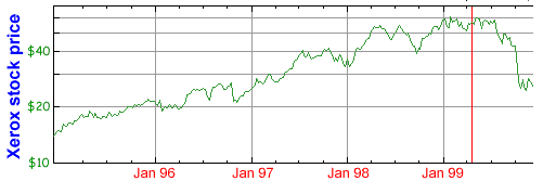 It is interesting to note that since
my editorial ran (cf. red line in graph), the price of Xerox
stock has tumbled to half of what it was, after many
years of good performance. A recent copyrighted story by
Reuters at MSNBC quotes J. P. Morgan analyst Daniel
Kunstler saying this about a recent Xerox announcement:
"I don’t like this at all... It sounds like the
productivity - the execution - problems are rather
insidious. It’s very bothersome, and I can’t
help but feel that at some point there’s a ripple
effect on competitive position... Something is really
fishy in the way that whole place is being run..."
It is interesting to note that since
my editorial ran (cf. red line in graph), the price of Xerox
stock has tumbled to half of what it was, after many
years of good performance. A recent copyrighted story by
Reuters at MSNBC quotes J. P. Morgan analyst Daniel
Kunstler saying this about a recent Xerox announcement:
"I don’t like this at all... It sounds like the
productivity - the execution - problems are rather
insidious. It’s very bothersome, and I can’t
help but feel that at some point there’s a ripple
effect on competitive position... Something is really
fishy in the way that whole place is being run..."
- The Microsoft ClearType
breakthrough came in the context of work on so-called
"E-Books", of which I have always been an
enthusiastic booster, as you can see from my 1994 February letter to Byte. "E-Book" actually has
multiple meanings. Of late, it has referred to digital
appliances dedicated to largely passive reading (vs.
authoring) of material. But any machine-readable copy of
an extended document might be referred to as an E-Book as
well. In this sense, long before it
was an industry giant, Microsoft was a leader in E-Books
and the technologies needed to foster them: A dozen years ago the role of the
CD-ROM in the future of the computer was by no means
obvious to everyone. Indeed, my colleague Prof.
Cordonnier (cf. above) was dubious about my enthusiasm.
At the time, I was impresario of a lecture series at IBM
for outside speakers, so my Research Division colleagues
could learn of advances from things like this 1988 demo
of Digital
Video Interactive ("DVI") technology, first announced at the Microsoft CD-ROM
conference
some months prior. Later that year, Intel bought the
technology. The following year IBM entered into an
agreement with Intel and went on to make DVI the basis of
its multimedia offerings through the early 90s.
Remarks
on 1999 December 26
ClearType is now briefly discussed here
in Wired magazine. I
feel the item continues to perpetuate an unfortunate myth, so I
took some spare time to compose the following. Perhaps confusion
comes from what people mean by
"subpixel addressing".
Josef Maria Eder's impressive tome Geschichte
der Photographie (1932), a 1945 English
translation of which Dover Publications reissued in 1978,
includes an interesting section titled "PHOTOCHROMY BY
JUXTAPOSITION OF SMALL COLOR ELEMENTS - COLOR SCREEN
PROCESS". This is precisely what I call "color
mosaic" imaging in my discussion, but in the cited book it
pertains to image capture and display by photochemistry. Eder's
text discusses the extensive work in this area, including patents
dating back over a century and even projected cinema film
demonstrations in 1931.
I make this historical citation to
clarify that space-division-multiplexed color is not a creation
of the 20th century. A (periodic) color reseau was used in 19th
century photography to provide a rendering surface for imagery.
If the source image
was that of a small letter in a particular position, the centroid
of the letter in the rendered
image would depend on what color it was! An analogous situation
arises when trying to render a colored letter on a composite
color raster display. Because color is coded by adding a video
signal component at the color burst
frequency, the different phases associated with different colors
lead to lateral (horizontal) displacement of each scanline
centroid of the letter.
The Apple II was created in an era
where providing enough memory to allow pixel gray-scale
information was cost-prohibitive. Therefore, a bilevel video
signal was used to produce images on the display. By clocking
transitions between the "on" and "off" levels
as often as twice the color burst
frequency, it was possible to provide color modulation. (For more
detail see, for example: Microcomputer
Displays, Graphics and Animation (Prentice-Hall,
1985) by Bruce Artwick, pages 96-97.) Let's use the term dot
to designate the smallest interval between potential transitions.
A single driven ("on") dot on an undriven
("off") pedestal would be colored either magenta or
cyan, depending on whether it sat in an odd on even ordinally
numbered dot slot in the scan of a raster line. This makes it
analogous to the 19th century photochromy scheme above. (Of
course the photographic scheme was more
sophisticated in that it provided gray-scale).
But the paramount thing to note is
this: ANY very narrow isolated driven interval on the scanline of
a composite color monitor has a color which depends on its
horizontal position. This fact is inherent
to the 1953 NTSC color method and not a design decision
made almost a quarter century later at Apple or anywhere else!
Call it "addressing color subpixels" if you so define
your terms, but that is not
relevant to Microsoft ClearType any more than the 19th century
photochromy method is! (Or relevant to my
own work, for that matter.)
Question: So, if not
to ClearType, then to what
in color-mosaic LCD technology is the Apple II color method
analogous?
Answer: To the method used before either ClearType or
conventional (superpixel) "font-smoothing". A specific
example would be: an older Windows display driver intended for
CRTs and lacking font-smoothing, but used to drive a color mosaic
LCD instead. If one incorrectly insists
the Apple II method is a "crude example of ClearType",
then such an "example" does not require that the Apple
II ever existed. Just
whip out your 1998 Windows color-LCD laptop computer and turn
font-smoothing off, and there you have such an alleged
"example".
When color-mosaic stadium displays
were first deployed, people could have correctly
observed: This is not the first time
space-divison-multiplexed color is being used: the Apple II used
this method a few short years earlier! But, of course, so did the
photographers of the 19th century. And we won't even mention
decorative knit garments.
What ClearType appears
to be is an important extension
of conventional computer graphics font-smoothing techniques,
known since the early 70's, which exploit pixel
gray scale. The extension involves
respecting the unique implications of an enforced periodic color
mosaic (as my work in the late 80's did). Windows eventually
folded in traditional font-smoothing techniques (often referred
to with the jargon "anti-aliasing"), and this arguably
helps display letters on LCDs as well as on CRTs, but
not as well as does a more sophisticated
technique that knows about the color mosaic
pattern used to display the letters on an
LCD. This is the
"added value" of Microsoft ClearType.
Microsoft now displays a simulated
magnified ClearType image here.
There are limitations to such a demonstration. First, the colors
on your particular monitor may be somewhat different from that
which was assumed in generating the image. (Even with identical
models of monitor, tuned to the "same" settings, I have
seen visually evident color differences!) Second, you should not
view the image from the normal monitor viewing distance: you
should back far away from the display, until the angular size of
the pixels are those of the hypothetical LCD at a normal viewing
distance.
From the perspective of critical
analysis, it is regrettable Microsoft does not provide a
comparison image which represents a rendering of the same image,
but using the naive older methods we discussed above. With enough
work, we folks out in Web land might make an approximate (but
never certain) guess of what it would be, but it is infinitely
easier for Microsoft to do this.
It is also interesting that
Microsoft chose the example of a black letter on a white
background. This probably shows off ClearType to greatest
advantage. I would be curious to see how a red letter might
benefit from the use of ClearType! (Aside: There are few
circumstances in which yours truly
would want to use a color mosaic screen to read and annotate a
fixed text, as in an e-book appliance;
why not instead extend backlight battery life by using a
monochrome display and exploit gray scale or interactivity to
code the greatly limited
examples which benefit from coloring in a typical text? Ignore
those red letters in my post of 1999 December 12,
LOL. One can even entertain "overloading"
super/subscripting or italicization to serve as a proxy for
color. For this reason, I think Microsoft Cleartype is more
interesting for general-purpose computer displays than for dedicated
e-book appliances.)
One more historical note- It seems
that Matrox, the people who make video adapter boards, used the
name "ClearType" in trade no later than 1993. See:
PC Magazine -- April 13, 1993
Waking up Windows
John R. Quain
"Matrox's MGA (Multimedia Graphics Architecture) series
of boards based on a proprietary chip set are expected to
ship in volume early in May... Also bundled with the cards
will be ...a ClearType anti-aliasing utility..."
Gosh, I sure hope this won't lead
the media sages to claim that Microsoft ClearType isn't really
new because Matrox ClearType existed half a decade earlier!!!
Readers may be
curious about a more complete history of composite-color raster
graphic displays. I was happy to hear from the distinguished
engineer Ralph Baer, whose role as father of the home video game
is detailed in this video game history, and who will be the
subject of a 7-page article in the January 2000 issue of Electronic Gaming
Monthly magazine. (You can see his Website for more details.) I am
sorry that his busy career did not allow him to document the
first use of synthetic color characters on a composite video
monitor. He writes:
...Lord knows how
many character generator schemes (with all their their
plusses and minuses) we've built in the 40s and 50's
(before most of
your present community was even a protoplasm) from TV
typewriters to
Saturn V launch vehicle monitors for NASA....everything
had to be
pioneered in those days....and, of course, I've forgotten
most the
details...
...the first honest-to-goodness raster-scan character
generator
I encountered was a 4-foot hight 19" rack full of
cards which I saw in
NY when Irving Kahn, then the Chairman of Teleprompter,
took me around a
Cable-TV competitor's facility . The unit had been
designed and built by
RCA Labs in Camden, NJ.
Not too long after that an enterprising fellow at Sanders
Associates
built an early raster scan terminal which we sold to AVIS
and within a
couple of years our red displays and red printers could
be found all
over the US on AVIS counters. Don't remember who built
the
computers........those were the early days when
everything we take for
granted now started.
Microsoft now describes in detail
at this mini-portal how ClearType(TM)
operates. The summary work is described in:
Betrisey, C., Blinn, J. F., Dresevic, B., Hill,
B., Hitchcock, G., Keely, B., Mitchell, D. P., Platt, J. C.,
Whitted, T., "Displaced Filtering for Patterned
Displays," Proc. Society for Information Display
Symposium, (2000),
hereinafter called DFPD. It
exploits a perceptual error metric developed in:
Platt, J., "Optimal Filtering for Patterned
Displays," IEEE Signal Processing Letters, (2000)
hereinafter called OFPD. There are
many interesting things in both of these papers, some of which I
discuss below. I regret I do not have copies of all the many
papers they cite. (Aside: DFPD makes a typo in quoting the title
of my SPIE paper.)
USE OF GRAY SCALE TO
SUGGEST INTERPOLATED POSITION
I would beg your
patience to briefly discuss how display technology has used gray
scale to suggest the position of an object when there was no
means of drawing it at that exact position. Many people think
these methods originated with "font-smoothing" or
"antialiasing" work on the digital computer displays of
the early 70's but that is not the whole story.
Early high-resolution
electronic displays used the raster-scanned, one-phosphor cathode
ray tube. The source of imagery was not a frame buffer, but a
synchronized raster-scanned camera tube which transcribed the
image at which it was focused. We now call this system
"television". (Yes, there were other schemes.) Let us
consider the common raster orientation where the electron beam
spends most of its time sweeping in the horizontal direction.
There is no discrete spatial binning of the raster-dissected
image in the horizontal direction. The sweep is continuous. Of
course it is true that the optics of the camera, and the
electron-optics of both the camera and display, do not have
infinite bandwidth and no perfect vertical edge can faithfully be
represented. But now let's look at two successive horizontal
raster scan lines which dissect a thin horizontal feature in the
source image between them. The finite spot size of the scan then
has the effect of processing the image using the very technique
"developed" in the early 1970's for computer graphics
fonts, edges, lines, etc., helping to imply a feature location
more precisely than the horizontal binning of the raster per se
would allow! (Also, if the raster drifts vertically over time one
subdues artifacts that would otherwise "pop" as the
raster traverses aligned horizontal borders.) The germ of the
computer graphics idea could be elicited by looking at a TV image
of a printed letter and asking why it looked so good, and then
applying the method both horizontally and vertically.
But this wasn't the
only time those clever early display engineers used this same
effect. Some years later, people wanted to represent the color as
well as the luminance pattern of remote imagery - they wanted
color television. Various schemes were examined and implemented,
such as color wheels, optical coprojection from multiple CRTs,
etc. But the method which made good color TV cheap enough to find
its way into the home of the average person used the shadowmask
CRT. In this scheme, the viewing screen is coated with three
different color phosphors regularly patterned in dots or even
lines ("Trinitron"). A regularly perforated opaque
sheet called a "showmask" sits in synchronous alignment
a short distance behind the rear surface of the screen. Three
electron guns shoot at the screen from three different angles and
so each only illuminates phosphor particles of one color. The
hole pattern is very dense, so that an electron beam always
penetrates more than one
shadowmask hole at all times. A hole the beam center is closer to
passes greater current than one it is farther from. The
proportional illumination of the holes, and thus the phosphors
beyond them, hints to the eye of the beam position in a location
between them! [More along these lines later below.]
By the way, one reason
I didn't mention this second example in my earlier postings is
that I was concerned it would further confuse people who were
listening to discussions of composite-color TV signals. Those
discussions do not
change if one deals with a TV using three optically coprojected
maskless CRTs rather than a single shadowmask CRT.
PERSONAL HISTORY NOTES
Skip this section if
you do not like personal history.
The Media Lab:
Inventing the Future at MIT (1987) quotes
lab founder Nicholas Negroponte as saying (p. 171):
"I
personally have exposed tens of thousands of
people to Fuzzy Fonts since Paula Mosaides [sic.]
- I remember her name because she was Greek - got
us started with this back in 1971."
This achievement seems
especially remarkable because Paula was a member of the class of
1976, and so presumably only entered college in late 1972. [Both
my freshman picturebook and graduating yearbook spell her name
Mossaides, by the way.] Not big mistakes I guess, especially from
someone who is mildly LD like me. Who cares about silly details -
it is big ideas which really matter. Oddly, I bumped into Paula
several times during my freshman year: we were both kids of
limited means from New York City and shared a few car-rides home
from a fellow-student driver who would charge only $5 for the
ride from Cambridge! Later I decided to fork out the big bucks
for the bus when our driver finally casually mentioned his
sometime use of LSD, LOL.
It was not merely the
cultural influence of Negropontes and Dertouzoses, but I was wont
to name many projects at IBM after ancient Greek notables. The
Mosaic Real-time Error Diffuser hardware which the SPIE paper
describes was an exception. As an alert reader notices, yes, its
acronym is MRED or Mr. Ed. Why? Well, as the urban
legend
"reveals", while Mr. Ed looked like an ordinary white
Palamino, he was really a "horse of a different color"
- a zebra! Whatever his species, Mr. Ed provided the
"horsepower" we needed to do real-time error
propagation in 1988. Further, as the theme song from the television series explained:
"He's
always on a steady course",
i.e. the error-diffusion paths were channels, not trees,
in the implementation built.
"Mr. Ed
will never speak unless he has something to say",
i.e. pixel output events only occured when enough signal
amplitude had been integrated to merit this.
Actually I suppose
there was a Hellene angle to Mr. Ed as well. "Mosaic"
is a cognate of "museum", the temple of the Muses. (An
engineering colleague outside IBM once suggested my use of the
term was an obfuscated reference to a Hebrew lawgiver asked to
make bricks without straw.)
Microsoft's November
1998 Web site quoted Brown Professor Andries van Dam as saying:
"ClearType
is the greatest advance in font technology in
more than a decade - since work on grey-scale
screen fonts was done at the MIT Media Lab."
(Actually, I guess it would have
been Negroponte's Architecture Machine group back then, not the
Media Lab, but close enough.)
Prof. van Dam is known to a
generation of computer science students as co-author of one of
the "bibles" of his field, "Fundamentals
of Interactive Computer Graphics",
which I will in fact quote below. We used this book in a course I
attended at IBM Research on March 24 and 25, 1983 called
"Advanced Computer Graphics", given by RPI's Prof.
Herbert Freeman . My manager at the time stopped just short of forbidding
my attendance. I guess I got to go because I was a highly prized
new hire in my first six months on the job. I had just completed
Ph.D. thesis research titled "Bandgap-Resonant High Field
Magnetospectroscopy of II-VI Semiconductor Donors" and I had
the strangely exotic notion it would be helpful to learn more
about modern computer graphics if I was working for a computer
company on display technology. Thus two whole days of "time
theft" was perpetrated!
WHY VERTICALLY ELONGATED COLOR
PIXELS?
DFPD states "User
tests have consistently indicated a preference for striped
patterns over alternatives for text and graphics."
No one has a comprehensive model for the human visual system
(hereinafter HVS), so empirical tests of this type are very
important. Still, it is interesting to speculate on why people
might prefer viewing text on striped periodic color mosaics.
One supposes it is important to do
a better job rendering letters which are most frequently used.
Below we show the relative frequency (sum=0.981) of the various
letters of the alphabet in English text, as estimated by Becker
and Pipe and recorded here.
We divide crude cumulative frequency quartiles by horizontal
ruled lines. (One supposes the ten numerals occur in roughly
equal frequencies, save the popular 0 and 1.)
![091]()
E .127 ![127]()
T .091 ![091]()
![091]()
A .082 ![082]()
O .075 ![075]()
I .070 ![070]()
N .067 ![067]()
![091]()
S .063 ![063]()
H .061 ![061]()
R .060 ![060]()
D .043 ![043]()
![091]()
L .040 ![040]()
C .028 ![028]()
U .028 ![028]()
M .024 ![024]()
W .023 ![023]()
F .022 ![022]()
Y .020 ![020]()
G .020 ![020]()
P .019 ![019]()
B .015 ![015]()
V .010 ![010]()
K .008 ![008]()
J .002 ![002]()
Q .001 ![001]()
X .001 ![001]()
Z .001 ![001]()
![091]()
Below are the letters of the English alphabet in the
decreasing frequency order detailed above. We display an austere
sans-serif font which captures the essence of the letters, and
whose simplicity commends it for accomodating use on a surface of
limited spatial resolution. Both the Roman capitals and
Carolingian minuscules are made up almost entirely of line
segments and arcs (circular for this font). We highlight vertical line segments in
red
and horizontal
line segments in blue.

The verticals are rather more popular and
indeed very common, including in many of the most frequently
appearing letters. This contrast in orientations is especially
great for the harder-to-discern minuscule, where many a
horizontal stroke in a capital corresponds to an arc in the
minuscule version of the same letter. This is illustrated by the cariactures
below, where we completely
remove first the horizontal strokes alone, and then the vertical
strokes alone (leaving the black arcs and dots alone as well):


The pre-eminence of vertical over
horizontal line segments would be a basis for favoring a display
which does a better job with the former (as long as it tolerably
rendered arcs too). The use of anisotropic aspect-ratio color
elements to comprise a white super-pixel is such a mosaic design.
One can orient the long axis of the color pixels either
vertically or horizontally, (among other theoretical
possibilities). Doing it vertically tends to favor rendering
vertical lines, because such lines are rendered CONTIGUOUS,
rather than striped, even if they are of a primary color,
reinforcing the collective
identity of the pixels which comprise a vertical stroke. Another
difference is this: while the narrowest possible green vertical
and horizontal strokes both have the same
amount of green light per unit length along the stroke, and the
spacing of possible strokes is the same
in both dimensions, the transverse dimension
of the stroke is smeared out three fold as badly for the
horizontals.
Additionally, the anisotropy moves
the dark spaces between the color pixels to a higher horizontal
spatial frequency, so this source of fixed periodic visual noise
becomes less visible, interfering less with the perception of
isolated vertical edges. If its angular period is small enough, a
rigorously periodic structure tends to be perceived as a texture
rather than as a set of INFORMATION-BEARING features. Evidence of
this is suggested by psychophysical studies. When subjects are
asked to locate the single anomoly in a collection of N objects,
in some experiments the time to answer is proportional to N. But
in other experiments (such as locating the single misplaced
picket in a fence from a photo), the time is largely independent
of N, evidence that some sort of parallel processing is in play.
It is as if the periodic "texture" was
"invisible" and only the individual "feature"
germane. By the way, it is HARDER to see ANY of many defects in
one picket fence, rather than the single defect in another fence
(despite the fact that in both cases the 'luminance defects' have
the same local mean-square 'error'), because the defects then
start to assume a collective textural identity themselves. (Not
all textures are periodic, even if other statistics do show
regularity.) Builders have exploited this for long ages.
Conventionally backlit LCDs greatly
benefit from low opaque spatial duty cycle. For displays not so
constrained, one could theoretically reduce the distraction of
the dark spaces between the pixels even further by adding fake
vertical (and
horizontal) mullions/muntins to each pixel, pushing the
fundamental frequencies of the opaque texture even higher.
Note that vertical striping
decreases the horizontal dark-space period at the expense of
increasing the vertical period, for a given pixel density. The
trade-off may be beneficial because of the way in which English
rasterizes a page of text, i.e. most scanning motion is
horizontal, the direction in which horizontal lines are
invariant. In the dark ages of my early years, before word
processing, children used to write on and proofread from paper
with widely spaced horizontal lines without undue hardship. When
learning their letters per se, they might even use paper with
several rules per letter row. And even today, visible horizontal
lines assist one to perceive the pitch of notes in conventional
written music notation. (Of course some human languages sequence
symbols vertically and different considerations may apply.)
For the record, before I left the
issue of rendering on color mosaic LCDs in the 1980's, I looked
at this type of vertically oriented striped pattern, subjectively
judging how naively drawn (i.e. bilevel intensity) letters
appeared. (Remember, back then we could not assume high-quality
displays with gray scale would be available any time soon.) You
can ask IBM about any results.
While English is now surely the
most important single language in the world, and the Internet
explosion has done nothing but reinforce this, there are other
human languages, too. Many of the most important ones use similar
Roman-derived alphabets and so would follow identical
considerations to those above. But a non-Roman alphabet which
uses many more horizontal than vertical line segments would not;
it would favor horizontal pixel elongation.
And today one wants to display more
sophisticated letters than the Nixie-tube wannabes above. There
are italic versions of the font above, fonts with all sorts of
serifs, as well as the placement of letters incommensurately with
the color mosaic pattern. This tends to compromise the
considerations above, of course.
We are now also in a different
world where one can
exploit intrinsic gray-scale. Remember, which mosaic design is
most favored depends, theoretically, on what abstract objects one
looks at (e.g. text vs. line drawings vs. photos) and which
algorithms are used to do the rendering. Perhaps another pattern
might serve better for some things, but one wonders about the
pull of legacy. Nature often likes hexagonal nearest-neighbor
coordination because of decreased spacing between array centers.
(Square pixels can be arranged in a "delta
configuration", for example.) Now that hardware accelerators
can make performing very many operations per pixel more
practical, the boring old checkboard coordination may lose some
of its appeal deriving from simplicity.
For that matter, Nature doesn't
especially like perfectly periodic structures either (but see the
picket fence discussion above): interacting pairs of them clash
and create Moire effects, and staying tidy over long distances
sure is a hassle! Besides, designs of higher entropy are more robust:
they have a much bigger footprint in phase space than low-entropy
designs and so are tolerant of the unwanted phase space Brownian
displacements that comprise the vicissitudes of existence. How
much easier it is for biology to iteratively use fuzzy,
short-range rules to build large structures: wetware has the
virtue of "squishiness".
Of course, when a large human-made
object is built by accretion, in a labor-intensive manner, it can
sometimes make sense to use a "mold" to produce
identical constituent elements, like the very unsquishy
dried-mud-bricks of a pre-Imhotep Nile Valley mastaba. But if one
is cookie-cutting the entire object whole, as with
photolithography, it may not be necessary to use a periodic
pattern to comprise the design to save effort. I like to imagine
an ancient Egyptian plucked up by a time machine and dropped down
into a lab in our own world. I see him peering through a
microscope at a CCD camera IC chip and feeling that, for all the
mysterious things he finds about him amongst these odd strangers,
at least they still
build mastabas! (Hmm, maybe an Eli Whitney story would work
better.) In "The Ancient
Engineers", author L. Sprague de Camp
discusses (pg. 44-46) the evolution of building columns and
concludes:
"Just
remember, next time you pass a bank with
conventional Greek columns before it, that
you are beholding an imitation in concrete of
an imitation in stone of a simple wooden
log."
Group theory teaches us there are
very few ways to fill a plane with a periodic structure. But one
method of filling 2-space with (two) simple repeated objects in a
non-periodic manner is the Penrose tiling. I suppose if Ray
Kurzweil can tremble in wonderous delight before a
"likely" prospect of cyborged humans before they plant
me in the bone garden, I can at least imagine the possibility of
Penrose tiling transducers, if not far more irregular variants.
THE NONLINEAR HUMAN
VISUAL SYSTEM
OFPD cites previous work in
halftoning, in which a perceptual error metric is used to
construct algorithms. It notes: "Halftoning
is a non-linear process... In contrast, this paper uses direct
linear optimal filtering."
Many fields of study have tried to
leverage the ideas of linear systems analysis, because they are
so well developed. Mean-square error metrics are popular because
differentiation yields linear equations which are easily solved.
Of course the HVS is a very
complicated non-linear system that remains even when one leaves
the domain of halftone rendering. The very smart people at
Microsoft know this of course, but they try to do the best they
can all the same, like everyone else.
Many sensory judgements follow
something like Weber's Law: the size of a least-noticeable
difference ("LND") to a mean signal is proportional to
the size of that signal. This includes experiments with the HVS.
Studies of scotopic (rod) vision, important in low-light
conditions which do not directly bear on electronic display
perception, have shown Weber's Law applies over MANY orders of
decimal magnitude in luminance. A system which computes the
logarithm of a stimulus and then quantizes the derived signal
into equal interval bins for ultimate discrimination processing
would follow Weber's law: in this sense some like to say many
sensory judgements are "logarithmic".
There is an interesting potential
advantage to computing the logarithm of the luminance values of
an image before doing further processing on it, as Stockham
(1972) has pointed out in introducing "homomorphic
filtering". If the image is comprised largely of nearby
reflective surfaces lit by distant illumination sources (e.g. the
moon), without complications like "radiosity" effects,
highly detailed shadows, et cetera, we can describe the field by
the product function L(r)=I(r)R(r), where L(r) is the luminance
(as a function of position, r), I(r) is the illumination and R(r)
is the reflectivity. Now define the derived quantity V(r) =
log(L(r)) = log(I(r)) + log(R(r)). If I(r) is a weak function of
position, albeit selected from any of a huge range of mean
values, then V(r1)-V(r2)
= log(R(r1)/R(r2))
+ a very small correction for r1
and r2 not far
apart: it is essentially independent of the illumination and
represents only the details of the relative reflectivity
structure of nearby objects in our environment, which we can, for
example, eat or be eaten by. It also is a good way to extract
features using subtraction instead of division. On the assumption
subtraction is much easier to implement than division and
logarithm, this is a potentially huge computation savings if we
compare many more pairs
of sample points than there are points,
in doing image recognition.
"Constancy" or invariance
under irrelevant environmental variations is a key principle of
the HVS. Besides the invariance under changes in mean
illumination we just discussed, there are things like "color
constancy" and the persistent identity of an object as it is
viewed at varying degrees of angular magnification and in various
orientations.
HALFTONING AT "HIGH
QUANTUM NUMBERS"
In the history of physics,
so-called classical mechanics, applicable to macroscopic objects,
was developed before quantum mechanics. The latter is the more
general description of Nature, and the correspondance
principle says that classical mechanics
should emerge as the limit of any proper theory of quantum
mechanics when one approaches the macroscopic realm. Of course,
one can speculate about a fanciful world in which quantum
mechanics was developed first.
In reading the Microsoft papers, I
was delighted, not to say mildly amused, how well my original
research from 1988 has held up. That work attempted to focus on
the optimal rendering of an image of rectangularly coordinated
pixels, each with considerable amplitude resolution, on a display
surface made from a repeating color mosaic pattern of pixels,
each with highly quantized amplitude resolution. It did not only
look at a target of binary amplitude, like old-fashioned
newsprint, but addressed the general case of going from M to N
bits of amplitude resolution.
I described two static methods for
doing this. One of the two methods specifies the use of a simple
low-pass filter (inspired by long-established non-color-mosaic
image rendering technology, cf. below) before the halftoning
(quantization) process per se is applied. In the degenerate limit
that the amplitude resolution of the display approaches that of
the source image, this method in the SPIE paper and IBM patent
becomes identical to the preferred high-speed implementation of
ClearType for the striped mosaic pattern now in common use.
But the irony is yet to come. In
1988 I drafted an invention disclosure (later revised to include
temporal methods) on the static technology, which was issued as a
patent assigned to IBM in 1993. When it came time to pay a
maintenance fee on the patent in late 1997, the year before
Microsoft started its ClearType work, IBM made no payment and the
technology lapsed into the public domain!
If one assumes this was not just negligence, the reasoning might
have gone like this: Well, we now have reasonably fine physical
amplitude resolution in color mosaic LCDs; why should we care
about protecting a halftoning scheme? Those who have argued the essence
of ClearType is obvious
after reading my patent should be asked: Since patent law
considers the inobviousness criterion of an invention satisfied
when it is not obvious to one "normally skilled" in the
art, what is the IBM Corporation? (Remember, "normally
skilled" does not mean excellent, much less the best.) If I was a Microsoft patent
attorney, I might argue that IBM's abandonment of the Feigenblatt
patent argues for the inobviousness of ClearType. The quality of IBM's technical acumen in
defending its stockholder's intellectual property during the
decade following my departure is another matter.
What possessed me to use the
prefilter, you ask? Well, my inspiration was this. What if I had
an image which was all red, with no green or blue anywhere?
Perhaps the best thing then would be to keep all the green and
blue pixels off. Sure, this would result in local luminance
errors, but I could deal with that as a second-order effect
later, I hoped. What becomes of a three-primary-color mosaic
display when those two other primary colors are as black as the
unlit spacing between the pixels (cf. above)? Well, it is now a
monochrome display, albeit with much thicker
mullions/muntins than usual. I said: I know how to apply conventional
rendering techniques to such a display! Two well-known methods,
with different advantages, present themselves.
First, one can just make a very
local sample of a continuum image. This is very fast and
sometimes preserves certain precise location information well
(cf. below).
Second, one can try to represent
the average value of
the continuum image which is not closer
to another sample point. And the "virtual" area of each
red pixel includes the black space that surrounds it! To quote
Foley and van Dam's synopsis of the work by Catmull, Crow and
Shoup: "The
essential idea is that a pixel, which has nonzero area on the
screen, should be used to represent the nonzero area of the world
which is mapped onto the pixel." I took the full-color source image sampled
at three times the areal density of the display's white
super-pixels and linearly added together each triplet which
corresponded to each respective remaining display pixel. As the
SPIE paper relates, I played with other filters, but this
simplest scheme could be computed easily, especially if I wanted
to prototype real-time halftoning hardware driven by CRT
frame-buffer data streams as cheaply as possible. I speculated,
in direct application of extant Prior Art, that given a source
image of infinite spatial resolution, a theoretically superior
source image filtering scheme could use a flat-top kernel
centered on the lightable pixel which was the locus of points not
closer to the center of any other lightable pixel. (Notice that
the optical filter described in section 2.6 of the SPIE paper
would ideally diffuse
a pixel so that it only
covered this locus of points with a uniform-intensity
illumination.) In the example of square pixels with isochromatic
diagonals, the simple filter would be a horizontally-long 3:1
aspect ratio rectangle, whereas the better one would be a
diagonally-long 1.5:1 aspect ratio rectangle of the same area,
hence of smaller "moment of inertia". Of course, there
also can be reasons to use tapered-amplitude kernels, as I will
discuss below.
ALTERNATIVE RENDERING
SCHEMES
What about the first (local-sample)
static rendering method in the patent? (Ambiguously deprecated in
the SPIE paper.) It was crudely
inspired by Prof. Cordonnier's work (cf. above) on
"smart" font smoothing, in which he demonstrated that
pig-headed low-pass filtering produces subjectively inferior
results to his more restrained smoothing techniques. I had hoped
to return to this aspect of the work to develop better techniques
for mosaic color displays, but I wanted to afford IBM the maximum
patent protection possible in the meantime. Here I show one
example in which it arguably produces superior results. (The
mosaic pictures below turn on all pixels slightly merely
for the sake of illustrating the mosaic pattern.)
Consider a mosaic pattern with
square color pixels and isochromatic diagonals. Now try to render
a full-intensity vertical red line with a width of one pixel
("one-third" pixel using Microsoft's vocabulary)
exactly aligned with one of the columns. (A CAD drawing of an IC
design would include very many such vertical and horizontal
lines!) If the lowpass filter is applied, the line is needlessly
broadened. (There are issues when one draws lines at various
angles, or even a vertical line not on an integral pixel column,
but arguably one can do better than dumb filtering there too.)
Because text makes use of line segments, the SPIE paper
speculated that this method might be useful when rendering text
as well.
 |
 |
 |
Abstract
image desired
|
Method
without lowpass filter
|
Method with
lowpass filter
(like ClearType)
|
Why does the
"local-sample" method work here? Surely, when one
ignores the signal in the "sphere of influence" (the
full color triad) around a pixel, and only averages data directly
under the extended pixel itself, one forever loses data! Critics
could harp, If one gets better results, like we do above, it is
merely because we were lucky
the red vertical line was not shifted one pixel to the right! But
that is not true: In
the case of the diagonal pattern color mosaic, we do as
well shifted one full pixel to the right,
albeit the phase of the matrix hatching changes. The reason is
that we are not asking the eye to recognize isolated pixels, but
rather to seize upon the Gestalt impression
of an extended geometric object, in this
case a line. Under such circumstances, we can
do white-super-pixel "super-Nyquist" sampling and
rendering (cf. also discussion below) and not be sorry for having
tried! Even shifting a fractional pixel to the right will work,
too: we will span two columns (not four, as with the
RGB-decimation method filter). And diagonals can be cleverly
rendered as well, although only using a low-pass filter might
guarantee automatic brightness compensation. (An exercise left to
the reader.) But maybe doing vertical and horizontals very well
is quite enough: after all, the striped mosaic pattern doesn't
even give horizontals as much respect as verticals! Obviously,
all this depends on the interaction of the mosaic pattern and the
objects we favor drawing. (Note that using a "minimum
inertia moment" filter, as discussed above, is better than
using the naive RGB-decimation filter that emerges from a
one-dimensional analysis.)
Of course some might raise the
point that DFPD spoke about a striped periodic mosaic pattern,
not a square one. But the same idea applies there. Using the type
of one-dimensional analysis DFPD makes, based on the work of
OFPD, the abstract image would be rendered on a diagonal
striped mosaic pattern the same away as for square pixels above!
(I am uncertain if anyone has built such a display, but it
wouldn't be hard.) Let's use a mosaic equal in areal pixel
density to that above, and exploit the fact that vertical stripes
allow us to draw even thinner
vertical lines. Let's start out with an abstract vertical line
only one (narrower) pixel in width exactly aligned with one of
the columns and apply the RGB decimation method of ClearType:
|
|
Abstract
image desired
|
ClearType
(RGB decimation) method
|
I don't mean to imply
there is something really bad about ClearType. But the HVS
recognizes objects, not pixels.
As I pointed out
above, the RGB decimation filter implementation of ClearType is
isomorphic to traditional dejagging or antialiasing, on a
color-primary by color-primary basis. It has the virtues and
faults of that method. I explore those which do not
relate to the existence of a color mosaic pattern in the next
section, which I think mostly
covers fairly familiar ground.
SUPER-NYQUIST
INFORMATION
The Nyquist Theorem states that if
one samples a rigorously bandlimited signal with a periodic
impulse train (of Dirac delta functions), the samples contain ALL
the information needed to precisely
recover the signal, as long as the sampling period is less than
half the period of the highest frequency component of the
original signal (the Nyquist rate). Recovery under these
circumstances can be made merely by passing the sampled impulse
train through a perfect low-pass filter of suitable cutoff
frequency. In the regime where the sampling rate is too small,
doing such filtering will not work because high frequencies will
become confused or aliased with
low frequencies, even after the filtering.
As a matter of notation, the term antialiasing
has been associated with methods of dealing with areal
quantization (pixelation) of the image plane because of the
phenomenon of Nyquist-limited sampling. In applying the notion to
rendering on a pixelated display, it is said that the sampling
process of the pixel matrix aliases high-frequency details with
low-frequency details, corrupting the representation, unless the
source image is first bandlimited according to the Nyquist
criterion computed from the pixel density.
In general, some people labor under
the misapprehension that the Nyquist Theorem means one can never
use a pixelated medium to communicate any
details finer than the spacing between the pixels. This is
untrue. One example is the HVS phenomenon of hyperacute
vision.
Consider the task of joining
together a thin broken wire. Let's say we have a jig that will
place the two wire sections in contact merely by translating the
position of one of the wires perpendicular to the direction of
the wire axis. How accurately could we align the wires with our
naked eye?
In the highest-resolution portion
of the visual field, the cones in this so-called foveal region of
our retina are spaced so they can approximately sample the image
at an angular rate consistent with the optical system spatial
bandlimit and the Nyquist criterion. The spot size is about one
minute of arc. Yet we find we can align the wires in the task
above to within a few seconds of arc! This is not a surprise to
photometric engineers.
Such engineers can measure the position
of a (round) spot of light with an accuracy which is a tiny
fraction of the diameter of the spot. The method works by shining
the spot near the border of a pair of photocells adjacent to one
another. By measuring how much signal is produced from one
photocell versus the other, one can infer where the center of the
beam sits! The method works not because we can completely
reconstruct an unknown undersampled image, but because we know
the beam shape a priori.
Similar issues emerge when trying
to do rendering on a pixelated computer display. Let us consider
a monochrome matrix display on which we will draw abstract
vertically oriented edges and bars of uniform intensity 1.0 on a
black background (intensity 0). Concentrating on bars and edges,
rather than points and spots, is inspired by HVS neurobiology.
The receptive fields of neurons in the retina and lateral
geniculate nucleus are spotlike (with inhibiting surrounds) and
electrical engineers are wont to try to establish an analogy with
the sampled signals of linear systems. But once one reaches the
visual cortex, we find neurological representations of bars and
edges, as pioneered in Nobel-Prize-winning research by Hubel and
Wiesel on cats. This neurobiology is reflected in important
psychophysics. The centrality of line detectors in the HVS is why
(vector) drawing works so well to represent continuous images!
Moreover, playing "connect the dots" is harder: that
game only works when the dots are configured to virtually excite
the line detectors
which are the key to morphological analysis of an image.
First let's consider an
"edge". By this we mean that even if the object of
which the edge is a part is not semi-infinite, its expanse
perpendicular to the edge is one or more pixels in size. This
might be typical of the letter "I" drawn in a big font
on the computer display, for example. For simplicity of
exposition, we consider the case of a half-plane which extends to
the right.
It is not hard to draw the edge
when it is perfectly aligned with the boundary between two pixel
columns. Pixels to the right of the boundary are set to intensity
1, and those to the left are set to intensity 0. As we move the
edge to the left, we must start to illuminate pixels in the
column we now start to enter. In the oldest scheme we compute the
fraction of the pixel which the edge covers to compute what
fraction of 1 to add to the pixel's intensity. This is equivalent
to a flat-top integrating filter one pixel in size centered at
the pixel's middle-point. As the edge smoothly moves a single
pixel to the left, the amplitude of the pixel column being
traversed increases linearly from 0 to 1, exactly proportional to
the edge position movement. In the same way our optical engineer
friends above measured a spot position, the display observer is
afforded a very keen hint here about edge position.
Now let's shrink the width of our
edge so that it is less than a full pixel wide - the edge has
turned into what we are terming a "bar". Now let's
examine what happens as we gradually move this bar to the left a
single pixel column.
Let's start out with the bar center
aligned with the center of a pixel column. When we start, the
rendering scheme is obvious. Set the pixels in the aligned column
to 1 and those in all other columns to 0. As move to the left, if
we use the same filter kernel we used for the edge, at first nothing
happens. This is because the bar is not the full width of a pixel
column and has not yet started to overlap the column to the left.
Eventually, when we do start to overlap this column, the rendered
intensity in that column rises linearly with incremental
displacement, even as the intensity in the original lit column
falls linearly. Once the bar passes completely into the new
column, rendered intensities again seize, even as bar position
continues leftward, until we have completed the full pixel of
leftward translation we had set out to make.
The relative sizes of the
seized/saturated and linear intensity variation zones depends on
bar thickness. In the limit that the bar becomes infinitely thin,
the only change seen is when the bar crosses the pixel column
boundary and the rendered image jumps at once, or saccades,
one full column to the left.
Is the difference one sees in
rendering the edge (object width > pixel width) and the bar
(object width < pixel width) desirable or not? It depends on
what one wants to communicate. If one wants to communicate
position, it is bad. This is because even if we move the bar at a
constant speed, the eye sees partially seized motion mixed with uniform motion, rather
than a uniform velocity (and faithful integrated position). But
if one wants to distinguish a very thin bar from a fatter one, or
even an edge, this behavior marks them as distinct, at least if
they are moving.
What if one wanted to emphasize bar
position over bar sharpness in importance? What would one do? The
answer is simple. Just compensate the original image with a
low-pass filter, e.g. one with a flat-top kernel one pixel in
size. Then there are "no" bars under a pixel in width
and we get the unpunctuated position hinting of the edge zone. [This is
just bandlimiting the source image to prevent frequency
aliasing!] One should observe that rather than do two convolution
operations for each
pixel in rendering the final image, one can preconvolve the two
kernels once for the
entire image, and then use this single composite kernel instead.
(In one dimension, a pair of flat- top kernels produces a
triangular kernel twice as wide at the zero intercept.)
It is interesting that one may want
to treat "edges" and "bars" so differently.
From the naive
perspective of linear harmonic analysis, they both
contain infinitely high frequency
components. Yet in one case we want to quash those, and in the
other, not.
What implication does this have for
"fuzzy font" technology, whether in the traditional
Media Lab domain or the color mosaic sensitive ClearType domain?
The main body of text strokes tend to be more than a "white
super-pixel" in width: To use one-dimensional language, it
seems to be counterproductive to replace the boxtop filter with
the triangle filter, because they are "edge"-like. But
text serifs and such are "bar"-like: to properly
reflect position it is important that they are bandlimited, so
that one favors the triangle rather than the boxcar. Notice that
the proper filtering
must be applied before
the image is rasterized (the "display list" stage) and
the semantics of
structures are encrypted as mere collections of pixels. DFPD
states: "ClearType filtering is very
general... [and] applies to any arbitrary RGB image, although the
effects are most dramatic for text images." I suggest that for general
pre-rasterized imagery, sampled at way
above the Nyquist rate of the target display, I would default to
the triangle approach, rather than the boxcar approach, even though we know it
would do unwanted violence to the major
strokes of any characters rendered within
the scene.
SUPER-NYQUIST
REPRESENTATION THROUGH ANIMATION PROXIES
But is there a way we can get the
best of both worlds? Can we enjoy the faithful
position hinting of a bandlimited source image, while preserving
a visual distinction between narrower and wider bars less
than a pixel in width?
I am not sure how useful this method would be, but I have a
suggestion. (I don't have time to check and see if this method is
well-known.) Rather than use a linear low-pass filter to
bandlimit the abstract source image, one might try using a statistical
displacement filter. It works this way. Consider a source image
pixelated so that it has NxN times as many pixels as the display
area onto which it will map. Rather than apply a linear filter
with a flat-top kernel NxN pixels in size, take the amplitude in
a pixel and move it with equal probability into any of the NxN
pixels collectively centered on it. (Some refinement would be
needed to work around saturation
issues.)
What might such a scheme look like
when we moved a perfect abstract vertical bar (less than a pixel
in width) toward the left? The eye would detect and track the bar
as a whole. As one moved the bar, the collective
intensity of illuminated pixels in the column being entered would
be proportional to the displacement at all times, in the limit of
an infinitely long line. But rather than being translationally
invariant in the vertical direction, as would be the rendering of
an edge, this image would be very "noisy". As we slowly
moved the bar left, we would see punctuated
motion in
individual rows, in constrast to the continuous variation each
row would show when rendering an edge. Thus, greater amounts of
such sparkling behavior would mark a narrower bar in constrast to
a wider one. Naturally, if the saccading was too annoying, one
could variably admix the linear low-pass prefiltering with the
stochastic displacement prefiltering of the source image as well.
Crudely speaking, by bending
the perfectly straight thin bar to and fro in the direction of
motion, 1 pixel peak-to-peak, we have statistically
low-passed the bar, while preserving the saccadic aspects which
represent its thinness. Notice that natural objects
would not have mathematically perfect edges, even if they had
super-Nyquist details, and would not even require statistical
filtering to enjoy this effect. And obviously, non-moving images
do not show animation effects.
Let me add one final remark before
leaving the distinction between edges and bars. In the discussion
above, we only considered sharp-edged objects, i.e. those with
"boxcar" tops. In general, things are not like abstract
fonts, but have mushy edges. For example, consider the integral
of a "bar": this is a "soft edge", a mesa
with a ramp, not a cliff, for a boundary. As we move such a
vertically oriented object across a raster with uniform
velocity, as in the thought experiments
above, the rendered gray levels never seize like for the bar, but
they do show velocity acceleration
as the ramp crosses between the two columns of pixels. This is a
false velocity (and hence position) cue and one may want to deal
with "fixing" this much as we did when
"fixing" the "bar".
THE IMPROVEMENTS OFFERED
BY CLEARTYPE
I find it reassuring that
Microsoft's studies confirm my stated impression in the SPIE
paper that a humble boxcar filter serves little worse than
fancier alternatives, even when a particular periodic color
mosaic pattern is studied at length. I tried not to tie my
methods down to any particular mosaic pattern design for the sake
of generality that would better serve IBM's patent interests. Of
course, Microsoft also offers a more optimized filter based on
the perceptual error metric they introduce.
The SPIE paper had stated "it
may even be worthwhile to allow some crosstalk between the color
primary image triplets", as this could improve luminance
fidelity at the expense of some color fidelity, but it offered no
algorithm of any kind. Microsoft's optimum design includes such
an algorithm and is potentially patentable in itself, but may be
too easy to work around by using an alternative perceptual error
metric. DFPD identifies its greatest value is in sharpening
primary-color fonts. Observe that if the ideal
optical filter I recommended (cf. above) could be applied to the
display, no crosstalk between color primaries should be
undertaken during digital image processing which used my
"low-pass" method. Obviously, one would demure from
applying the optical filter using my "local sampling"
method, as this would undo
the very advantages peculiar to the method.
DFPD mentions that "The
readability of ClearType text is further enhanced through
additional techniques, such as display-specific font
hinting." I am not sure, but this work
may be in the spirit of what Prof. Cordonnier published about
monochrome fonts and I wanted to extend to the periodic color
mosaic pattern domain, but never did while in IBM's employ.
THE PAST AND THE FUTURE
Recently I heard reports that Adobe
will be rolling out a technology similar to ClearType, called
CoolType. I look forward to reading more about it and how it
operates. But one must credit Microsoft alone for being the first
to apply the imaging science of displaced
sampling to important products (Microsoft
Reader(TM) and
Pocket PCs) from which many real people have benefited. The IBM
technology languished in a dusty old abandoned intellectual
warehouse for a decade
before anything important came of the science underlying it, and
only then because it was independently discovered by Microsoft.
Do you think just maybe THIS
is why Microsoft is now the leader of the computer world and IBM
is just another large company? At a recent high-profile kangaroo
court proceeding, IBM complained it had spent a billion dollars
marketing OS/2 and yet it has now come to nothing.
I think if you are stupid and evil,
if you use goons to terrorize and try to defame anyone who shows
insight, courage, imagination and perseverance in the face of a
faithless nomenklatura
which thinks the company belongs to it, and not the stockholders,
by some sort of "adverse possession", then you can
spend 10 billion dollars or 100 billion dollars or a trillion
dollars and get back NOTHING for all your efforts! Nothing. I
guess if you are familiar with using military
force against dissidents, including
expatriate dissidents, then when you are vanquished by a peaceful competitor
who reaps the benefits of not acting that way, your mind and muscles turn toward
instigating a suzerain who can wield even greater military force
yet against your competitor.
People who have visited IBM's
Yorktown Heights research lab know that the cafeteria is
decorated by drawings and models of the inventions of Leonardo Da
Vinci. One finds appropriate (if unintentional) irony in that
choice of decor. While Leonardo was a great genius who came up
with many wonderful ideas, he would find himself in the employ of
violent, stupid monsters like Caesare Borgia and little would be
known of much of his work before the world had moved on for
centuries and his original designs were no longer of any unique
technical value. Sic transit gloria.
All the same, it is a great honor
to have my work cited as the first reference in DFPD, considering
the computer graphics luminaries who are included in its list of
co-authors. That list prompts me to close with a funny story
which may only hint at the more trivial problems which eventually
helped make life at IBM Research impossible for me. Together with
a member of my management, I attended the annual SIGGRAPH meeting
held in Dallas in the late 1980's at which now-ClearType-coauthor
Jim Blinn was singled out for extensive honors. Part of the
ceremony included Blinn explaining how he had done so much of his
work using VMS. On the way home to New York, my low-level
management companion recounted the remark by saying how very
proud it had made him to learn that all that celebrated work had
been done under "IBM's VMS operating system"! (No
deadpan humor was intended.)
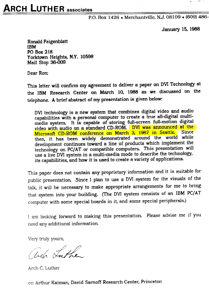