Amethyst Bay and Resort needed an ad campaign to promote tourism to their tropical island resort and spa. My final design showcased cool, inviting colors, and photographs that enhance the beauty of the resort and spa.

One of my first projects while attending SNHU, I had to do a newsletter refresh for an article posted on the Writing Department's website. This concept was my result.
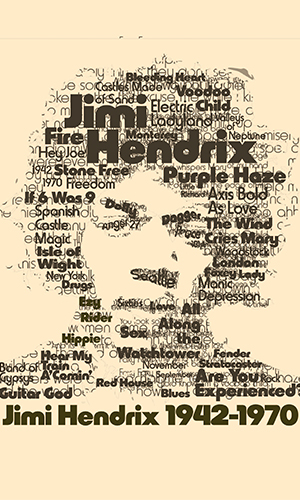
For my final project in my typography course, I had to come up with a portrait made up entirely of typography. I decided upon Jimi Hendrix and used key words that highlighted his career.
Another typography project involving an advertisement for a font. The font of choice was Harry Pro and the concept combines the psychedelic of the 1960s with a modern grid based composition.

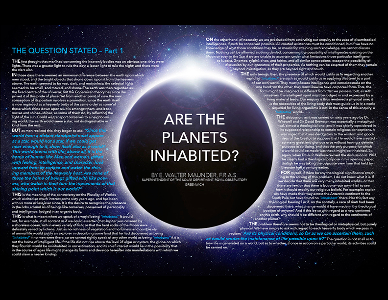
A magazine article about other planets being inhabited was in need of a refresh and thus I came up with the following concept as my solution.
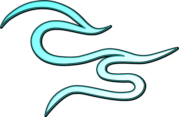
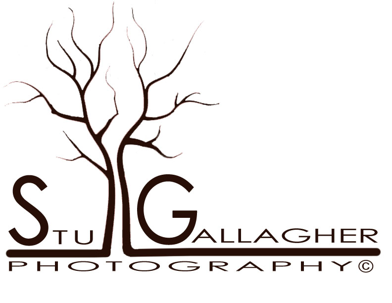
A photography client was in need of a logo for his photography practice. He mainly did nature and rock 'n' roll photographs and thus my logo design was runner-up towards being chosen as the final design.
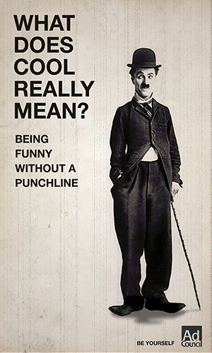
For my final concept development project, I had to come up with an ad campaign for the Ad Council promoting the tagline 'What is Cool?'. Thus I ended up with Charlie Chaplin and the tag 'Being funny without a punchline'.
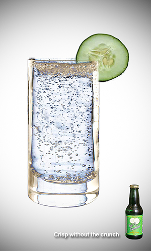
Mr. Q Cumber is a cucumber flavored soda drink that needed an advertisement promotion. My solution involved the tagline 'Crisp without the crunch' and showcased a crisp, cold cucumber beverage with a cucumber slice on the rim.
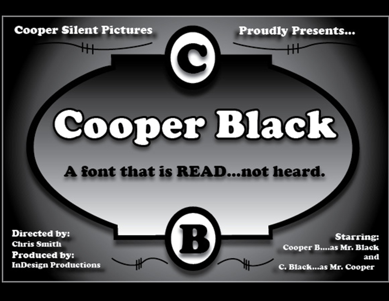
To promote the font Cooper Black, I was inspired to imitate a 1920s style silent film title card that showcased Cooper Black as a font to be 'Read, not heard'.
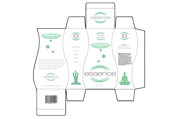
For my final package design project, I had to create a body wash box design for a company called 'Essence'.