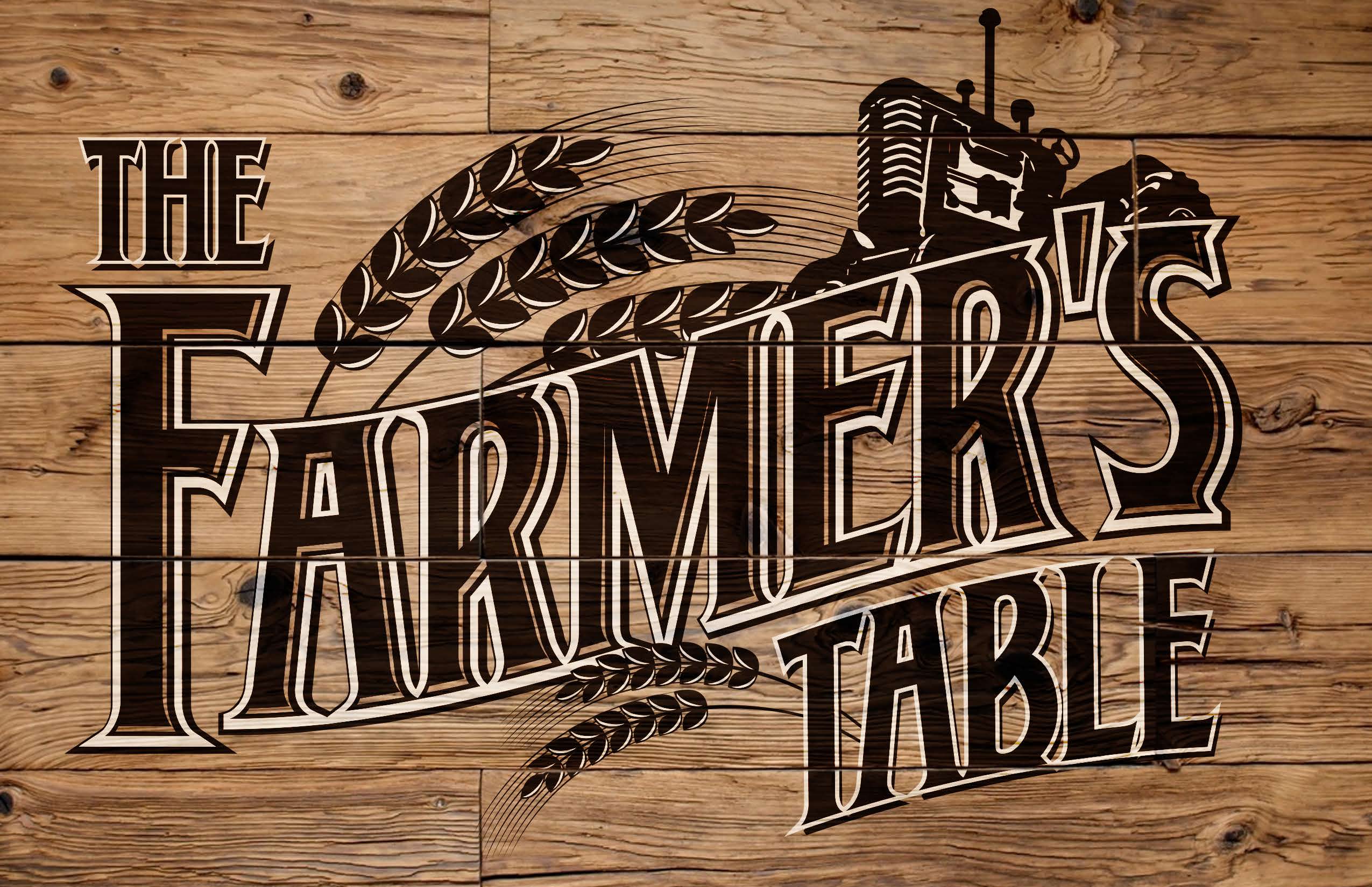
"Our mission is to provide delicious farm-to-table meals while supporting our community. We proudly serve food & beverages made with fresh ingredients from local farms and businesses."
We strive to use the freshest ingredients available while also supporting our community. We've partnered with local farms to supply the fresh ingredients we use to craft our menu items, and with a small coffee company in NY to provide our coffee.
A. Documentation of the Development Process
This website was created to attract hungry customers seeking quality food made with ingredients sourced from local farms. To ensure I met my objectives I figured out a page layout for each content page, and a separate design for the homepage. I gathered images and chose colors for each page that worked around the café’s theme while also being user-friendly. I created the header with the navigation links and added an image in the corner for all but Contact and put that on each page. The next step was to put the content on the page, which for the Our Story page included inserting working links in a list. I created a table for the menu, and then 2 separate menus on the Sweets To-Go page. I created the select list and input text areas for the To-Go Order form after creating the menus. I added the Contact page content in a section, along with links (non-working currently) and a form for subscribing to the mailing list. This “About Us” part is the last piece of content for the website, being put on the Our Story page in its own section.
B. Defense of the Final Product
I made the choice to use a color template with light green, and orange-red, and yellow with a few earthy tones like brown for contrast. I used these colors because I wanted a natural food/farm color scheme due to the café’s mission of using fresh local ingredients. I also used red, orange, and yellow because these are the colors that stimulate the desire to eat.
i. Homepage: This page has a different layout and background than the other pages. I used earthy tones in the background image and logo. These colors are also present in the images. I chose white font for the name of the business so it would stand out. I put the address, hours of operation, and name of the café in bold in the paragraph to help the users find that information faster. The content on the homepage is centered for easy access by users.
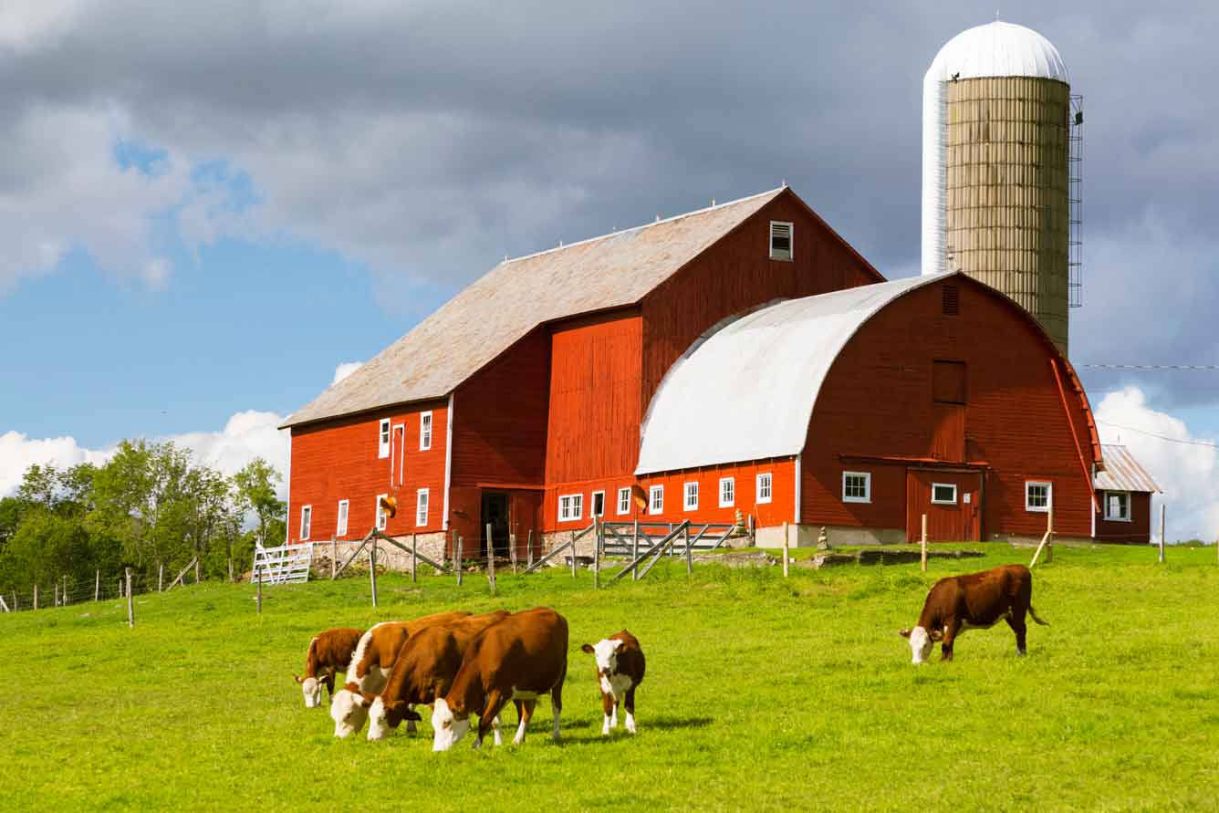
ii. Our Story: This page uses complementary colors: greens, yellow, and orange, as well as some brown, blue, and red in the images. The font is black or white, depending on the background color and font size, to ensure the user can easily read the text. There’s an image in the top right corner (opposite of the logo) to give the user an idea of what’s on this page, in this case it’s a farm because the Our Story page is about the café’s mission to support local farms by using local ingredients. In the list of farms & businesses partnered with the café, the ingredients supplied are italicized to show importance.
iii. Menu: The menu page has the same saturated green background, with a light orange background for the table containing the menu. I used orange for the menu because yellow, orange, and red are colors used to stimulate appetites of users while they are browsing the menu. I used black font on the menu so the users can read the items and prices with ease. There is an image of breakfast opposite the logo at the top of the page, to let the user know that this page is about food.
iv. Sweets To-Go: This page has the same colors for the background, and section background colors, however, the coffee and sweets menu are placed on background images. The coffee menu uses white font to show easily on the brown burlap sack and coffee bean background. The sweets menu uses black font to stand out against the pink “sweets” background. There is a To-Go Order Form on this page to engage users. They can place an order online by choosing items, along with quantity, and flavor (when required), and pick it up at the café.
v. Contact: This page has the same green background, white font for the page title, and yellow-orange background color for the section of text. This page engages users by giving them the information they need to contact and/or find the café, with the option to subscribe to the café’s mailing list which can earn them a free Sweet. There are links to social media (currently not linked to the café’s pages).
C. Opportunities for Improvement and Growth
a. In the future I would like to add a Gallery page for the café to showcase photos taken by both the café owner and the customers. I feel that would be an effective way to show the customers the quality of the café’s food. I would also like to link the location to a location on Google Maps so customers can click to get directions. I’d also like to include links to the café’s Facebook and Instagram pages. I would like to add an improved order form for the Sweets To-Go page in the future. I would also like to understand and fix the footer on the Sweets-To-Go page. If I had more time I would have created a more engaging menu page. I would have also liked to have images of actual farms & farmers that the café supports. I’d like to add a Comment section to the Contact page as well.