Object Palette: In dream
weaver object palette is most important for designing our
WebPages. It contains many functions such inserting table,
inserting images, inserting frame etc. When you open the dream
weaver .It will automatically visible in your screen. If it is not
visible in your screen then you can go to the window in the menu
bar and click on objects or you can press Ctrl+F2 from keyboard.
Properties inspector
or palette
It is like an option bar of other software. It
shows the properties of the work that we are doing at that time.
If we are working on the text, Then it show the properties of the
text like text size, style, color, font, alignment etc. Inserting the images in our WebPages: For inserting the images in our WebPages we have
the separate tool in the object palette. Steps for inserting the images: 1.Position
your cursor where you want to insert the image.
2. Click on the insert image icon from the object palette.
3. In a dialog box choose the required image to insert.
4. Click on ok
5. Then the image will be in your window.
You can also change the size of the image by using the 3
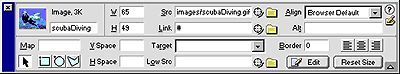
handles around the image. Properties of the image: You can see the current properties of the image in
the properties inspector. Like height width of the image,
Alignment, border, alt name, etc Alt name is the text or group of text
that you give which appear when the cursor is over the image.
Inserting the table
Like in HTML you can insert the table. Here you
can insert the table more easily than in HTML.
Steps for inserting table in our web pages: In the properties inspector you can see the properties of
the current table. Using the properties inspector you can merge
rows or column, give the color for border and cell, you can also
insert the background image for table.
For merging and splitting the cell you have to select
the cells which you want to merge or split
Cell
spacing:
This is the space between the two adjacent cells. You
can give the cell spacing as your wish. You can give the cell
spacing value when you insert table or you can give the value
after you insert the table using the properties inspector.
Cell
padding: This is the area of the cell. You can also give
the value for the cell padding like the cell spacing.
Border: This is the outline of the table. You can set the
border thickness as well as border color.
Rows
and column: You can also set the no of column or rows as you
need before inserting the table or using the properties inspector
after inserting the table.
Splitting and merging the cell: You can split one cell into different cell or
merge the two or more than two cell. There is an icon for merging
and splitting. When you are in the single cell then the splitting
cell icon is active and when you select two or more than two cells
then the merging cell icon is active. You can use these icons to
split and merge the cells.
Background
color for the cell:
You can also give the background color for each and
every cell. And also give the background image to the table.
Horizontal and vertical alignment: When you starting typing the text in the cell then
you see the default setting i.e. horizontally left and vertically
middle. You can set the alignment by using the list from the
inspector properties i.e. Horz and Vert.
Links: There are two types of links. They are active links and
visited links. Active link is the link, which is not yet visited,
and the visited link is the link that is visited ok is clicked.
To link
the file from the image or the text: Select text or an image in the Design view. Click the folder
icon to the right of the link field to browse to and select a
file. Select a location in which to open a document.
(To make the linked document appear somewhere other than in the
current window select an option from the target pop-up menu on the
Properties inspector)
1. _blankloads the linked document in a new
browser window.
2. _parent loads the linked document in the parent
window of the document that contains the link
3. _self loads the linked document in the same
window as the link. This target is the default, so you usually
dont have to specify it.
4. _top loads the linked document in a full browser
window removing all the frames
Layers
in Dream weaver: Layer in dreamweaver is like a textbox of MS
office. We can insert the layer anywhere anytime in the dream
weaver. The main advantage of using layers is that you can drag it
anywhere in the design view. You can also insert image, table
inside the layers Steps for inserting layers:
·Click on the insert layers icon from the
object palette.
·Place the mouse pointer where you want
to insert the layers.
·And then drag into the design view.
(You can see the layer box in the design view.)
·Type anything inside it or insert table
or image.
Properties of layers
:
L
& T (left and top): This specify the position of the
layers top left corner relative to the top left corner of the
page.
W & H (width and height): It specifies the width and
height of the layers.
Vis (visibility): It specifies whether the
layer is initially visible or not. Choose one of the following
options:
Default doesnt specify the visibility properties. When no
visibility is specified, most browser defaults to inherit.
Inherit uses the visibility property of the layers parent.
Visible displays the layer contents, regardless of parents value.
Hidden hides the layer content
Bg Image: It specifies the background image for the
layer. Click at the fonder icon to browse and select a desired
file.
Bg Color:this is used to fill
the layer with different color. You can choose the color from the
properties inspector.
Overflow: It controls how the layer appears in the
browser. Visible shows all the content of the layer. Hide only
shows the content of the layer that we have defined. Scroll
specifies that the browser display the scroll bars to right and
bottom. Auto also specifies scroll but it only displays when it
need.
To
insert the predefined frameset: Predefined framesets makes it easy for you to
select the type of frameset you want create. The predefined
frameset icons in the frameset icon in the frames category of the
object panel provided a visual representation of each frameset as
applied to a selected document.
To insert the frameset
Place the cursor in the design view.
Open the frame category from the object panel.
Click on any one of the frame set as your requirement.
Saving
the frameset: To save the frame you can go to the file menu and choose save
frameset.
You can also save a particular frames by choosing the save all
frames.
Properties of the fames
To show the properties: Select window menu
Chose frames from the list.
Click on the particular frame to view its properties.
(Note you have to save the entire frames particularly to view in
the browser.)
Scroll: Click on the frame from the frames panel
and in the properties inspector you can choose the scroll as yes
for the scroll bar display, no for not displaying the scrollbars,
auto for the scrollbar display whenever it is needed, and default
for default setting.
Borders: If you want the borders to be displayed
then choose yes from the border list and if you dont want the
border then choose no from the border list in the properties
inspector.
Links in the frames: You can give the link in the desired
frames. You have the name to the particulars frames. You can give
the link to only one frame keeping the remaining frame as it is.
Select the text in one frame
Click on the folder icon of the link
from the properties inspector and choose the file to which you
want to give the link.
Give the target as _self : for displaying linked file in the same
frame. Name of the frame: for displaying the linked file
in the particular frame.
Rollover image: A rollover is an image that changes when the
pointer moves across it. Image in a rollover should be the same
size.
To create a rollover:
In a design view place the cursor
where you want the rollover to appear.
In an object, click on the insert
rollover image icon. The insert rollover image dialog box
appears.
In the Image Name field, type the
name for rollover image.
In the Original Image field, click
on browse and choose the image.
In the Rollover Image field, click
on Browse and select the image to be displayed when the pointer
rolls over the original image.
In the When Clicked Go to URL field,
click Browse and select the file you want to open when user
click the rollover image.
Click Ok.
Forms: Forms are the important part of the web page
designing. We can see many sites that contain the form. Forms are
inserted in websites for different purpose. For example:
registration form, admission form etc. In Dreamweaver we can
design our own form. For this we have different tools in the
object panels form category.
The different tools are as follows
Insert form:If we are designing the separate
page for form then we can insert the form: Text field: It is used to create a single line information
(like name, address), multiple line information (like comments),
and password. In an object you can choose either of these three. Check box:Checkboxes allow the user to select more than one option from a
set of options. Radio button: Use radio buttons when the user
must select only one choice from a set of options. File field: Use this field to make the user
find the file from their hard disk. That means inserting Browse
button. List or menu: Use this to insert the
menu or list of menu. This is mainly used in many sites to
inserting the date of birth or selecting the county etc. In the
properties inspector you can click on the list value button to
insert the menu. Using the list radio button you can use the no
list and in the menu you can insert the list of text. Button: you can use this for inserting the
button like reset or submit button. You can also give the label to
the button from the label field.
Inserting the flash button You can make your site more attractive by
inserting the flash button. Click on the insert flash button icon
from the object palette. Choose the button style from the list of
different button. Type the text for the button; choose the font
size, bgcolor, and font style. You can give the link for the
button.
Note: You have to save the file first to insert the
flash button. When you insert the button then the button is
automatically save in your folder where you saved the file.
Inserting the flash text: This is also used to make your site attractive.
You have to save your file first to insert the flash text. Click
on the insert flash text icon from the object palette. In the
dialog box you can choose the color of the text and the rollover
color of the text. Give the font size, style, bgcolor and name for
the flash text. You can also give the link for the flash text.
Email
links: You can also give the Email links. That means when
the user click on the particular text then the browser will
automatically connect to the Outlook Express. For this click on
the Email link icon from the object palette. In the dialog box
give the text name (like email me or my email address etc.) and
the your email address.
Inserting date: You can insert the date by clicking on the insert
date icon from the object palette. Chose the date format, day
format and time format. Click on Ok.

 DREAMWEAVER

 :
: