

Standard Bank of South Africa
antelope / copyright
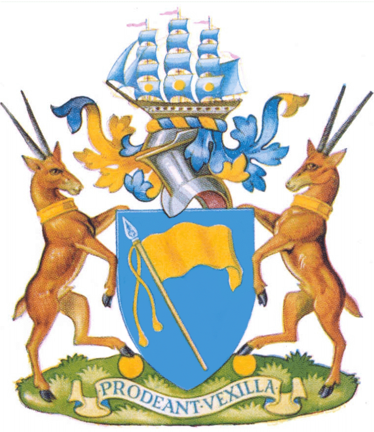
The arms were granted by the College of Arms by Letters Patent issued on 30 March 1955. This grant was recognised by the South African Heraldry Council in 1963 (Government notice No 1653 of 25 October 1963). The official blazon reads:
Arms: Azure, flying from a staff proper in bend a standard with
cords and tassels Or.
Crest: On a wreath of the colours a three-masted sailing ship of the nineteenth century in full sail proper, the sails Azure, the foresail, mainsail and mizzen sail each charged with a bezant; pennants flying to the dexter, Gules.
Supporters: On each side an antelope proper collared Or, resting the interior hindleg upon a bezant.
Motto: PRODEANT VEXILLA.
About the arms:
An official explanation of the arms states:
“The Standard Bank’s coat-of-arms is designed to speak primarily of Africa. The standard represents the name of the Bank and the blue background shows the blue skies of Africa.
“The ship with Golden Bezants refers to our banking for trade and commerce with an allusion to our birthplace, Port Elizabeth, which incorporates such a ship in its Arms.
“The supporters are heraldic antelopes, an animal common to all parts of Africa, with Golden Bezants for banking.
“The motto is adapted from a famous Latin hymn and may be interpreted ‘Let the Standards go forward.’ ”
The most striking aspect of the arms is the single charge on the shield, blazoned here as a standard but in fact, in the normal usage of heraldry called a banner. This clearly alludes to the bank’s name.
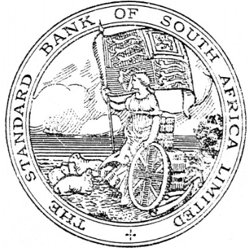
The terms banner and standard are easily confused because of the popular name for the banner of the British sovereign, the Royal Standard. In fact, this plain banner with its single colour, gold, is a replacement for the Royal Standard which formed part of the bank’s seal.
The seal, typical of 19th-century British and colonial devices, both official and commercial, was in use from the 1870s to about 1952. It appeared on printed and engraved bank forms, including cheques and banknotes.
In addition the bank at times used the intertwined initials SB or SBSAL, but not in any regular format. In the early years of Union, bank documents also frequently bore the words “The Standard Bank of South Africa Ltd” in what is described as scroll writing (probably copperplate script).
The seal is a landscape depicting a virginal figure holding a shield of the Union Jack[1] and a staff bearing the Royal Standard, standing or resting on a sandy shore against bales of wool and accompanied by three sheep. A ship in the roadstead symbolises overseas trade, while further symbols are to be found in the elephants’ tusks lying beneath the bales, and the anchor alongside them, which symbolises the Cape of Good Hope.
Wool and ivory were major exports from the Cape Colony – especially the Eastern Province – in the period when the bank was established.
The ship survives the transition by being incorporated into the crest, where it is almost identical with the ship crest used by the City of Port Elizabeth.
In the main illustration the pennants (blazoned as “flags flying”) on the mastheads appear mauve, but in the enamelled version shown at left they are definitely red, as indicated in the blazon and as they also appear in the city’s crest. This enamelled version was displayed prominently in bank branches in the 1960s and ’70s.
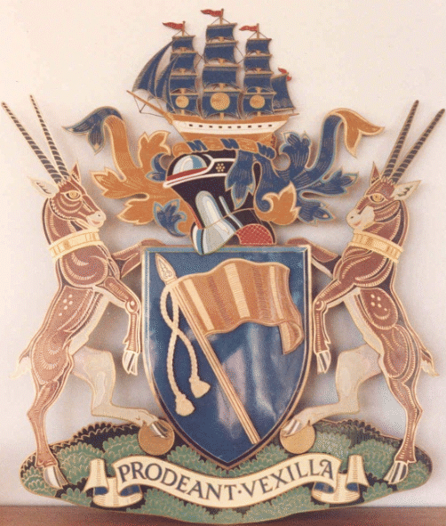
The bank’s crest differs from the city’s in the colour of its sails, blue (taken from the field of the shield), and in the addition of the three bezants, or gold roundels, on the principal sails.
The bezant takes its name from a gold coin minted in Constantinople during the period of the (Eastern) Roman Empire. Neither the name Byzantium nor the adjective Byzantine was ordinarily used of the city or the empire while it still lasted[2] – the empire came to an end in 1453 when the Ottoman Turks seized the city and made it their capital, naming it Istanbul. However the name appears to have been used in poetry and rhetoric.
The coins – well known among the Crusaders, among whom heraldry first became widespread in Western Europe – recalled in their name the town of Byzantium, which the Emperor Constantine I (or Constantine the Great) used as the site of his new city, Constantinople – the rebuilt city was formally dedicated in AD 330 as the capital of the Empire.
The gold collars on the antelope have a similar symbolism, in that they restrain the natural energy of the wild animals into the service of commerce.
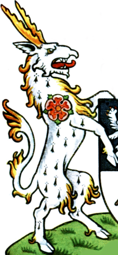
The use of the term antelope in both the blazon and the official explanation is an anomaly, for the heraldic antelope is an entirely different beast; a fantastical creature described in mediæval bestiaries and adopted by the heralds by reason of its strange appearance and the characteristics ascribed to it by the learned men of the time. It resembles a heraldic tygre (another such mythical beast) but additionally has cloven hoofs and on the head a pair of short, straight horns with serrated backs.
The tygre,[3] in turn, is described as having the tail, body and limbs of a lion, the maned neck of a horse, and the head of a wolf, but the upper jaw develops into a frontal horn. It is described as a vain creature, and in some coats of arms appears with a characteristic mirror, in which it stares at its own image.
The two buck, or natural African antelope, which do in fact appear as supporters are clearly male animals (as shown in the main illustration). However, in the enamelled version of the arms, a process of bowdlerisation has rendered them of neuter gender.
In their horns they most closely resemble the gemsbok,[4] or Oryx gazella, but there are anomalies in both the colouring and the shape of the tail.
The gemsbok has white (or near-white) underparts and black (or very dark brown) markings both down the back and separating the sandy brown or grey of the flanks from the white underneath. It also has characteristic black (dark brown) and white facial markings, which are absent here. These buck do appear to have dark markings down the back and a hint of pale bellies, both of which are more pronounced in the enamelled version of the arms.
The gemsbok also has a long, relatively thin, dark tail ending in a substantial sweep, but these buck have short, stubby, fat tails.
It would seem that the heralds in London were too lazy to research African antelope properly and simply concocted a homogeneous variety.
The enamelled version of the arms, executed on a brass background, was widely distributed among bank branches during the years in which the bank made use of its coat of arms, and could be seen prominently displayed at the major branches.
Regarding the motto, it is surprising to see the wording actually reflected in the blazon, since (unless a motto appears within a shield, for instance on the pages of a book) it is usual for the College of Arms to illustrate one on a grant but not to mention the wording in the blazon at all. It seems likely that the blazon quoted above comes rather from the Government notice of 1963, instead of the deed of grant from 1955.
Use of the arms:
The bank first used the arms on its annual report for the year ended 31 March 1957, and began using them on engraved forms from around August 1958.
In the early 1960s it began using a flag, ties and badges bearing the arms. It would seem that such flags, ties and badges displayed the full heraldic achievement.
It is especially unfortunate that the full achievement appeared on a flag, since the ideal flag for the bank’s use would have been plain blue with only the banner emblem (the so-called standard) – in short, a heraldic banner of the arms.
In October/November 1965 the bank introduced a blazer badge comprising the shield only, which for some reason it chose to call a furling emblem.
The use of this term is obscure, since the verbs unfurl and furl refer to a sail lashed to the boom or yard-arm, and the work of bringing it into or out of action.
This so-called furling emblem marks a high point in the bank’s heraldic usage, since using a shield (and only a shield) as a pocket badge on a blazer is perhaps the most appropriate usage of a corporate coat of arms for officials or members of that corporate.
This badge would have been particularly impressive, since it was worked in gold yarn and royal blue, with gilt wire for the flagpole. However, the use of two rows of gilt wire to outline the shield introduced, quite unnecessarily, an additional colour element in the shield.
During the 1950s and ’60s the Standard was one of two South African banks which bore coats of arms and displayed them prominently, the other being Barclays Bank DCO. For an example of this bank’s arms, see this page.
Disappearance of the arms:
In February 1967 a simplified version of the arms, in shield-only format (still described as a furling emblem) was adopted, together with new slogans, and referred to the bank’s attorneys for registration.
The device chosen was heraldically wrong, in that it used the colours blue and white, instead of blue and yellow.
In June that year a decision was taken not to register the new emblem, on the grounds that in time it would acquire recognition and was not likely to be copied by anyone else.
It was additionally protected under copyright – an unwelcome and unwarranted intrusion of commercial law into the field of heraldry, which has a proud legal tradition protecting owners’ rights that goes back to the Middle Ages.
The new “furling emblem” or “furling logo” was introduced in the form of brass plates at bank branches from February 1968.
When this writer initially made inquiries concerning the bank’s arms, a public relations officer stated simply and dismissively that the bank did not possess a coat of arms. It seems that an entire generation of bank officials has served in ignorance of this fine armorial device.
About the bank:
In 1963 the Oxford University Press published a history, The First Hundred Years of the Standard Bank, written by J A Henry, edited by H A Siepmann and with an Afrikaans translation by G A Watermeyer.
This was the second history of the bank. The first, History of the Standard Bank of South Africa Ltd 1862-1913, by George Thomas Amphlett, was published in Glasgow in 1914.
The introduction to First Hundred Years reads:[5]
“The Standard Bank is the oldest bank in Africa south of the Sahara. It has now been operating in South Africa for a hundred years; seventy-two years in Rhodesia and Nyasaland;[6] fifty-two years in East Africa.[7]
“In all these territories the Bank has played a significant role throughout the period of their economic development; and in this period Africa has come through the developmental phase which in Western Europe took a thousand years or more.
“The Standard Bank is the only bank in Africa which has observed and promoted this development from beginning to end.
“Its history began before the time of the first mail coach in the south, when the native runner with his cleft stick and carrying burdens on his head[8] provided the only known form of communication and transport over an extensive region.
“War and bloodshed, initially between tribes and later on the international front, have left their trails on the road of economic progress, but nonetheless not hindered it disastrously. Local troubles and jealousies hindered growth towards unity and a common understanding.
“But the Standard Bank, although it was inevitably drawn into such difference, at all times held itself back from active involvement, so that it could instead focus with greater efficiency on the promotion of material advancement.”
The opening chapter indicates that the bank’s formal founding took place in Port Elizabeth in 1862, but that its history could be traced to a meeting in that town on 3 June 1857. It first traded as The Standard Bank of Port Elizabeth.
The bank’s own website can be found here.
