Welcome to my portfolio |
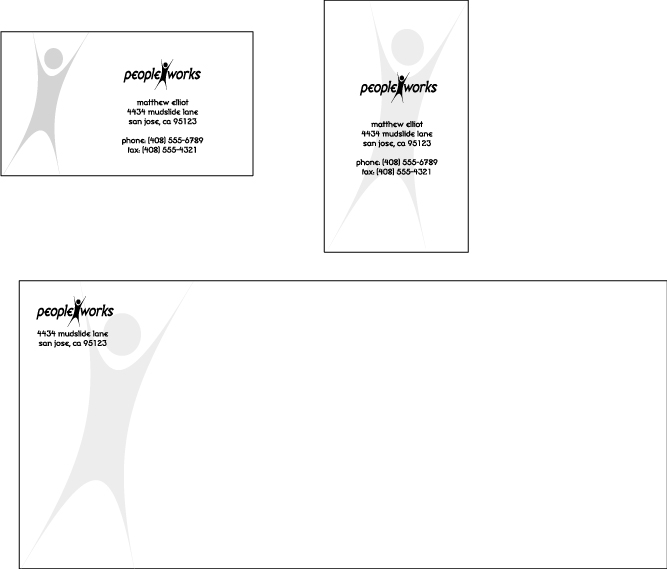
| Peopleworks: This was one of my earliest works in logo design. The company itself is fictitious, and the work was done in class, but the process gives you an idea of what I go through to produce a logo. Midway through, my teacher acted as a client and chose the preferred design, and I carried it from there to completion. |
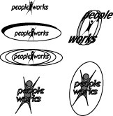 |
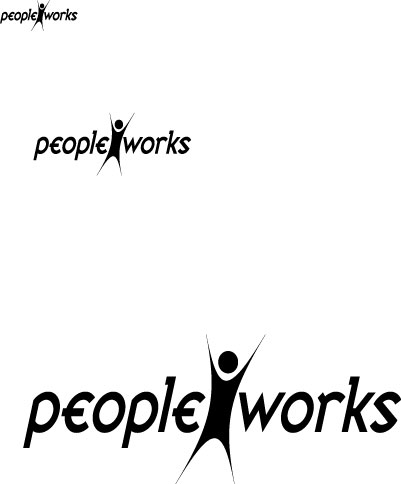
These were the variants I started with. Already, I've narrowed my idea to having a sihlouette of someone cheering. The idea was that Peopleworks is a temp hiring service, and so the company wanted something to reflect that it revolves around people. |
 |
This was one of two ideas that I decided to try and make into a regular logo. You'll notice when you click the link that I shrink and enlarge the logo. This is important, since this identity will be put on everything from newspaper advertisements to business cards to the signs of their businesses. |
 |
Ultimately, it was the second logo design that my teacher (playing the client) chose. In hindsight, I have to agree. This one shrinks and enlarges better than the previous one, and the little man stands out better as well. |
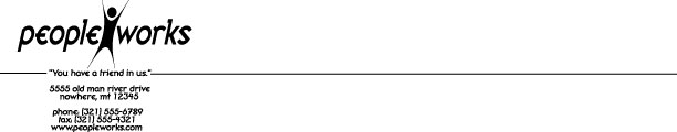
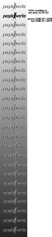
| Letterhead: Below, I started to experiment with potential letterheads for the imaginary company. I went through a number of ideas before narrowing it down to a single choice. |
 |
 |
 |
 |
 |
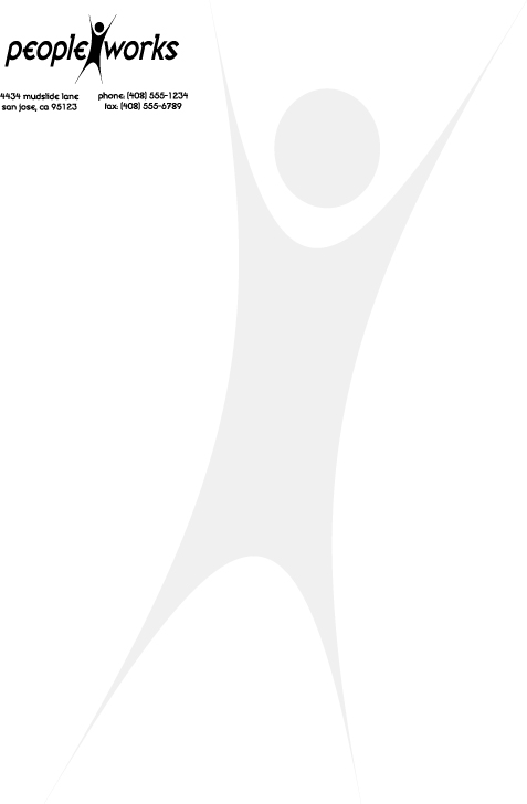
This was the final choice made, not only for the letterhead, but for the envelope and business card as well. |
| Other logos: A lot of work and practice revolves around logos. That simple picture helps to represent an identity, and makes the first impression that sticks with people, so I take this work very seriously. |
 |
A friend of mine is starting in the real estate business, and she asked for a logo that included her Chinese astrological sign: The monkey. I made four logos for her approval. |
 |
This logo was practice, and it was for a fictitious music newsletter called "Louder Than God". |
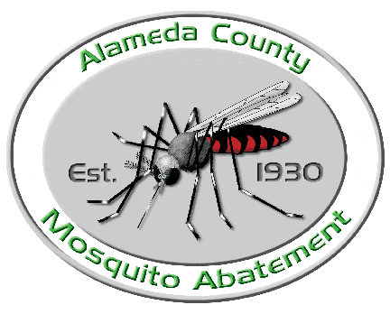
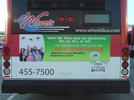
| ACMAD: ACMAD stands for Alameda County Mosquito Abatement District, which is responsible for keeping the mosquito population down (a really daunting task, given all the marshland in the county). I started out by working on their website. This continued into creating or modifying written materials, remaking their logo, and even creating a bus poster back in 2004, when West Nile was a big scare. |
 |
I was requested to update the ACMAD logo so that it was less two dimensional. I started with a scientific drawing, and worked to simplify. This was the finished result, which is used today. |
 |
Designing a poster for the county of Alameda was a challenge. What ended up being the poster of choice was a team effort between myself and my boss. We both wanted this to succeed. The result was the fourth iteration, which passed muster with ACMAD's board of trustees. |
| Other work: While I do quite a bit of logo work, I don't do logo work exclusively. Part of being a graphic designer is having a broad base. |
 |
 |
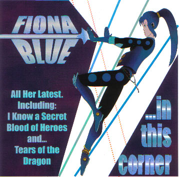
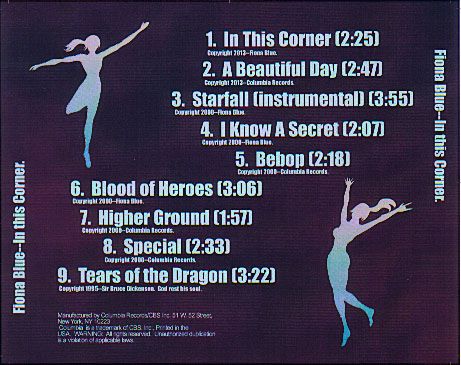
This practice assignment was done with the idea of creating a CD cover, and I came up with the idea of Fiona Blue, an anime J-pop star. I like the back with the sihlouettes than I do the front. |
 |
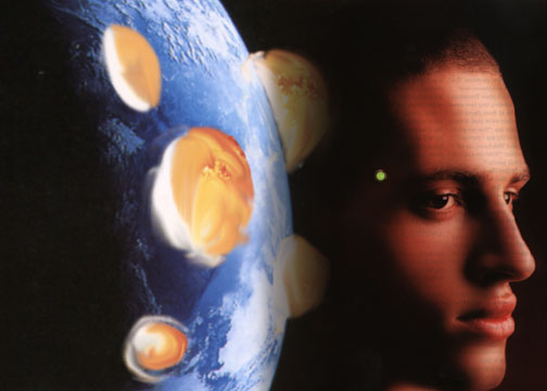
A photo montage, combining two or more photographs, is a common practice in advertising. It's found mainly in magazine spreads and movie posters. This photo montage was created using three photos. Note the explosions; they were created using a photo of fire. |