
As I mentioned, she wanted a monkey in the design, which I was glad to comply with.
|
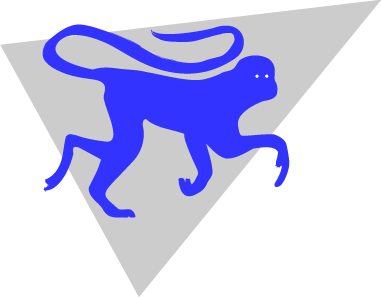
The first thing I designed was the monkey itself. Knowing that the logo had to be simple, I went for a sihlouette. She loved the monkey, but now I had to design the rest of the logo, as the monkey couldn't stand alone. This was the first go, using a geometric shapeto make things stand out a bit. |
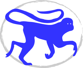
| For the second design, I thought that circling the monkey might be a way to go. Part of designing something new is experimentation, and simply going for it to see what happens. I didn't like this one as much as I thought I was going to, but I included it in the logo concepts I presented my client, since perceptions can vary from person to person. She could like the design, after all. | |
|
This one I had a good feeling about. It juxtaposed my client's initials with the monkey sihlouette, giving a combination of playfulness and sophistication. Both these qualities, in my opinion, reflect well on her. As it turned out, this was the logo that won out above the other two. |