
 |
 |
 |
 |
 |
 |
 |
 |
 |
The Electric Page Layout
The publication medium for the Web page developer is each individual user's monitor or screen. These may vary not only in physical size, but in resolution and also in their ability to accurately reproduce colour.
The resolution of a screen signifies the number of dots or pixels on the
entire surface of the screen that can be individually addressed by the
video graphics system of the computer. For example, a 640 x 480 pixel
screen is capable of displaying 640 distinct dots on each of 480 lines,
or 307,200 individual pixels. For the popular screen sizes of 14, 15,
17 and 19-inch, this translates into a different dots per inch (dpi) measurement
depending on the size of the screen. For example, a 15-inch VGA monitor
(640x480) displays about 50 dots per inch.
This means that higher screen resolutions (800 x 600 or 1024 x 768) used
on the same size screen, will display identical information in a smaller
physical area. For example, consider the three images in Figure 1. I have
altered the size of the images to represent the relative difference between
the three screen resolutions.
 |
 |
 |
| 640 x 480 | 800 x 600 | 1024 x 768 |
| Figure 1 ~ Relative image for each resolution | ||
This provides a graphic demonstration of the problems associated with screen resolution. Even though the three commonly used settings (640 x 480, 800 x 600 & 1024 x 768) retain the same aspect ratio (640 / 480 = 1.33), because the image is a constant size, it appears smaller as the resolution increases. The relative sizes of the screen at each of the three resolutions is shown in Figure 2.
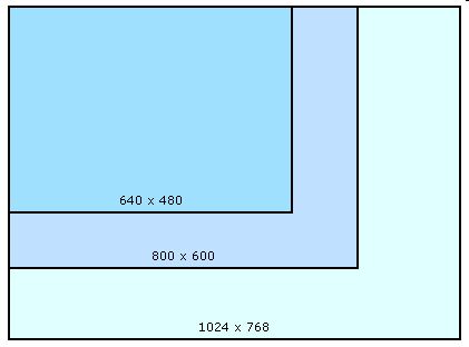 |
| Figure 2 ~ Relative screen area for each resolution (to scale) |
The Viewpoint:
Each browser uses some
of the available screen area for the title, menu, tool and status bars,
usually at the top and bottom of the screen on a PC and on the side of
the screen a Macintosh. Consequently, the browser window, which is the
developers' actual publication space, is considerably smaller than the
available screen. The term "viewport", although not universally
adopted by Web designers, is often used to describe the "safe"
viewing area.
If you compare Figure 2 and Figure 3, both of which are drawn to the same
scale, you can quickly appreciate the problem facing the Web designer.
There is an enormous difference in the available screen area between the
highest and lowest resolutions.
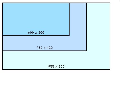 |
| Figure 3 ~ Relative viewpoint for each resolution |
A page designed to fill the viewport at 640 x 480 will only occupy only 30% of the available viewing area at 1024 x 768, and conversely, only 30% of a page designed to fit a 1024 X 768 screen will be visible at the lower resolution.
It is impossible to design a page that will be equally effective at all
three resolutions. The 640 x 480 resolution was very popular on 14 inch
screens, but these are slowly disappearing in favour of 15 and 17 inch
screens. The most popular resolution for these sizes is 800 x 600 and
most designers take a pragmatic approach and optimise their design for
the safe viewing area of 760 x 420.
This does not mean that the other resolutions can be ignored. On the contrary,
every effort should be made to make your design as portable as possible
from one resolution to another. However, the reality is that no design
will be equally effective at every resolution and screen size.