|
|||||||||||||||||||||||
|
The Environmental Nature Center
public awareness and supplementary scholastic information website, 1997-1998 My friend Bo Glover, administrator of the Environmental Nature Center, wanted a website. We'd published a magazine together, and I'd designed several marketing tools for him, so this seemed to be a good idea. The ENC is an outdoor education facility, with representations of 14 native California plant communities. Schoolchildren take fieldtrips there to study flora, attend sessions on indigenous peoples, and learn the science section appropriate to their grade level. The scope of the project was enormous, and although content is typically the client's responsibility, I ended up coordinating the lion's share of both text research and image collection. This gave me a level of artistic control that I thoroughly enjoyed and will likely never see again in a project of this magnitude.
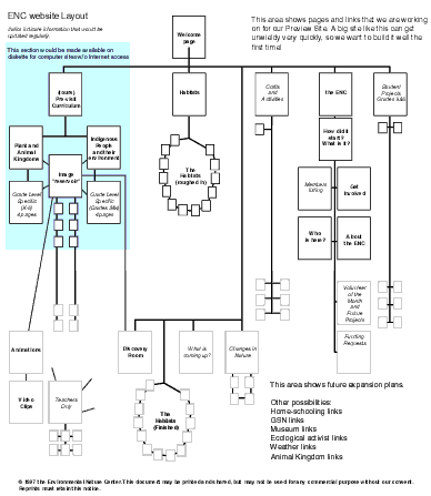
Cross-purpose Criteria
Each stated function of the site earned its own spot on the opening page. Each category then broke down into ever-more distinct pages. Bo did a fine job supplying information for the fundraising and outreach portions. For the educational section, 14 habitats needed to be coordinated, indexed, and linked to regional websites. We broke the task into three distinct blocks: an immediate first phase, consisting of the plant sections and the fundraising section, a second phase addressing individual school's program requirements and a third phase of on-going maintenance and public awareness
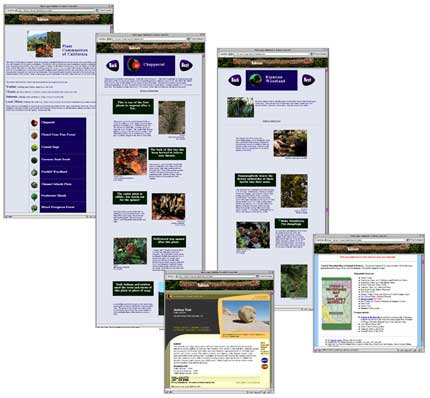
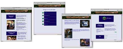
I chose an outdoors theme for the graphics and the colors. I used a very dark green, a light green, a light blue, and a dark blue. The main navigation bar was built out of a twig which I scanned. Navigation buttons and page identifiers were built large to be large, attractive and able to uniquely identify each of 14 habitats, while maintaining some sort of common theme. I created these shaded, rimmed buttons, and designed a few sets to use throughout the site. I downsampled everything to make the image files as small as possible. Although the entire site would use the same set of colors, the facility background section used them with the dark green as the background color, while the educational section used the light blue. Bold, friendly header type kept the theme friendly and "outdoorsy" without resorting to trite chalkboard or wooden-log lettering.
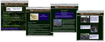
The welcome page lead straight off with what the ENC did, where they were, who to contact, and had about a dozen links to current, pertinent information. Clicking on the navigation twig led to the other sections.
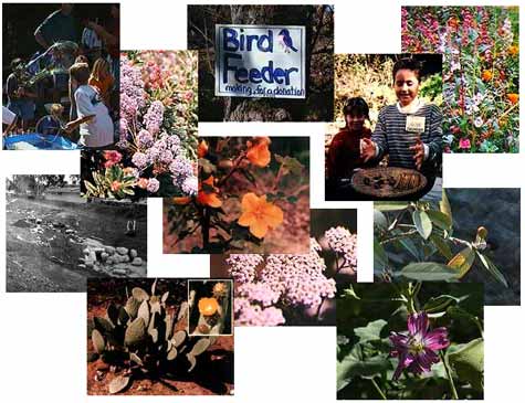
The most comprehensive coordination of information for a website that I have ever undertaken, the plant community education section contained hundreds of images, a few animations, and "further interest" links which took visitors to resources to find out more about that particular habitat, or where to find it in their area. The entire section was reviewed by area educators and for weeks went through many iterations before being approved.
The remaining pages showcased student projects, described tours offered by the ENC, and demonstrated a few crafts. I created all the imagery and instruction for these, as well. If an educator spent time with students reviewing any of the information contained on the site, they were prepared to have an excellent visit to the actual facility. |
|||||||||||||||||||||||
Site of Bob |
|||||||||||||||||||||||
|
|
|||||||||||||||||||||||
ProfessionalCorporate ID PlayTheories |
|||||||||||||||||||||||
|
|
|||||||||||||||||||||||