Logo glyphs and Signatures
The Unknown Artist Production House
Criteria:
The original name, "The Unknown Artist," needed to be changed to reflect the higher level of services being offered and to grow the company beyond a "Mom and Pop Shop" perception. A sharp, professional image would match the new goals of the company to provide incredible graphics at fair prices with excellent service. Stability and calmness had to be balanced against a "we'll get it done yesterday" theme.
Solution:
Change the name only slightly and develop a sculptural logo glyph. Set the type for the name flush left, to suggest that boundaries are being pushed.
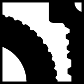
Gigoscan
Criteria:
Gigoscan offered image digitizing of any bitmap file into vector art. Difficult to print raster images became beautifully scalable printer-friendly documents. Although a difficult sell to people outside the printing or graphics industry, targeted clients were already familiar with the need, so the logo could be esoteric. Gigoscan solved many an art crisis at the last moment.
Solution:
Show jaggies being smoothed, and use a large x-height font to create an air of friendly helpfulness. Also incorporate a "light at the end of the tunnel" sense.

Action Displays
Criteria:
Entrant into the tradeshow display manufacturer/reseller needed to look established. Logo was actually designed for the name "American Displays" which a later title search later proved had been taken. Desire was for something instantly memorable, using the letters A D and the colors of the American Flag.
Solution:
Change the letter shapes to include suggestions of the American Flag. My personal favorite of all the logos I've designed. I still look at it and ask, "How'd I do that?" Positive/negative areas are well balanced, a fair amount of dynamic tension is created, and it's also soothing and solid.

Costa Mesa Tire and Rentals
Criteria:
A prominent auto dealer desired to expand into the car rental business, simultaneously folding some aspects of the service department into the new venture. How to combine these two very different enterprises into a single entity?
Solution:
This elegant positive/negative glyph resulted from many conceptual iterations. It blatantly avoids directly linking the two endeavors, seeking to relate them only in proximity.
Sport Write! Coaching Tools
Criteria:
To develop a folksy signature that communicates how to use the product, a dry-erase board printed with a representation of several different sports' playing fields
Solution:
Slightly modifying the typeface Tekton and converting the exclamation point into a marker creates a logo which is clean but appears hand lettered and full of action.

|
