|
|||||||||
|
Graphics for pop-up booths
RSI
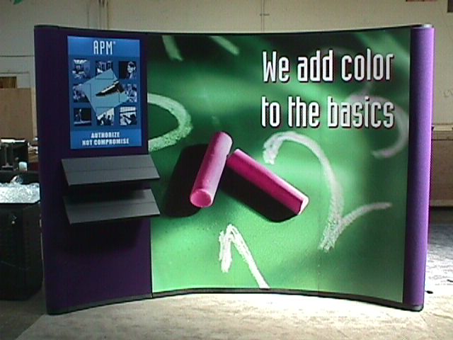
The client brought a strong concept and base image to me, making my job as Art Director very simple for this particular booth. She had found the chalkboard image, and liked it, so my task was to help define the message, and then support that through both the large center piece she had found, as well as the product panel (in blue monochrome) and collateral materials. We had to do the usual file manipulation to adjust proportion, rotation, actual colors, and so on, but the finished booth, though small, is very striking. The "color" they add is to the basic task of authorizing users' access to data. The product establishes tiers of accessibility, so the metaphor of "grade levels" was well understood by the particular industry.
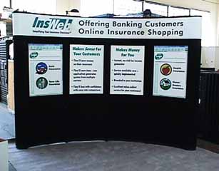
Insweb
Plain vanilla is sometimes the only choice that time, budget, or client conception allows, but it's nice to know that these sort of projects can be accomplished within those constraints, and contribute to the client's success at meeting their tradeshow objectives. I was responsible for account management, content generation, messaging, layout, and project management for this display, and the client went off and had a great set of shows. |
|||||||||
Site of Bob |
|||||||||
|
|
|||||||||
ProfessionalCorporate ID PlayTheories |
|||||||||
|
|
|||||||||