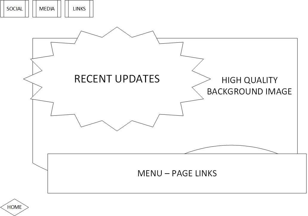
Homepage Layout 1)
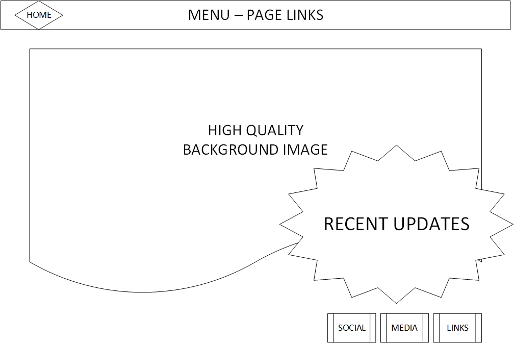
Good top-left -> bottom-right flow
Homepage Layout 2)
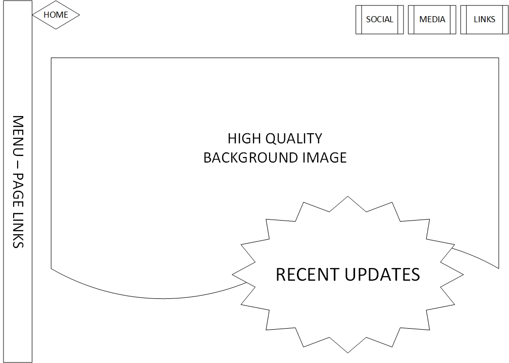
I'm unsure about this left menu bar...
Good top-left -> bottom-right flow
I'm unsure about this left menu bar...
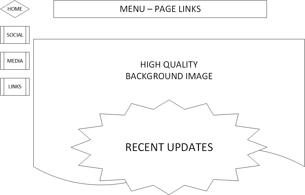
Nice symmetry, but is it a bit boring...?
Better top-left -> bottom-right flow

1) Button / Icon changes under mouse hover
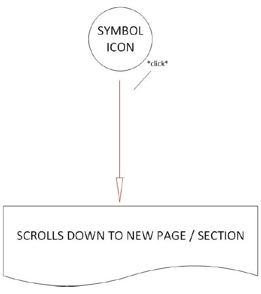
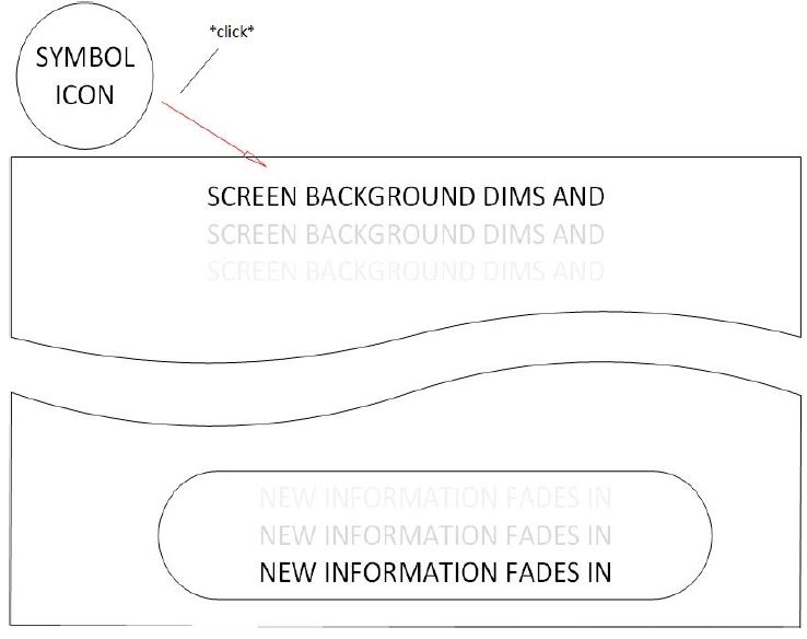
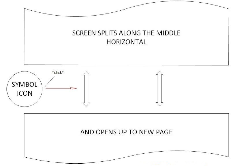
2) Click causes auto-scroll down to new page section
3) Thin vertical line is shown upper center to signify breadcrumb trail
(Eg. ifly50.com/)
(Eg. moxhe.com.au/)
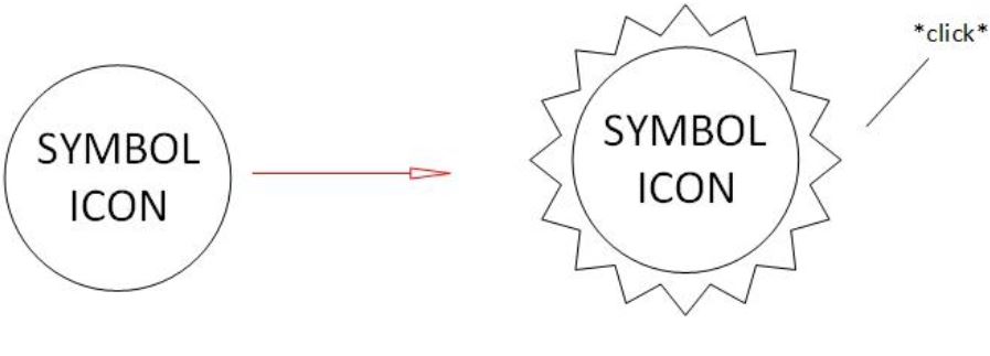
When a button or icon is under mouse hover, it changes to a brighter colour with a glowing border, showing the user that it may be clicked.
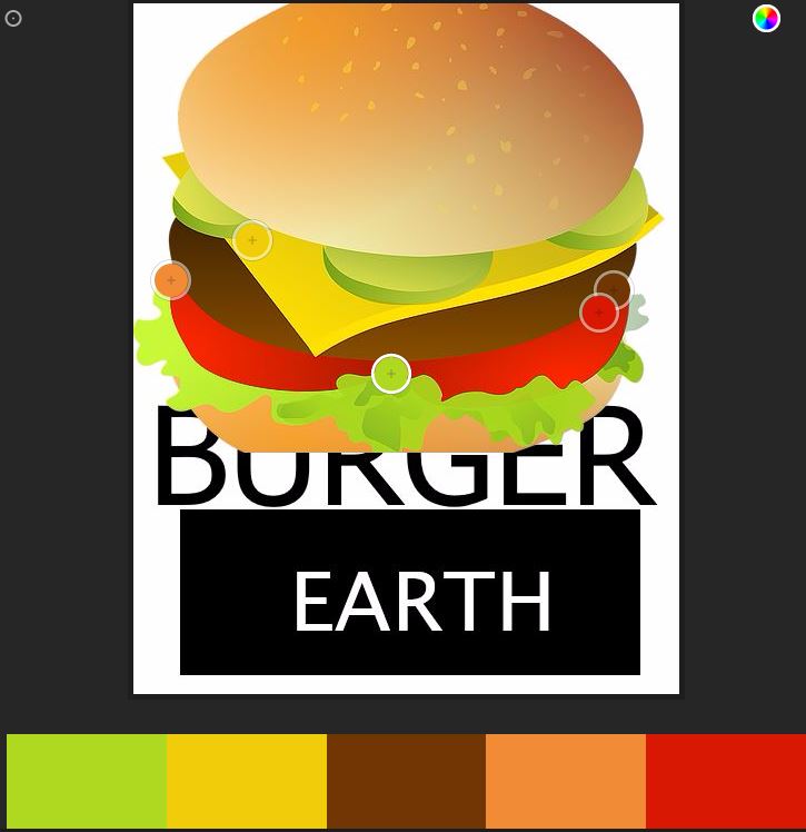
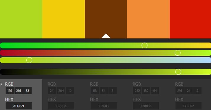
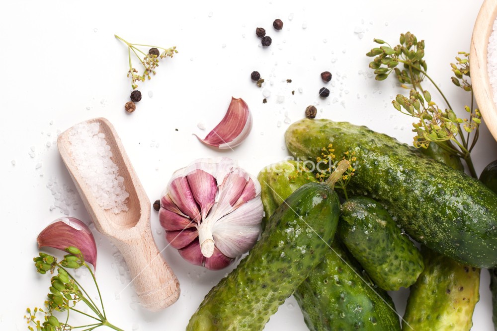
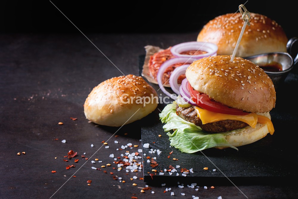
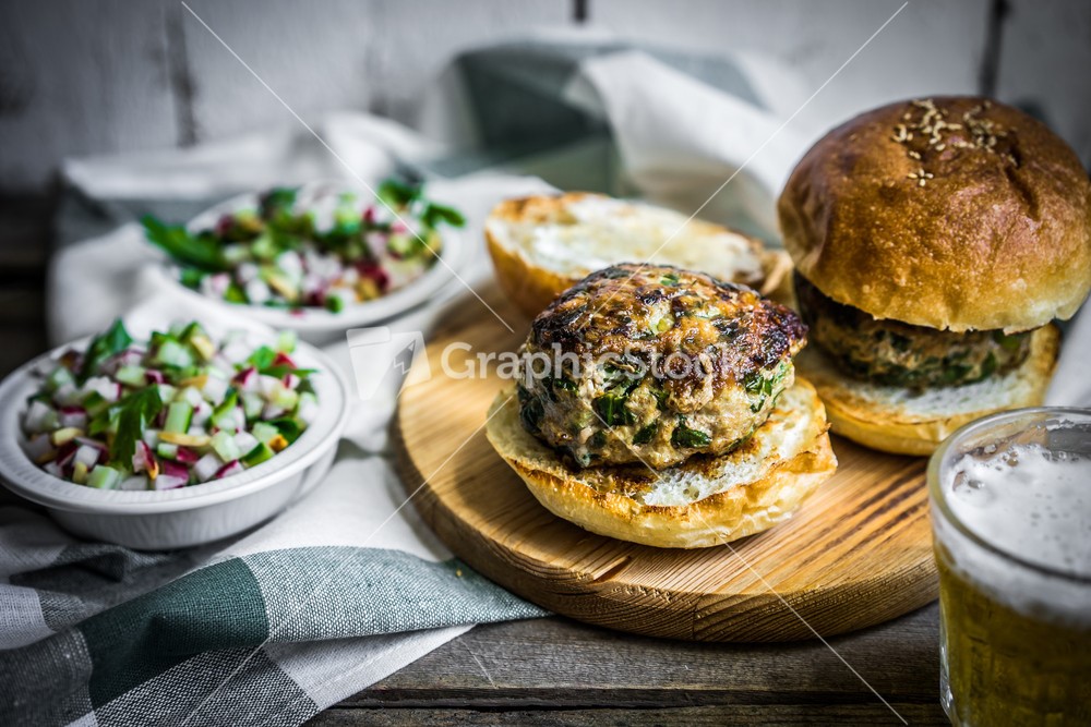
Using the online ‘Adobe Color CC’ tool (https://color.adobe.com/create/image/) I based the colour scheme on my BurgerEarth logo.
Of the various colour-sets, I prefer the original ‘colourful’ selection on white (or near-white) background, but will reserve judgement until having experimented with actual photographs for background images, as they will take up most of the visual space of the webpage.