*Vinyl Spin*
with the best customer service and quality vinyl the planet Earth has to offer. We are armed with a knowledgeable
staff that can help you get the most of your record buying experience. Whether it be hits or extreme rarities we are
here to help you find exacty what you are looking. Not only do we supply the greatest of sounds, we also put on local
events such as concerts, street sales, instore appearances, and much more. So stop in today and see just why we are the
best there is and why you shouldn't be shopping anywhere else.
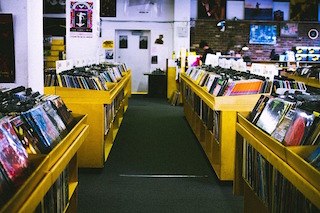
A) The intent and purpose of designing this website was to create a ficticious record store. I wanted the customer to be able to access the website and have a simple and streamlined experience that granted them easy site access to anything they wanted to browse. I also needed to create a page that allowed a customer to purchase LP's from the stores "selection", as well as see what monthly events were being put on by the store. For this, I created a modified "calender" of events that the customer could easily see what was happening and when. This calendar can easily be updated so that the webmaster can make monthly adjustments as well as any last minute updates. Lastly, the customer needed to be able to communicate with the store via the site so I made a comments input as well as an input if the customer would like to sign up for the stores monthly newsletter.
B) The overall design principle behind the Vinyl Spin website was to try and keep things as streamlined and simple as possible. The reason for this was so that the user would not have to spend too much time navigating to get to things they wanted to access. I made the navigation bar bold, thick, and strong so there could be no mistake where it sent you. There have been many marketing and data studies lately that show the average consumer using a website to purchase items or try to access information has a limited on site attention span. They want to access things quickly within very few seconds to get what they need or they will give up and move on. I think I achieved this by creating each page with a simple but bold and eye catching header that was uniform in principle across each of my pages. They were done in red with an Impact font which is eye popping and really identifies the point of the page the user is on. The background of every page is a beautiful record player photo that sticks with the theme of the site and what it represents. My typography is bold, strong and eye catching which makes things easy to read as well as pop out to the viewer. All my LP images are uniform which creates a nice and easy flow to the eye and doesn't distract the viewer from what they are there on the page to do; BUY STUFF!
By keeping things simple, uncluttered, and to the point I feel it is more engaging to the user and makes them want to stay and navigate through the page longer. This might create situations where people buy more things or it could make people want to sign up for the stores newsletter to find out more. I feel the overal design choices I made give the site a fun feeling to the user. The modified "calendar" box doesn't have every day of the month where there may be nothing going on, but shows the days that activities are taking place. That way the user doesn't see down days, they only see excitings events and the events are easily defineable; they can see right away if it is something they want to do.
C) If I was to have more time to develop this site with more resources there are a few things I would do. I would definitely add more inventory on the Records page. In doing that I would also lay the available LPs out differently in a grid. It would also be interesting to have the LP pop out at you if you click on it and display the picture as well as some notes regarding the album. I think a more professionaly designed store logo would also be an excellent upgrade to the site; it would give the site more of an individual feel. In the future, I would add more pages for things like t-shirts, CD's, etc... I also think I would like to float the context of each page over the background so the background stays the same instead of refreshing itself as the page is scrolled down.