| Assignment1 Scatter Diagram |
| Portfolio | Interest | Assignment1 | Assignment2 | Lab 4 | Feedback |
Scatter Diagram
History of Scatter Diagram
Using the theory of linear regression developed by Sir Francis Galton (1822-1911), the scatter diagram was developed so that intuitive and qualitative conclusions could be drawn about the paired data, or variables. The concept of correlation was employed to decide whether a significant relationship existed between the paired data. Furthermore, regression analysis was used to identify the exact nature of the relationship.
Key Terms
Ø Variable - a quality characteristic that can be measured and expressed as a number on some continuous scale of measurement.
Ø Relationship - Relationships between variables exist when one variable depends on the other and changing one variable will effect the other.
Ø Data Sheet - contains the measurements that were collected for plotting the diagram.
Ø Correlation - an analysis method used to decide whether there is a statistically significant relationship between two variables.
Ø Regression - an analysis method used to identify the exact nature of the relationship between two variablesConstructing a Scatter Diagram
Construction of Scatter Diagrams
Ø Collect and construct a data sheet. Create a summary table of the data.
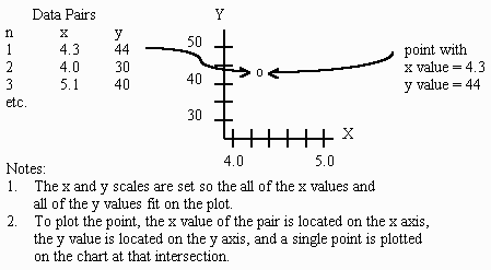
Ø Draw the axes of the diagram. The first variable (the independent variable) is usually located on the horizontal axis and its values should increase as you move to the right. The vertical axis usually contains the second variable (the dependent variable) and its values should increase as you move up the axis.
Ø Plot the data on the diagram, by placing a dot at the intersections of the X and Y coordinates for each data pair.
Ø Interpret the scatter diagram for direction and strength.
Interpretation of diagram
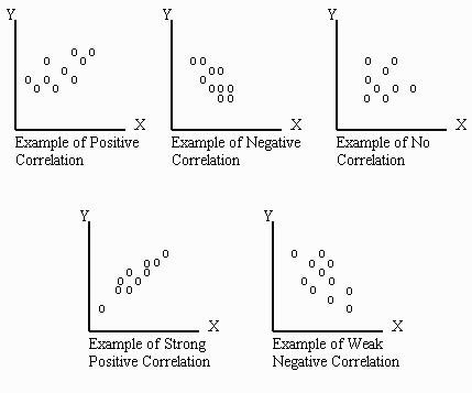
The more the points are clustered to look like a straight line the stronger the relationship. However, no relationship between the two variables is observed when the points are randomly scattered about the graph.
Ø In positive correlation, amount of variable x increases, the variable y also increases
Ø In negative correlation an increase in x will cause a decrease in y
Ø In no correlation the diagram is so random that there is no apparent correlation between the two variables.
Scatter Diagram Example
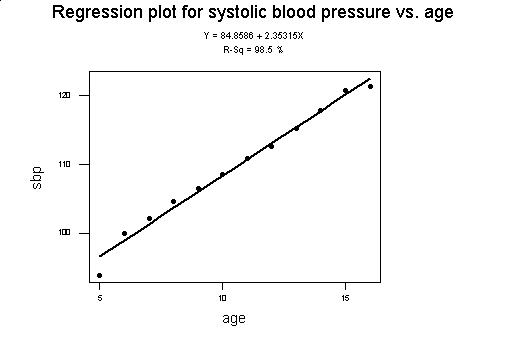
Example:
Base on the data collected an example of scatter diagram is being plotted out.
Age
|
Sbp
|
5
|
93.9
|
6
|
100.0
|
7
|
102.2
|
8
|
104.7
|
9
|
106.5
|
10
|
108.6
|
11
|
110.9
|
12
|
112.7
|
13
|
115.2
|
14
|
117.9
|
15
|
120.8
|
16
|
121.4
|
Recommended links