| Assignment1 Pareto Chart |
| Portfolio | Interest | Assignment1 | Assignment2 | Lab 4 | Feedback |
Pareto Chart
What is a Pareto Chart?
Pareto chart is simply a bar graph with the bars arranged in descending order of height from left to right across the horizontal axis. This organizes and displays information to show the relative importance of various problems or causes of problems. It is essentially a special form of a vertical bar chart that puts items in order (from the highest to the lowest) relative to some measurable effect of interest: frequency, cost, time. Thus, a Pareto chart helps teams to focus their efforts where they can have the greatest potential impact.
When to use it?
Pareto charts help teams focus on the small number of really important problems or causes of problems. Pareto charts are useful in establishing priorities by showing which are the most critical problems to be tackled or the causes to be addressed. Comparing Pareto charts of a given situation over time can also determine whether an implemented solution reduced the relative frequency or cost of that problem or cause.
History Of Pareto Chart
Vilfredo Pareto (1843-1923), an Italian economist, discovered that approximately 80% of the wealth of a country lies with approximately 20% of the people. Called the Pareto principle, holds true even today. Now in industries, a Pareto Analysis involves the categorization of items and the determination of which categories contain the most observations. This primary tool is now known as the Pareto Diagram, evolved by Vilfredo Pareto.
Steps to construct a Pareto chart
Step 1. Develop a list of problems, items, or causes to be compared.
Step 2. Develop a standard measure for comparing the items.
Step 3. Choose a time frame for collecting the data.
Step 4. List the items being compared in decreasing order of the measure of comparison
Step 5. List the items on the horizontal axis of a graph from highest to lowest.
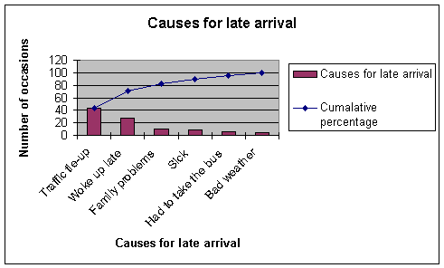
|
Causes
for Late Arrival |
Number
of Occasions |
Percentage |
Cumulative
Percentage |
|
Traffic
tie-up |
44 |
44 |
44 |
|
Woke
up late |
28 |
28 |
71 |
|
Family
problems |
10 |
10 |
82 |
|
Sick |
8 |
8 |
90 |
|
Had
to take the bus |
6 |
6 |
96 |
|
Bad
weather |
4 |
4 |
100 |
Step 6. Label the left vertical axis with the numbers (frequency, time, or cost), then label the right vertical axis with the cumulative percentages.
Step 7. Draw in the bars for each item and a line graph for cummulative percentages. The first point on line graph should line up with the top of the first bar.
Step 8. Analyze the diagram by identifying those items that appear to account for most of the difficulty.
Pareto Chart Example
Recommended links