Making models is no fun if you can't have fun painting. But everybody faces dry spells, those evenings when you hold the kit in one hand and your paint brush in the other, and nothing seems to be happening. Every so often, we all need inspiration.
What follows are a few ways to make painting Godzilla more enjoyable by borrowing techniques from other artists.
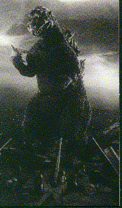
As we all know, the classic Godzilla is a dark grey, as opposed to the '84 - '95 Godzilla who is an almost black color. The suits themselves were not painted (except for small details like claws, eyes, et cetera) but highlighted with studio lights to bring out details. While the technique worked well, it doesn't seem to lead to much inspiration when painting your Godzilla kit.
But how about using those black and white stills from the early
Godzilla movies to directly inspire you? After all, since the suits were
grey toned in the first place, so b&w stills represent a very honest
rendering of the actual suit.
It's fun to paint in black and white - say Godzilla a la '54 - with different grey tones, and that way stills can serve as a tone references. One of the interesting aspects of the first two early pictures is their dark, almost film noirish lighting. There is a real variation and contrast between the dark, almost black, area of shadow and the highlights.
Look at a few black and white pictures, until you find one with dramatic lighting that compliments your kit. Start with the darkest grey tone and drybrush up to lighter tones. It's always possible to use washes to darken the recessed areas back down if you feel you've overdone the drybrushing.
Here's something to check out when you're looking at stills. Often, extreme toplighting in the night scenes make Godzilla look almost - well - damp. Look at pictures from the first two films and you'll see that Godzi almost looks to be shining, key lights on the upper head, neck, and shoulders appear to be very bright in contrast with the darkness of the shadows. Maybe this could be mimicked by using a satin finish, as if he'd just climbed up out of the sea.
Something I still haven't figured out is a way to suggest the very bright rotoscoping from the first two movies on a kit painted "black and white." The dorsal plates blaze radiation when Godzilla breaths fire, but is there any way to create that effect?
Perhaps lighting could be packed into dorsals while the rest of the kit was painted black internally and masked off, so that light would "leak" out of the dorsal plates. Or maybe the spines could be recast in clear resin and then illuminated from within.
Painting grey tones is an excellent learning exercise because it requires a much more subtle sense of control than it might first appear . . . but probably most modeler's will want to try something a little more colorful.
My own favorite paint job so far is a Kaiyodo '62 (also my favorite Godzilla suit by the way, the Kong-godzi, though purists still favour the '64 Mothra-godzi). I started with the regular light grey on dark grey dry-brushing (Godzi dry-brushes up well because of the texture of his skin) and then washing different dark ink tones into the folds on his body.
For the shadow tones I used were purples, blues, and even - gasp - green. You have to be careful, because you don't want him to look like a giant bruise . . . but I keep trying to work on kits that give the right Impression, but are still more colorful than the original critter (As I mentioned in GREY IS THE COLOR #1, my role model here is Basil Gogos who did so many wonderful FAMOUS MONSTERS covers, and lately, MONSTERSCENE.)
Dorsal spines are white/ivory at the tips, drybrushed lightly toward the center of the plates, which are grey (but don't forget that they gave the dorsal plates a SILVER sheen in the last few movies). I wash the claws, toes, and centers of the dorsals with dark brown and light brown inks - though this is more attention than they got in the films. Still, you have to believe that if Tsuburaya had more time, this is the kind of treatment Godzilla would have gotten.
As well, varying the tones inside the mouth really helps Godzilla come alive. For mouth tones I start with a very dark pink and drybrushed raised areas lighter pink. I go back in with a thin red wash and let it fill deep recesses. I usually paint the teeth ivory, wash them slightly with a brown wash which I let settle on the gum line. Afterwards, I lighten the tips of the teeth.
In the last article I talked about going wild with the paint scheme, but sometimes having some inspiration is good. Where can you turn when you just don't have an idea.
1. THE "GOOD GODZILLA ARTISTS"
I talked about Basil Gogos in the first article. Perhaps the best artist to study in this regard, though, is Bob Eggleton (The Dark Horse comic covers, the Random House Godzilla books . . . et cetera).
Now, I know from talking to Bob that he collects kits, but I have never seen one he's painted. I'd love to, because he has this incredible, translucent, radiant color palate in his book covers and other pictures that I would just love to somehow reproduce on a kit.
See particularly the cover of the Random House books GODZILLA 2000
(red and blue highlights), 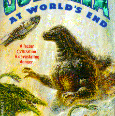 GODZILLA AT WORLD'S END (White, green, and
golden highlights reflecting off the surround of Biollante, water, and
ice), and, GODZILLA VS. THE SPACE MONSTER (the '62 suit with yellow and
white highlights created by Ghidorah's flame breath and blazing dorsal
plates).
GODZILLA AT WORLD'S END (White, green, and
golden highlights reflecting off the surround of Biollante, water, and
ice), and, GODZILLA VS. THE SPACE MONSTER (the '62 suit with yellow and
white highlights created by Ghidorah's flame breath and blazing dorsal
plates).
(I'm working on something I'm calling EGGLEZILLA '85 for G-FEST '98, but having had the temerity to admit this, I'm going cop right now to the fact that I am never really going to be able to reproduce Bob's effects myself. I'll give it a shot thought, and hopefully I'll stumble onto something new that I haven't done before. That's what inspiration is all about.)
Another "Good Godzilla Artist" is Art Adams, who has illustrated many of Dark Horses Godzilla comics, and just recently contributed to "The Official Godzilla Compendium." I'm not sure if it was Art's choice, or Dark Horse's, but his Godzilla is usually green. However, one look at the subtle shading gradation on the cover of the GODZILLA COLOR SPECIAL, with the shift from yellow to light green to dark green to black, and you'll want at least one Godzilla painted green as well.
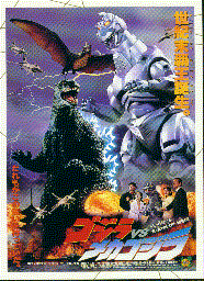
Finally, the last "Good Godzilla Artist" is Yuji Kaida, whose work has graced many a Bandai model box and covers of B-Club. If you study Mr. Kaida's work you'll see highlights colors that vary from blue, to yellow,green, and blue, to red - depending on the conditions around Godzilla.
Like Bob Eggleton, Yuji Kaida often varies the color of Godzilla's eye from a white eyeball to a deep, crystalline yellow. Occasionally, to increase the drama of his pictures, he paints Godzilla's eye an angry red - even when there are no flames to be reflected within it.
2. TOHO STUDIO COLOR PICTURES
Besides happily creating pictures with clippings from old films to promote new ones (there are dozens of pictures of the '54 Godzi taking on the '33 Kong), Toho also frequently "colorized" stills. (If King Ghidorahs were easy to come by, I'd definitely have one with rainbow hued wings, a blue body, and "red" hair - like the promotion shot from GHIDORAH THE THREE-HEADED MONSTER I mentioned in the last article.)
It's easy to find shots of Godzilla with Green, Blue, and even yellowish highlights. Often, these highlights are the result of the background of the pictures which tend to shift the neutral greys toward that color. There are plenty of shots from GODZILLA VS. MOTHRA '64 where highlights on the suit look yellow, and even one frequently reprinted - Godzilla emerging from the sand - in which yellow top light contrasts with blue shadows. Depending on the sequence and the surround, the Godzi suit in KING KONG VS. GODZILLA seems to vary in still pictures from a dull brown color to a muted green.
So which color is real? Take your choice.
3. STUDIO LIGHTS AND STUDIO POSTERS
The '85-'95 era Godzilla is almost always shot with blue highlights during night scenes, so using blue is a perfectly acceptable technique. But how about firelight? A quick glance through the classic Toho posters will turn up at least five that use red to highlight Godzilla. Look for the posters from GODZILLA ('54) (red toplight, blue shadows), GIGANTIS THE FIRE MONSTER (red), one of the KING KONG VS. GODZILLA POSTERS (Red and white highlights) DESTROY ALL MOSNTERS (red toplight), and GODZILLA VS. MECAGODZILLA. (Say, and if you paint some buildings red too, then you have a diorama to match. Or you could project red light onto them, but that's another article . . .) There's also one great still from Godzilla '85 in which the King of the Monsters is entirely red from the volcanic light reflecting off him.
 Scanning through Toho posters, you can quickly find green used as a
highlight again in posters for GODZILLA VS. BIOLLANTE, and in GODZILLA VS.
MECHAGODZILLA II. (In both these cases green is used in both the art
poster and the photo poster.)
Scanning through Toho posters, you can quickly find green used as a
highlight again in posters for GODZILLA VS. BIOLLANTE, and in GODZILLA VS.
MECHAGODZILLA II. (In both these cases green is used in both the art
poster and the photo poster.)
4. AND OF COURSE, HE'S "A WALKING NUCLEAR FIRESTORM"
Besides the shift from ivory to silver to almost-white in the
newest incarnation of the suit, don't forget that the dorsals are gigantic
heat-exchanging radiators. Take a look at the rotoscoping in the old films
- the hot blue glow.
So how about blue dorsals? Blue-white?
Glow-in-the-Dark paint?
Internal lighting systems?
Remember not to get stuck in the "a model is a reproduction of a real thing" bind, and remember to have fun. There are thousands of choices out there. A quick glance through this winter's HOBBY JAPAN EXTRA will reveal many Godzilla kits painted grey, but also a terrific demo by Takuji Yamada painting a super-deformed Godzilla '54 with transparent yellows, oranges, blues, browns - - - and oh yes, grey too.
Don't forget that we're painting with light.
And go wild.
STan
 Back to the Stan's Kaiju Korner