My Contribution To Cartography On The Web
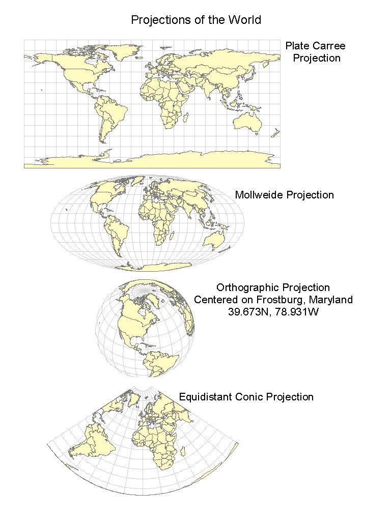
Projections of the World:
1
1. A visual comparison of four projections of the world.
The Plate Carree Projection
The Mollweide Projection
The Orthographic Projection, centered on Frostburg, Maryland at 39.673N, 78.931W.
The Equidistant Conic Projection
Projections of the Western Hemisphere:
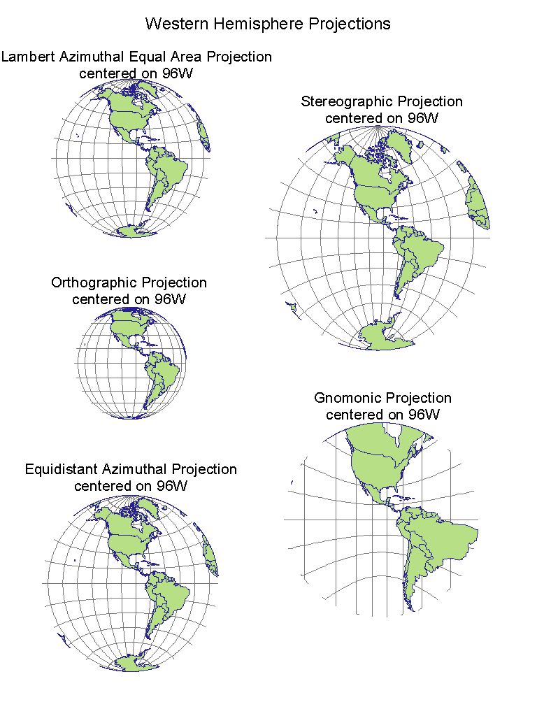
2
2. A visual comparison of five projections of the western hemisphere. The projections are centered at 96W, along the equator.
Lambert Azimuthal Equal Area Projection
Stereographic Projection
Orthographic Projection
Gnomonic Projection
Equidistant Azimuthal Projection
Exploring Projections Further:
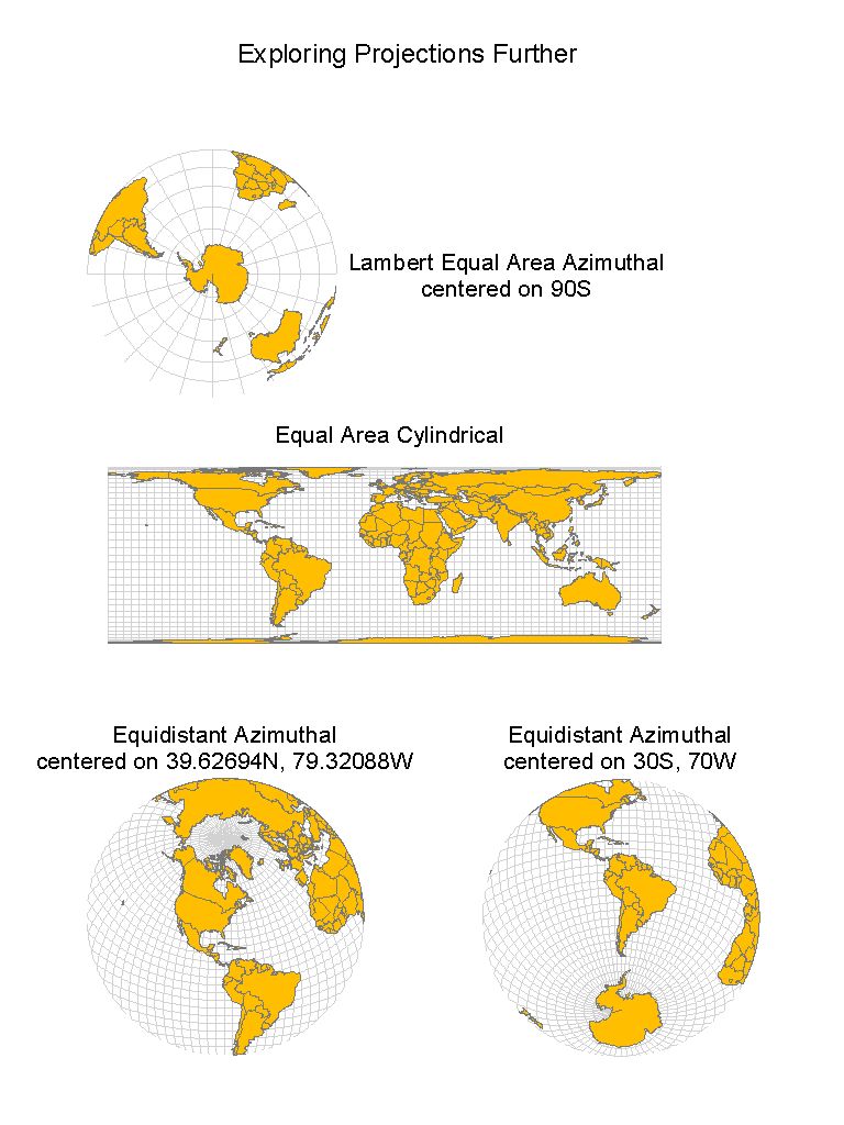
3
3. A visual comparison of four more projections, centered on different coordinates.
Lambert Equal Area Azimuthal, centered on 90S
Equal Area Cylindrical
Equidistant Azimuthal, centered on 39.62694N, 79.32088W
Equidistant Azimuthal, centered on 30S, 70W
Maryland Pollution Map:
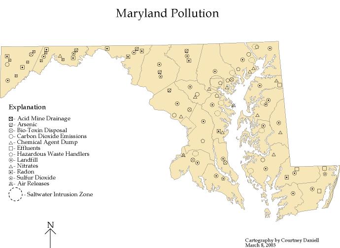
4
4. A map showing the different pollution types and their locations throughout the state of Maryland. This map is made from a nominal level of data, and uses the visual variable shape to represent the data.
Maryland Agricultural Production Map:

5
5. A map showing the primary agricultural activity by county for Maryland. This map is made from a nominal level of data, and uses the visual variable color hue to represent the data.
Maryland Stream Discharge Map:
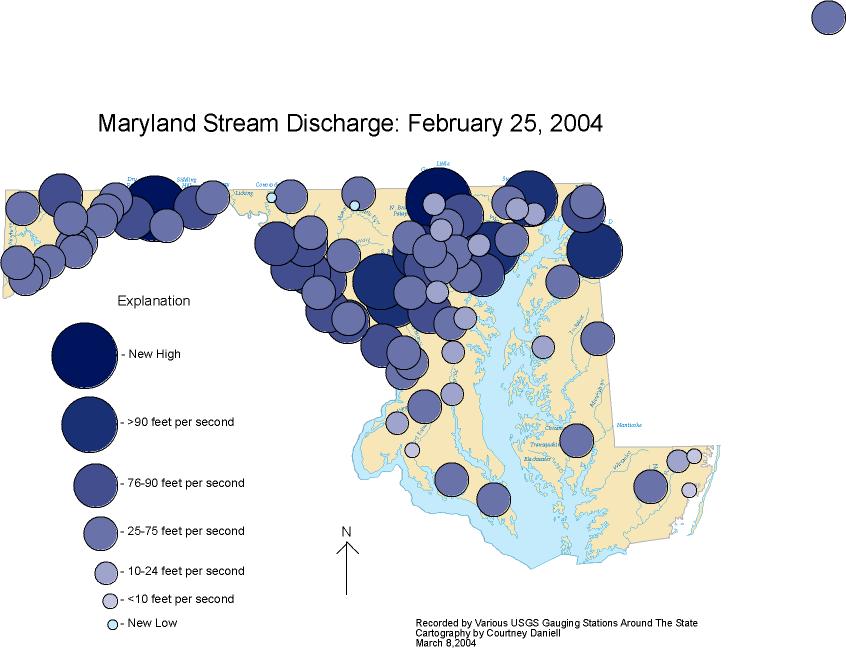
6
6. A map showing the stream discharge rates in Maryland on February 25, 2004. The rates were recorded by USGS gauging stations located around the state. This map is made from a ratio level of data, and uses the visual variables of size and color value to represent the data.
Maryland Road Map:
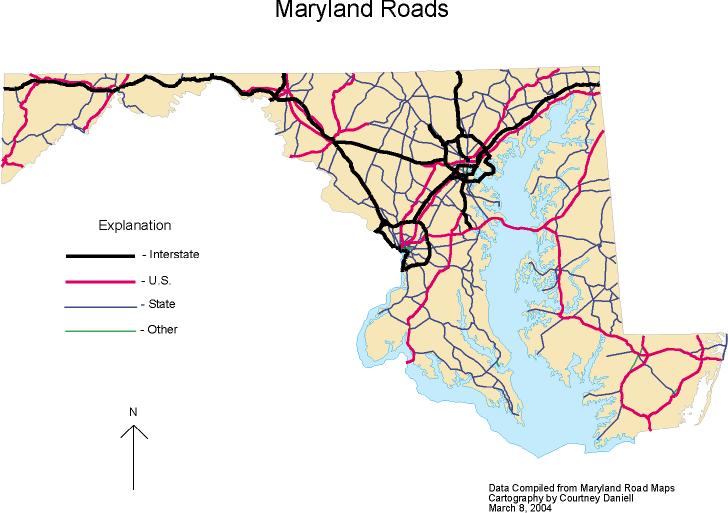
7
7. A map showing the different road categories in Maryland. This map is made from an ordinal level of data, and uses the visual variables of size and color hue to represent the data.
Proportional Symbol Maps:
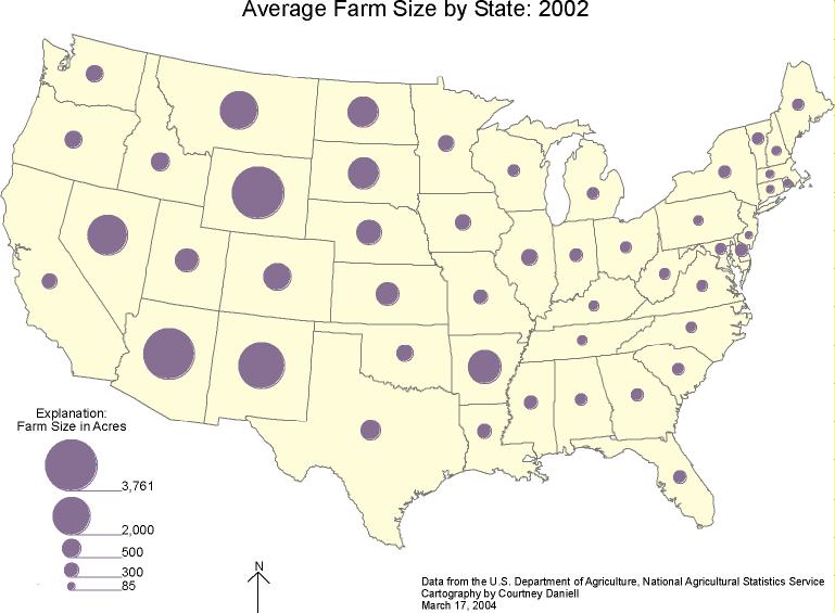
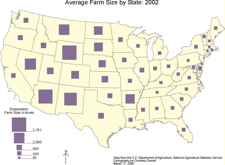
8 9
8 & 9. Two maps showing the average farm size in acres by state. These maps use proportional symbols to display the data.
Data Classification Methods:

10
10. These maps display total U.S. roadway miles and total U.S. roadway miles per square mile. The data is classified differently for each map. In the first map, the data is unstandardized. This map gives a raw count of roadway miles. In the last three maps the data is displayed per square mile. The data is classified using equal interval classification, quantile classification, and natural break classification.
Labeling and Type in Cartography:
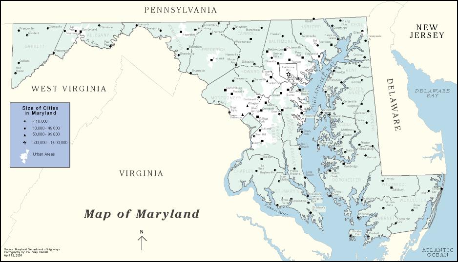
11
11. This map displays a hierarchy of labeling and type. It shows many Maryland cities, all counties, surrounding states, and major waterways.
Mapping the Turkish Peninsula:
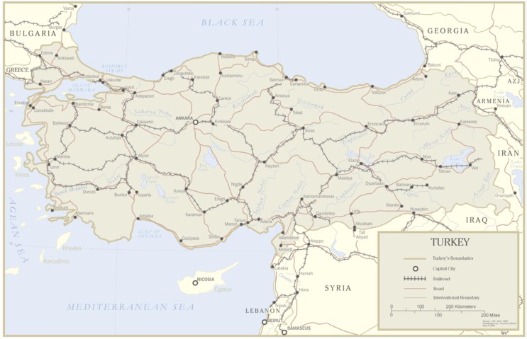
12
12. This map displays a hierarchy of line work and type. It is a complete map of Turkey showing major cities, roads, rivers, railroads, and major water bodies.
Final Project, Mapping the 1996 Presidential Election:
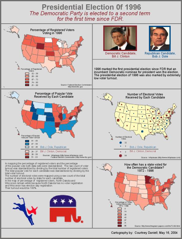
13
13. This page contains a set of four maps displaying voter turnout, percentage of popular vote for each candidate, number of electoral votes for each candidate, and democratic voting trends by state.
Congressional Districts, 2005:
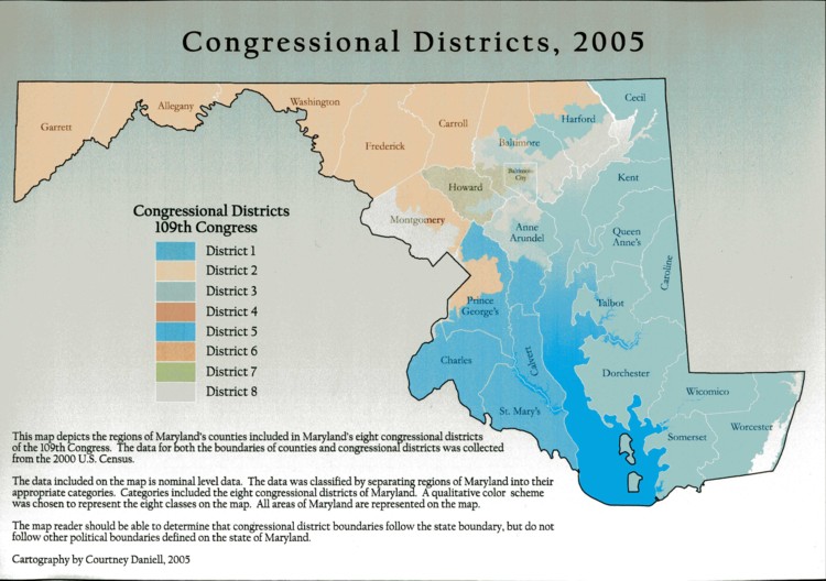
14
14. All text accomanying this map is placed on the map...click on the map!
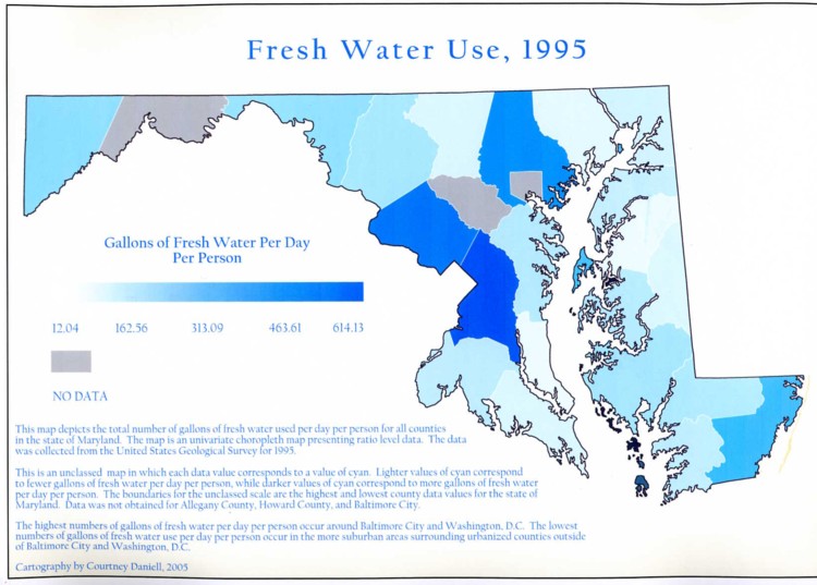
Fresh Water Use, 1995:
15
15. All text accomanying this map is placed on the map...click on the map!
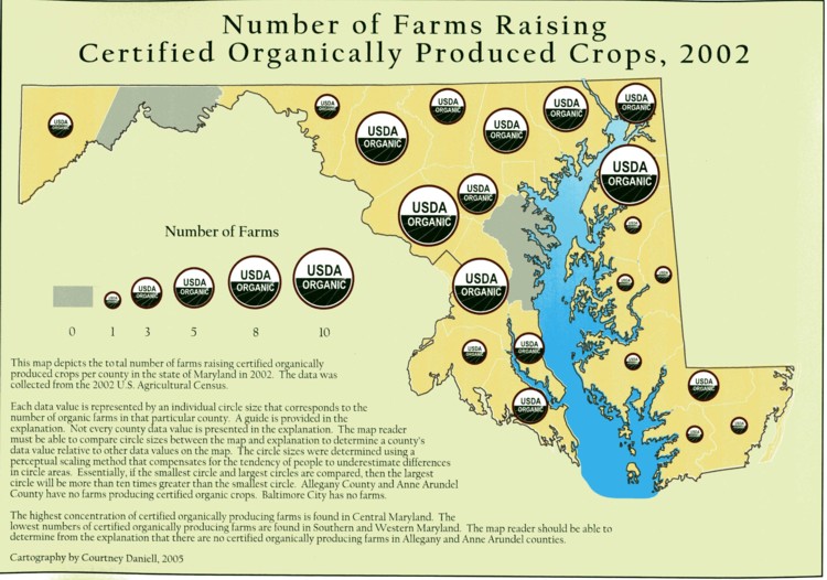
Number of Farms Raising Certified Organically Produced Crops, 2002:
16
16. All text accomanying this map is placed on the map...click on the map!
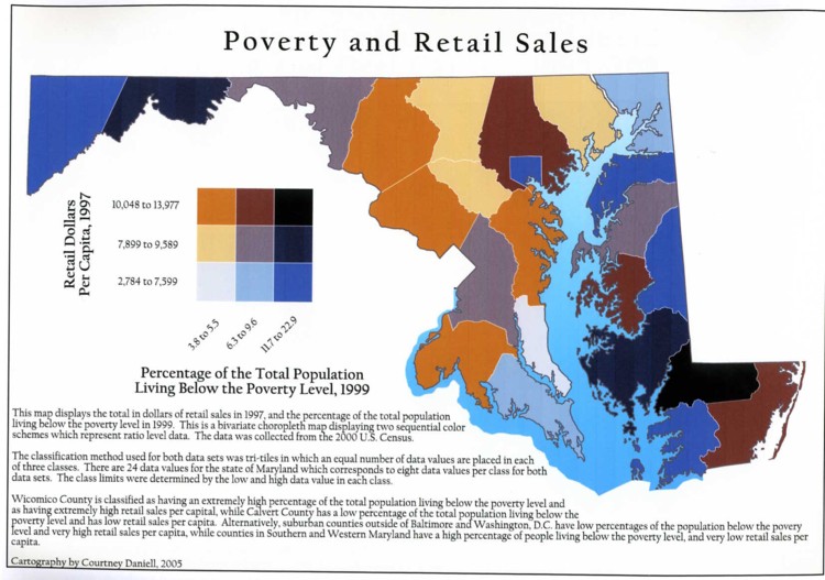
Poverty and Retail Sales:
17
17. All text accomanying this map is placed on the map...click on the map!
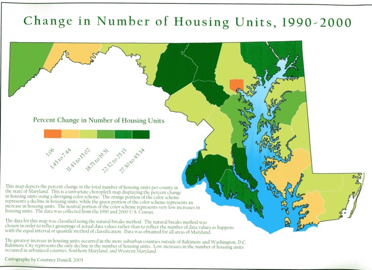
Change in Number of Housing Units, 1990-2000:
18
18. All text accomanying this map is placed on the map...click on the map!