
Colours of dye
by
Mike Oettle
tincture rule / stains / rare colours / bleu céleste / proper / new colours
THE word tincture can be traced back to the Latin word tinctura, meaning the process of dyeing.
It is discussed elsewhere whether the heraldic term tincture properly applies to all the colours used in heraldry, or just those that make up the essential five that are the basic workhorses of heraldic contrast.
But the word’s derivation from dyestuff would seem to argue a stronger case for limiting it to these five, or perhaps to the other colours discussed in this article as well, but excluding the metals and furs.
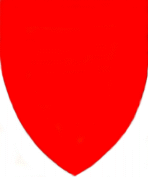
For the record, those colours are gules (red), azure (blue), sable (black), vert (green) and purpure (purple).
Heraldry does not prescribe exact shades for these colours, both artist and wearer being free to choose a shade that best suits the composition or the wardrobe. But bright, bold colouring is the hallmark of contrast in any armorial design.
Azure takes its name from the Persian word lazhuward (from which we also get the English word lapis lazuli).[1] This became, in Arabic, lazaward or allazaward,[2] and in Spanish azul or azur. This then passed to Old French as azur, and was passed on to other languages, too. In Dutch the heraldic term for blue is azuur or lazuur.[3]
Dictionaries will tell you that azure is a light purplish blue – a colour definition taken in part from the mineral lapis lazuli – but its heraldic meaning has always been much broader.

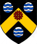
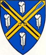
The shade of azure is perhaps more freely interpreted by heralds, and is at times so dark as to be almost black (although the darkest shades of blue will not usually be found in documents actually produced by heraldic authorities), but can often be quite light, as shown in the arms of St Mary’s Cathedral in Port Elizabeth, where the deed of grant from the College of Arms shows it as being quite pale.
An entirely different colour is bleu céleste (pale blue), which is discussed below among the rarities.
None of the five standard colours has traditionally been defined as a fur, although the terms used for two of them, curiously, have their origins in the fur trade.
This applies obviously to sable, which derives its name from the fur-bearing animal known as the sable, a type of marten which has the zoological name Martes zibellina.
Less obvious is the derivation of gules from another type of fur, which François Velde has linked to a type of white fur which, at a particular phase of the Middle Ages, might normally have been dyed red and worn around the throat.
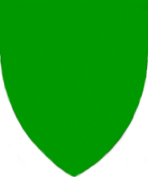
Quite straightforward is the colour vert, which derives from the Latin and French words for green. François Velde notes that French heraldry used vert until the 14th century.
At that point, a curious twist came in French usage: it turned to the name sinople instead. Dutch blazon has taken this word over, too, and speaks of sinopel.
Aside from the fact that the French pronunciation of vert was beginning to lose the final T-sound (leading to confusion with vair), there seems to be no logical reason for this change. It is usually accounted for by the fact that mediæval heralds desired to make their craft obscure, but this particular derivation defies reason.
The word is taken from the Black Sea city of Sinope, today the northernmost city in Turkey, which in classical times was famous as having been founded by the tribe of warrior women called Amazons, and named for their queen, Sinova.
The city has given us the ordinary English word sinople, defined in Webster’s Third New International Dictionary as “a ferruginous quartz that is blood-red or brownish red sometimes with a tinge of yellow”.
Closely linked to it are sinopite, which Webster’s defines as “a brick-red ferruginous clay used by the ancients as a paint”, and sinopia, “a red pigment made from sinopite”.
The only logical connection between a clay coloured brick-red, blood-red, brownish red or yellowish and the colour green seems to me to be a colour-blind herald, since a common form of colour-blindness entails the inability to distinguish between these colours.[4]
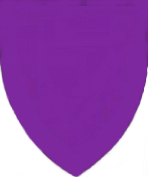
Last among the ordinary colours of heraldry is purpure, which – aside from having been relatively rare in the history of armory – has a curious history.
It seems that when the heralds first came to know this colour, it was something different from what it now traditionally has become: a mixture of blue and red.
François Velde has researched this extensively, and it would seem that purple originally described the dyestuff obtained from sea snails of the species Murex brandaris (commonly called dye murex).
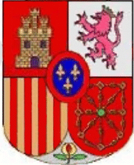
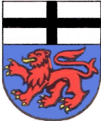
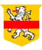
The dyestuff, and cloths dyed with it, were known as purpura, in Latin, which in turn was derived from porphura (porfura), a Greek word of Phoenician origin which described the shellfish and its dye. The precise colour of the dye is no longer known, but it seems that it may have varied; what it was most prized for was that it was the only colourfast dye known to the ancient world. It is especially associated with the imperial dignity: a family would claim that it had once worn purple, meaning that somebody in the family had been proclaimed emperor. Supplies of marine purple came to an end during the Middle Ages, possibly as a result of the collapse of the so-called Byzantine Empire (concluding with the fall of Constantinople in 1453), and since that time the word purple (in various Western languages) has come to mean what we understand it to mean today. However, an echo of the original meaning is perhaps to be found in one Spanish usage of heraldic purpure (purpura in Spanish) – the colour of the lion of León appears in the current official arms of Spain as pink or lilac. But this is not as straightforward as it seems. Santiago Dotor writes from Madrid: “This does not reflect reality but a heraldic mistake by Spanish 1981 legislators. Only the ‘official’ model of the ‘national’ arms uses that weird shade for the lion’s purpure.” The usual colour of the Leónese lion, he writes, is dark red. Before leaving the five basic colours, a word must be said about the colour rule. Just as there are exceptions to the rule that metal must not be placed on metal, there are exceptions to the rule forbidding the placement of tincture on tincture. Several examples are known of a red lion on blue – François Velde, having gone through Rietstap, lists those of Avila in Castile, Bemdorf in Saxony, Betti in Florence, Christol in Toulouse, Molnet in Lorraine and Strodl in Erlangen. Among civic arms, the best known is possibly that of the city of Bonn. But while these examples have existed for centuries, they remain scarce because they prove the colour rule: tincture on tincture does not provide adequate contrast. Indeed, Bonn – having borne these arms since the 13th century – abandoned them in 1971, adopting a red field and an unheraldic “natural” lion in gold. Just as there are exceptions to the rule that tincture must not be placed on tincture, there are exceptions to the rule forbidding the placement of metal on metal. A South African example can be found in the arms of Fish Hoek. Stains: Next among the colours of heraldry are the three stains: tenné, murrey (supposedly a colour associated with mulberries) and sanguine (or blood colour). All of them are rare in traditional usage, and Fox-Davies[5] telescopes the latter two when he writes: “Two other colours will be found in nearly all text-books of English armory. These are murrey and sanguine, and orange or tenné. The exact tint of murrey is between gules and purpure; and tenné is an orange-tawny colour. “They are both ‘stains’ and were perhaps invented by the old heralds for the perpetration of their preposterous system of abatements, which will be found set out in full in the old heraldry books, but which have yet to be found occurring in fact. “The subject of abatements is one of those pleasant little insanities which have done so much to the detriment of heraldry. One, and one only, can be said to have had the slightest foundation in fact: that was the entire reversal of the escutcheon in the ceremony of degradation following on upon attainder for high treason. “Even this, however, was but temporary, for a man forfeited his arms entirely by attainder. They were torn down from his banner of knighthood; they were erased from the records of the College of Arms; but on that one single occasion when he was drawn upon a hurdle to the place of his execution, they are said to have been painted reversed upon paper, which paper was fastened to his breast.”[6] He continues, after a digression on attainders and abatements: “. . . one might almost discard the ‘stains’ of murrey and tenné were it not that they were largely made use of for the purposes of liveries, in which usage they had no such objectionable meaning.” Fox-Davies knows of only one use of sanguine for the field of a coat of arms, but Brooke-Little, in a footnote, adds that all three of these colours have been used on several occasions since the end of the Second World War. Fox-Davies writes of tenné and orange as being almost the same (as with murrey and sanguine). However, the actual traditional colour of tenné was a tan colour – the shade of yellow-brown leather – while in modern British usage tenné has tended to be more distinctly orange. However, the arms of Crichton-Stuart, as displayed among the arms of members of the Heraldry Society of Scotland, shows a border in the traditional tawny shade. In contrast, orange has been regarded on the European Continent, and especially in the Netherlands, as being an altogether different colour. Dutch usage of this colour is frequently an allusion to the House of Orange,[7] and its usage has spread from that country to South Africa. The illustration at left shows a draft for the grant of arms made by the King of the Netherlands to the Oranje Vrij Staat. An oddity in South African usage concerns the colour murrey/sanguine. In at least one instance arms have been registered to a school in which the illustration on the registration certificate clearly shows a maroon or dark red, not a bright shade, yet the blazon reads “rooi” (gules). Since in law the arms have to conform to the wording, not the illustration, the school is technically in the wrong, since it has retained the maroon it originally selected as its colour before making application to Pretoria. It would seem that it is entitled in this instance to request a re-issue of the (wrongly worded) certificate of registration. Rare colours: To these a further category must be added, of colours noted in mediæval or later treatises but rarely used.
Fox-Davies mentions nine listed by German heralds: brown, blood-red (apparently a different colour from sanguine, as it has a different hatching), earth-colour, iron-grey (Eisengrau), water-colour, flesh-colour, ashen-grey (Aschengrau), orange (discussed under stains) and Naturfarbe or, as Fox-Davies puts it, the colour of nature (which in Britain is referred to as “proper”).
In addition, Fox-Davies lists others noted by Dr John Woodward:[8]
“That of which I have collected instances is:
“Cendrée, or ash colour [clearly identical with Aschengrau], which is borne by, among others, the Bavarian family of Ashua, as its armes parlantes: Cendrée, a mount of three coupeaux in base or.
“Brunâtre, a brown colour, is even more rare as a tincture of the field; the MIEROSZEWSKY in Silesia bear, ‘de Brunâtre, A cross patée argent supporting a raven rising sable, and holding in its beak a horseshoe proper, its points towards the chief.’
“Bleu-céleste, or bleu du ciel, appears occasionally, apart from what we may term ‘landscape coats’. That it differs from, and is a much lighter colour than, azure is shown by the following example. The Florentine CINTI (now CINI) bear a coat which would be numbered among the armes fausses, or à enquérir: Per pale azure and bleu-céleste, an estoile counterchanged.
“Amaranth or columbine is the field of a coat (of which the blazon is too lengthy for insertion in this place) which was granted to a Bohemian knight in 1701.”
Fox-Davies adds:
“Carnation is the French term for the colour of naked flesh, and is often employed in the blazonry of that country.”
Since heraldry arose in countries where people have pale skins, it is unsurprising that this is regarded as normal. But it seems a little out of place, when a coat of arms contains one hand of a white person and one of a black person, to blazon the one hand as carnation and the other as sable – especially when the dark-skinned person is probably not pitch-black.
It is entirely unclear what water-colour should look like, and in British usage it is a superfluous concept, since the heralds of England, Scotland and Ireland use a convention where wavy lines (usually horizontal barrulets) of azure and argent represent water.
A roundel with this appearance is conventionally called a fountain.
Brunâtre is a colour that has seen some use in South African blazons. It is appropriate in many African contexts, and can be seen in the arms prepared for, but not adopted by, the Damara homeland (a Bantustan state created in South West Africa, abolished at the time of Namibian independence).
It seems, however, that its use has been extended a little too enthusiastically.
For another, it occurs in at least one blazon where it should not have appeared at all. In this coat of arms, the rustic cross and crosslets are meant to be of wood, and the word proper was put forward as being the appropriate word to describe this wood colour, but when the certificate of registration was issued, the word brunâtre appeared instead.
Lastly, under this heading, a word should be said about bleu céleste, which in Dutch is called effeblaauw.
The occurrence of pale blue was formerly extremely rare in heraldry, and was regarded in British practice as being a purely Continental occurrence.
However, following the formation during the First World War of the Royal Flying Corps and its post-war absorption into the Royal Air Force, badges were designed for squadrons where a pale blue was used to symbolise the sky.
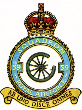
It is unclear whether the shade was in use before or after the innovation in 1936 of appointing one of the officers of the College of Arms to be Inspector of Royal Air Force Badges,[9] but the use of bleu céleste has continued not only in the badges of the RAF and its brother air forces around the world, and also in the arms and other armorial devices of persons associated with aviation, especially military aviation.
Where different shades of blue are appropriate in British blazon, the heralds have tended to avoid heraldic labels for them. The Borough of Barnes, on the Thames, which is home to the Oxford (dark blues) versus Cambridge (light blues) university boat race, has a blue shield on which two oars appear in the colours of the university teams. Its blazon reads:
Azure, on a saltire or between four ostrich feathers argent, two oars in saltire proper, the blade of that to the dexter dark blue and that to the sinister light blue.
‘Proper’:
The use of the term proper to refer to natural colours has been mentioned, but a passage from Fox-Davies is worth quoting:
“Anything, alive or otherwise, which is depicted in its natural colours is termed ‘proper’, and it should be depicted in its really correct tones or tints, without any attempt to assimilate these with any heraldic tincture.
“It will not be found in the very ancient coats of arms, and its use is not to be encouraged.
“When a natural animal is found existing in various colours it is usual to so describe it, for the term ‘proper’ alone would leave uncertainty. “For instance, the crest of the Lane family, which was granted to commemorate the ride of King Charles II behind Mistress Jane Lane as her servant, in his perilous escape to the coast after the disastrous Battle of Worcester, is blazoned ‘a strawberry roan horse, couped at the flanks proper, bridled sable, and holding between the feet an Imperial crown also proper’. “Lord Cowper’s supporters were, on either side of the escutcheon, ‘a light dun horse proper, with a large blaze down the face, the mane close shorn except a tuft on the withers, a black list down the back, a bob tail, and the near fore-foot and both hind feet white’. “Another instance that might be quoted are the supporters of Lord Newlands, which are: ‘On either side a dapple-grey horse proper, gorged with a riband and suspended therefrom an escutcheon gules, charged with three bezants in chevron.’ “The crest of the family of Bewes, of St Neots, Cornwall, is: ‘On a chapeau gules, turned up ermine, a Pegasus rearing on his hind legs of a bay colour, the mane and tail sable, winged or, and holding in the mouth a sprig of laurel proper.’”
New colours:
To the colours mentioned above, a further category must be added: colours not known to classical heraldry in any form (although they existed outside of armory), but used during the 20th century or more recently in grants or registrations of arms.
Four come to mind, three of them shades of red:
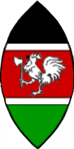
Kenya red is the wording used to describe the shade of darkish red traditionally used on shields among certain tribes of Kenya, which can be seen in the arms and flag of the Republic of Kenya.[10] The colour Kenya red is specified in Kenyan flag legislation, and the same shade (or something similar) can be seen in the arms. However, the heralds in London might well have fudged the issue and simply called it gules.
The same cannot be said of ochre, the colour of a reddish-brown clay, which is traditionally used among the amaXhosa as a facial decoration and protection from solar radiation.
The clay is defined[11] as: “1. Any of several earthy mineral oxides of iron mingled with varying amounts of clay and sand, occurring in yellow, brown, or red, and used either untreated or processed for colour intensification as pigments. 2. Moderate orange yellow, from moderate or deep orange to moderate or strong yellow.”
The actual colour used in the arms and flag of the Republic of Transkei and of the University of Transkei is more brownish-red.
This colour can also be found in the arms of Australia’s Northern Territory.
The third new colour, rose, will probably be in demand among female armigers, as it will meet a desire (among some women, at least) for a pinkish shade in heraldry – something which the traditional heraldic colours will not allow.
It is mentioned in this article in Baronage Magazine as being similar to, but not quite the same as, carnation (mentioned above as the colour of flesh). Illustrated on the third page of the article is a coat of arms using this colour.
In mid-2002 I approached a girls’ primary school in Cape Town which uses the colour pink in its badge and uniform with a view to its possibly adopting a coat of arms, and had to say that heraldry did not tolerate its traditional colours.
At the time, the only solution I could offer was a colour I had seen in the flags of three Breton regiments, namely aurore, which is described as being the colour of the dawn sky. It is essentially pink, but with a hint of orange. The three regimental flags shown in Flags of the World are illustrated here, here and here.
Perhaps the school will now request that it be registered with arms in rose.
However, there is another view to be taken into account. I had assumed, since the article appeared in Baronage, that the editor of that magazine would be in favour of the colours mentioned there. But in subsequent correspondence he remarked: “Personally, I do not advocate widening the choice of tinctures.” (This is perhaps even more relevant with reference to the metal copper in heraldry.)
There does seem to be good reason for adopting appropriate colours for especially African contexts (such as Kenya red or ochre) and for allowing a feminine preference for something softer than red, but at the same time the widespread use of such colourings (and others besides) would in the long run undermine the simplicity of colouring that is the hallmark of heraldry.
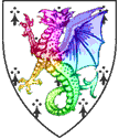
The editor of Baronage does, however, offer one more of his own devising: rainbow, which he conceived as a possibility for fabulous beasts blazoned as proper, and which is also mentioned in Appleton’s article. (The drawing is merely a concept; no such arms have been granted or registered.) Like all other innovations, it could be abused, but to my mind it has possibilities.
