SCATTER DIAGRAM
![]()
OVERVIEW
![]()
Scatter diagrams are used to study possible relationships between two variables. Although these diagrams cannot prove that one variable causes the other, they do indicate the existence of a relationship, as well as the strength of that relationship.
A scatter diagram is composed of a horizontal axis containing the measured values of one variable and a vertical axis representing the measurements of the other variable.
The purpose of the scatter diagram is to display what happens to one variables when another variable is changed. The diagram is used to test a theory that the two variables are related. The type of relationship that exits is indicated by the slope of the diagram.
Key Terms
![]()
Commonly, while a cause-effect diagram has been used to describe the relationship between two variables, the histogram was used to visualize the structure of the data. However, a means of observing the kinds of relationships between variables was needed. Using the theory of linear regression which originated from studies performed by Sir Francis Galton (1822-1911), the scatter diagram was developed so that intuitive and qualitative conclusions could be drawn about the paired data, or variables. The concept of correlation was employed to decide whether a significant relationship existed between the paired data. Furthermore, regression analysis was used to identify the exact nature of the relationship.
The Guide to Quality Control and The Statistical Quality Control Handbook, written by a Japanese quality consultant named Kaoru Ishikawa are useful in providing an understanding on how to use and interpret a scatter diagram. Ishikawa believed that there was no end to quality improvement and in 1985 suggested that seven base tools be used for collection and analysis of quality data. Among the tools was the scatter diagram.
INSTRUCTIONS FOR CREATING A SCATTER DIAGRAM
![]()
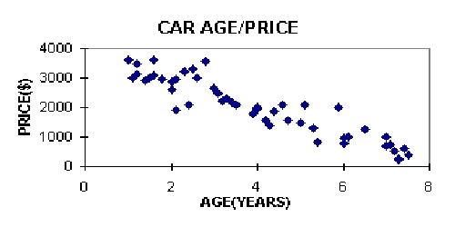
	Car		Age(In Years)		Price(In Dollars)
	  1			2			4000
	  2			4			2500
	  3			1			5000
	  4			5			1250
	  :			:			  :
	  :			:			  :
	  :			:			  :
	  :			:			  :
	100			7			1000
INTERPRETATION
![]()
The scatter diagram is a useful tool for identifying a potential relationship between two variables. The shape of the scatter diagram presents valuable information about the graph. It shows the type of relationship which may be occurring between the two variables. There are several different patterns (meanings) that scatter diagrams can have. The following describe five of the most common scenerios :
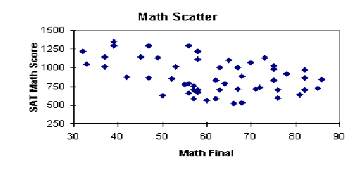
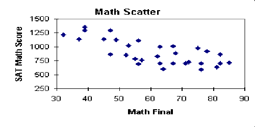
*A strong relationship between the two variables is observed when most of the points fall along an imaginary straight line with either a positive or negative slope.
*No relationship between the two variables is observed when the points are randomly scattered about the graph.
![]()
Situation: I want to construct a scatter diagram to find out if there any relationship between working experiences and salary for lecturers.
Data
|
LECTURER |
WORKING
EXPERIENCE (in yrs) |
SALARY
(in $) |
|
1. |
2 |
2600 |
|
2. |
4 |
2850 |
|
3. |
5 |
2800 |
|
4. |
1 |
2200 |
|
5. |
2 |
2550 |
|
6. |
6 |
3000 |
|
7. |
10 |
3600 |
|
8. |
7 |
2950 |
|
9. |
5 |
2780 |
|
10. |
3 |
2550 |
|
11. |
4 |
2750 |
|
12. |
8 |
3650 |
|
13. |
11 |
3400 |
|
14. |
9 |
3150 |
|
15. |
8 |
3200 |
|
16. |
4 |
2820 |
|
17. |
10 |
3650 |
|
18. |
15 |
4000 |
|
19. |
1 |
2000 |
|
20. |
3 |
2520 |
|
21. |
2 |
2480 |
|
22. |
7 |
2930 |
|
23. |
6 |
2880 |
|
24. |
5 |
2700 |
|
25. |
12 |
3700 |
|
26. |
6 |
2960 |
|
27. |
7 |
2900 |
|
28. |
1 |
2100 |
|
29. |
1 |
2050 |
|
30. |
4 |
2700 |
|
31. |
18 |
4500 |
|
32. |
15 |
4150 |
|
33. |
2 |
2320 |
|
34. |
7 |
2910 |
|
35. |
6 |
2860 |
|
36. |
10 |
3750 |
|
37. |
8 |
3220 |
|
38. |
3 |
2640 |
|
39. |
4 |
2690 |
|
40. |
2 |
2220 |
|
41. |
13 |
4040 |
|
42. |
1 |
2100 |
|
43. |
4 |
2700 |
|
44. |
5 |
2880 |
|
45. |
7 |
2920 |
|
46. |
11 |
3980 |
|
47. |
0 |
1950 |
|
48. |
9 |
3400 |
|
49. |
3 |
2490 |
|
50. |
5 |
2770 |
Scatter Diagram
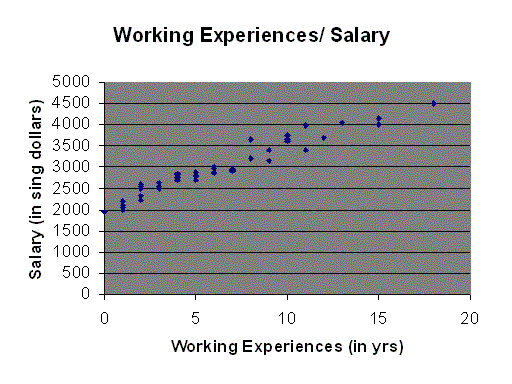
From the above diagram, there are strong relationship between the two variables, working experiences and salary, as they formed almost a straight line with a positive slope. Thus, this implemented that when the working experiences (in yrs) increased, the salary also increased most of the time.
