HISTOGRAM
My Example

OVERVIEW
Histograms
are effective Q.C. tools which are used in the analysis of data. They are used
as a check on specific process parameters to determine where the greatest amount
of variation occurs in the process, or to determine if process specifications
are exceeded. This statistical method does not prove that a process is in a
state of control. Nonetheless, histograms alone have been used to solve many
problems in quality control.
HISTORY
The histogram evolved to meet the need for evaluating data that occurs at a
certain frequency. This is possible because the histogram allows for a concise
portrayal of information in a bar graph format.
The histogram is a powerful engineering tool when routinely and intelligently
used. The histogram clearly portrays information on location, spread, and shape
that enables the user to perceive subtleties regarding the functioning of the
physical process that is generating the data. It can also help suggest both the
nature of, and possible improvements for, the physical mechanisms at work in the
process.
INSTRUCTIONS FOR CREATING A HISTOGRAM
- Determine the range of the data by subtracting the smallest observed
measurement from the largest and designate it as R.
     Example:
               Largest observed measurement = 1.1185 inches
               Smallest observed measurement = 1.1030 inches

               R = 1.1185 inches - 1.1030 inches =.0155 inch
- Record the measurement unit (MU) used. This is usually controlled by the
measuring instrument least count.
Example: MU = .0001 inch
- Determine the number of classes and the class width. The number of
classes, k, should be no lower than six and no higher than fifteen for
practical purposes. Trial and error may be done to achieve the best
distribution for analysis.
Example: k=8
- Determine the class width (H) by dividing the range, R, by the preferred
number of classes, k.
    Example:  R/k = .0155/8 = .0019375 inch
The class width selected should be an odd-numbered multiple of the
measurement unit, MU.  This value should be close to the H value:
     MU = .0001 inch
     Class width = .0019 inch or .0021 inch
- Establish the class midpoints and class limits. The first class midpoint
should be located near the largest observed measurement. If possible, it
should also be a convenient increment. Always make the class widths equal in
size, and express the class limits in terms which are one-half unit beyond
the accuracy of the original measurement unit. This avoids plotting an
observed measurement on a class limit.
    Example:  First class midpoint = 1.1185 inches, and the
class width is .0019 inch.  Therefore, limits would be
    1.1185 + or - .0019/2.
- Determine the axes for the graph. The frequency scale on the vertical axis
should slightly exceed the largest class frequency, and the measurement
scale along the horizontal axis should be at regular intervals which are
independent of the class width. (See example below steps.)
- Draw the graph. Mark off the classes, and draw rectangles with heights
corresponding to the measurement frequencies in that class.
- Title the histogram. Give an overall title and identify each axis.
Now you have a histogram!!
INTERPRETATION
When combined with the concept of the normal curve and the knowledge of a
particular process, the histogram becomes an effective, practical working tool
in the early stages of data analysis. A histogram may be interpreted by asking
three questions:
- Is the process performing within specification limits?
- Does the process seem to exhibit wide variation?
- If action needs to be taken on the process, what action is appropriate?
The answer to these three questions lies in analyzing three characteristics of
the histogram.
- How well is the histogram centered? The centering of the data provides
information on the process aim about some mean or nominal value.
- How wide is the histogram? Looking at histogram width defines the
variability of the process about the aim.
- What is the shape of the histogram? Remember that the data is expected to
form a normal or bell-shaped curve. Any significant change or anomaly
usually indicates that there is something going on in the process which is
causing the quality problem.
Examples of Typical Distributions
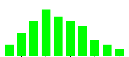
NORMAL
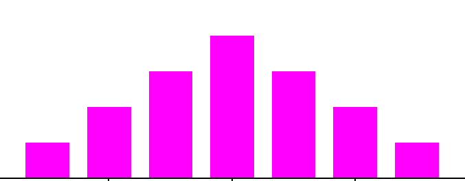
- Depicted by a bell-shaped curve
- most frequent measurement appears as center of distribution
- less frequent measurements taper gradually at both ends of
distribution
- Indicates that a process is running normally (only common causes are
present).
BI-MODAL
- Distribution appears to have two peaks
- May indicate that data from more than process are mixed together
- materials may come from two separate vendors
- samples may have come from two separate machines.
CLIFF-LIKE
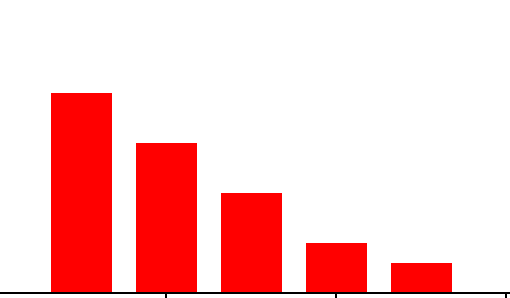
- Appears to end sharply or abruptly at one end
- Indicates possible sorting or inspection of non-conforming parts.
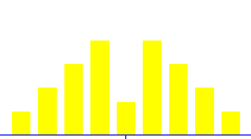
SAW-TOOTHED
- Also commonly referred to as a comb distribution, appears as an
alternating jagged pattern
- Often indicates a measuring problem
- improper gage readings
- gage not sensitive enough for readings.
SKEWED
- Appears as an uneven curve; values seem to taper to one side.
It is worth mentioning again that this or any other phase of histogram analysis
must be married to knowledge of the process being studied to have any real
value. Knowledge of the data analysis itself does not provide sufficient insight
into the quality problem.
OTHER CONSIDERATIONS
- Number of samples.
- For the histogram to be representative of the true process behavior, as a
general rule, at least fifty (50) samples should be measured.
- Limitations of technique.
- Histograms are limited in their use due to the random order in which
samples are taken and lack of information about the state of control of the
process. Because samples are gathered without regard to order, the
time-dependent or time-related trends in the process are not captured. So,
what may appear to be the central tendency of the data may be deceiving.
With respect to process statistical control, the histogram gives no
indication whether the process was operating at its best when the data was
collected. This lack of information on process control may lead to incorrect
conclusions being drawn and, hence, inappropriate decisions being made.
Still, with these considerations in mind, the histogram's simplicity of
construction and ease of use make it an invaluable tool in the elementary
stages of data analysis.
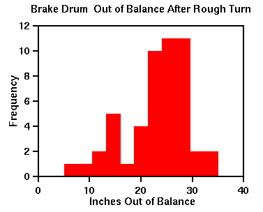
MY HISTOGRAM EXAMPLE
Problem Scenario: I wanted to determine the waistline of
jeans of my friends wore.
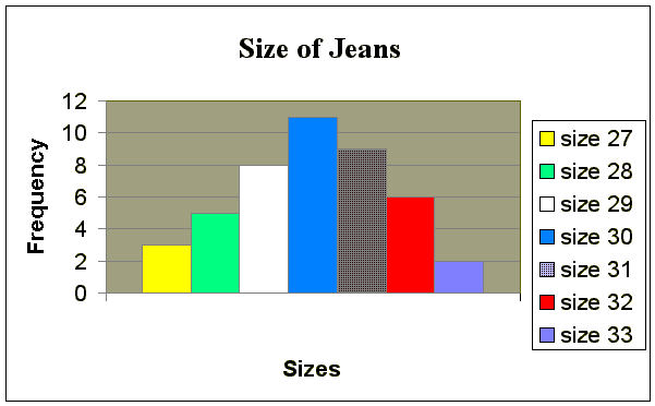
Implementation
This histogram is depicted by a bell-shaped. The most frequent
measurement appears as center of distribution, which is size 30. Less frequent
measurements of jeans size appear taper at the both ends of distribution. This
histogram indicates that a process is running normally.