

NOW THAT'S WHAT I CALL A BAD PINK FLOYD RECORD COVER
NOW THAT'S WHAT I CALL A BAD PINK FLOYD RECORD COVER
And they're often very, very wrong.
And he's a list of the ten worse offenders in the Floyd canon : All Pictures can be found at :

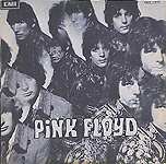
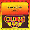
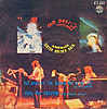
1: MONEY (Denmark, Black Harvest, 1973)
This is it. The nadir of the Floyd's career. Or, if you prefer, the pinnacle of truly tasteless sleeves. Not only did Denmark's Black Harvest label lift another, ahem, unauthorised 45 from the albatross that was "Dark Side Of The Moon", but they did so by wrapping it up in the most dreadful, amateurish sleeve I have ever seen. Imagine, if you can, a child let loose with a black crayon and ordered at gunpoint to draw a picture of the band. Make the picture crowded at the top, so you can barely tell which member is which, and that their likenesses are at best, flexible in their interpretation of where basic things like eyes and noses sit. Then, onto this scrawled mess of black and white, put very large, barely legible black letters announcing the song titles. Letters that disappear into the childish scrawl of the Infantile illustration. And voila! Worst Floyd sleeve ever. Excerable. Still, when whoever designed this grew up, maybe they too bought a football team. What a gas.
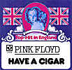
2. HAVE A CIGAR (Germany, 1975)
This is probably the worst one of the lot. The Floyd, never exactly renowned for being patriotic, or particularly enamoured with the music business, here find their most biting song released as a 'top hit' in Germany. The sleeve is particularly grotesque, with two Union jack flags framing an anonymous low-res face, on a sky blue background mounted on a crest. To cap it all, the sleeve proudly proclaims this song to be a "Top Hit In England", despite the Floyd having not released any singles in the UK for the decade surrounding this song, and the fact that nobody from the Floyd sings on it either. Madness. Anyone who bought this on the strength of the cover properly needs to be put down as artistically it's worthless. The music inside on another hand..

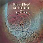
3. MEDDLE WITH ECHOES, Madagascaran, Isreali and Taiwanese issues
Particular mentions also go to the Isreali edition of "Meddle" which is now called "Meddle With Echoes" (complete with retro 70's typefaces straight out of cheap prono movies) but also the Taiwanese edition which manages to superimpose a bad black and white photo of the band from the same session as that which produced the original "Meddle" gatefold sleeve and superimposes it crudely over the original, well known, ear photo that graced the 'proper' Meddle sleeves.
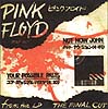
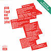
4. NOT NOW JOHN (Japanese and Italian versions)
These two are fairly tasteless as well. The first one, purely for the virtue of having the lyrics (presumably including the expletive laden chorus), printed on the cover in fake Newspaper style script, in white on shocking Pink, so the single looks like nothing more, and nothing less than a newspaper designed by a colour-blind impressionist. Even worse, The Japanese issue tastefully wraps up a scratchy piece of barely legible handwriting (in obvious homage to Mr.Scarfe's style) along side a blood-stained splotch that looks oddly like the Japanese flag. Considering at least a couple of songs on the tracks parent album have somewhat questionable lyrics about "Nips" and "The Wily Japanese", this can hardly be seen to be erm, the most tasteful of Floyd sleeves. Not Now John, please.

5.PIPER AT THE GATES OF DAWN (Italian version)
6. MASTERS OF ROCK
Or could it be the fact that in at least one version of the album cover, again, highly unauthorised by the Floyd, features the traditional "Meddle" lineup shot of the usual suspects - except that David Gilmour has had Syd's face crudely grafted onto his lovely long locks?
Hmm. I'm not sure. What I am sure of is that if you absolutely must buy this record, please, please hide the cover before listening to it.
7. BEST OF PINK FLOYD (Hungary)
Almost as useless as "MASTERS OF ROCK" is this. Dreadful. Not only is a Great Collection of Dance Songs a, to be honest, fairly execrable record in terms of concept (and nobody seems to like the original, Storm Thorgerson cover for a start) and features a David Gilmour solo re-recording of "Money" masquerading as a 'brand new' Floyd song, but even worse is that in Hungary it came out like this : redubbed "The Best of Pink Floyd", and imprisoned inside a sleeve that is some, ahem, artistic, painterly reinterpretation of the cover of Ummagumma, namely a painting of David's legs sitting on a chair, crossed with a bizarre picture of what appears to be an enormous lake painted in red and white. What's it all about? I have no idea. And I suspect nobody else does. Just in case you hadn't worked out that it is a Pink Floyd LP, the artist has cunningly ripped off Gerald Scarfe's spidery scrawl and turned it into a gentle, flowing script, as well as cut'n'pasted the song titles in enormous capitals on the LP cover. Thank God for communism eh? The monkey looks confused and goes out to the kitchen to do the dishes.
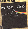
8. MONEY (Dance For Ever) / (Golden Oldies)
OK, maybe not that bad, but sure as hell not good either. The first issue of "Money" here from France is a "Dance For Ever" reissue. Since Money was in it's awkward 7/8 time its actually scientifically proven to be impossible to dance to (I've conducted experiments on the issue as well, just to be sure) quite what the point of issuing it with the instruction to "DANCE FOR EVER" on the cover for is I don't know. Though live versions do occasionally feel like they are going on forever. Especially on the "Delicate Sound Of Thunder" CD. So it's not a good sleeve : It just takes the standard DSOTM cover, twists it at a 20 degree angle, and plasters a bit of cheap text done by the office secretary between fag breaks on either corner. Just so you know, it's by PINK FLOYD, it's called MONEY, and you can DANCE FOR EVER to it.
I haven't even mentioned the Golden oldies version. It's even worse than the cover that's got a tourist postcard picture of a pyramid on it.
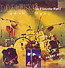
9. HAVE A CIGAR. Portguese version.
10. WISH YOU WERE HERE Malaysian version
11. TIME Thailand version 


Oh, look. A topless hippy. Flashing the V sign. And a painting of a painting of a naked woman that looks as if it was done in crayon. Why, it�s got to be Time and Money by Pink Floyd! �because we all know that cheap tacky nudie pictures of women are so very very Floydian. Planks. Idiots. Fools. Pigs. Dogs� hmm. I see a theme.
Aside from these cheap Thailand knock offs that actually ahd Pink Floyd music on them, witness also the glory of records with Pink Floyd on the cover� but NO PINK FLOYD MUSIC. I mean, DUH!
Somewhere in deepest Thailand, sometime in the 70's, Thailands highly dodgy record companies issued these, the worst Pink Floyd records ever - because they contained absolutely no Pink Floyd music whatsoever. Instead a series of 7" 4 track EP 's containing hit singles from other bands, seemingly chosen at random, were released. All of which had nice pictures of the Floyd live in concert on the front. Except they weren't nice. They were bad, cheap colour photographs that looked as if they were taken from the balcony of a concert sometime in the early 70's. Welcome to Thailand. Me love you long dollar. Bet the records are worth well more than five dollar now.
home | reviews | rants | poems | writings | trivia | news | links | about mark | guestbook
� copyright Mark Reed, 1991-2004 except where indicated
![]()