

This Brochure was created for Pasta Amore to help bring awarness to the deals and specials that Pasta Amore was having.
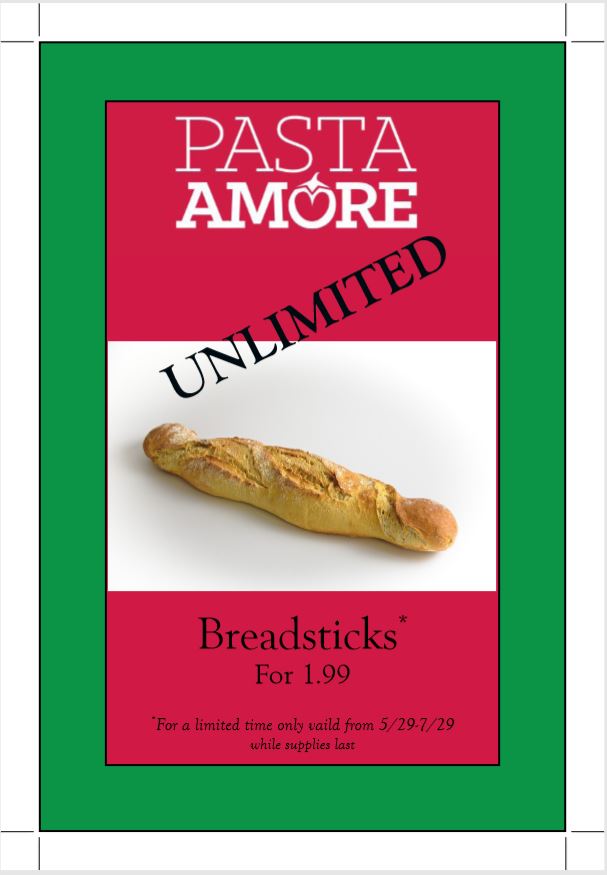
The front of the table tent was created to show their deal on the breadsticks.
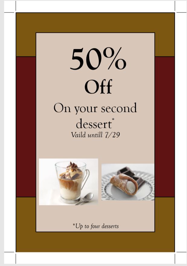
The back of the table tent was to show case the desserts and to also show them that there was a deal with the desserts.
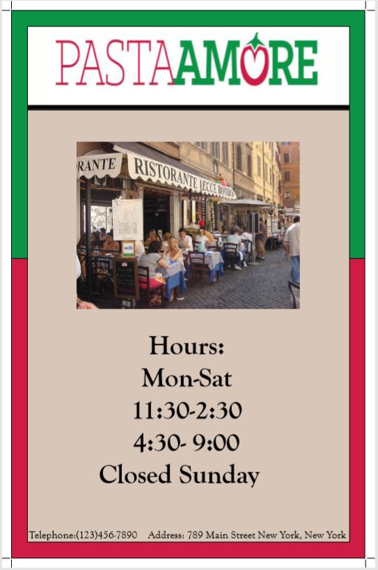
This menu cover was to show the customers Pasta Amore especially if they could take this menu home with them.
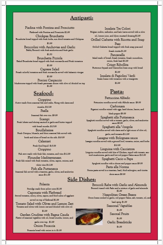
This was to show the customers the meu for the meal.
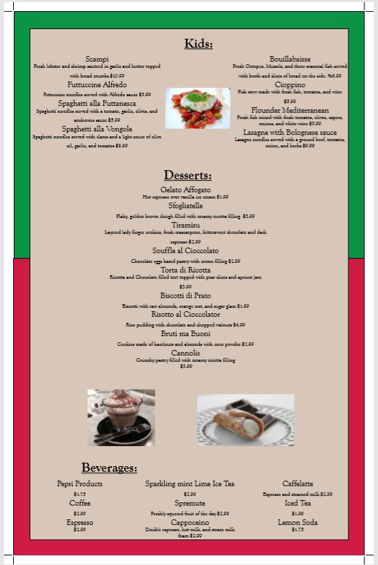
This was to show the desserts, kids menu, and non alcoholic drinks.
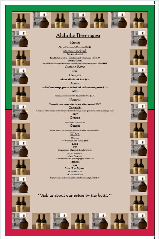
This was used to show the alcoholic drinks that are served at Pasta Amore.

This ad was done for Amythest Bay Resort & Spa. This magazine ad was to show the reader the deal and the experiance of Amythest Bay.

This was a project that we had to capture a person through not only the font choice but also through the words that the portriat is made up of.

This was the first design for the Danbury head coach. For this design he really didn't know what he wanted and he provided some examples to show me. I designed it similar to what he wanted and he said that he liked it but felt it was a bit much for what he wanted. He then asked if he could use it for something else.

This was the second design that I made for the Danbury head coach. This time around he finally said what he wanted in the design. The photos that were used were all ones that I took. The only one that I did use that was not mine was the lightning in the background which I got from the creative commons.