Upper Crust Bakery
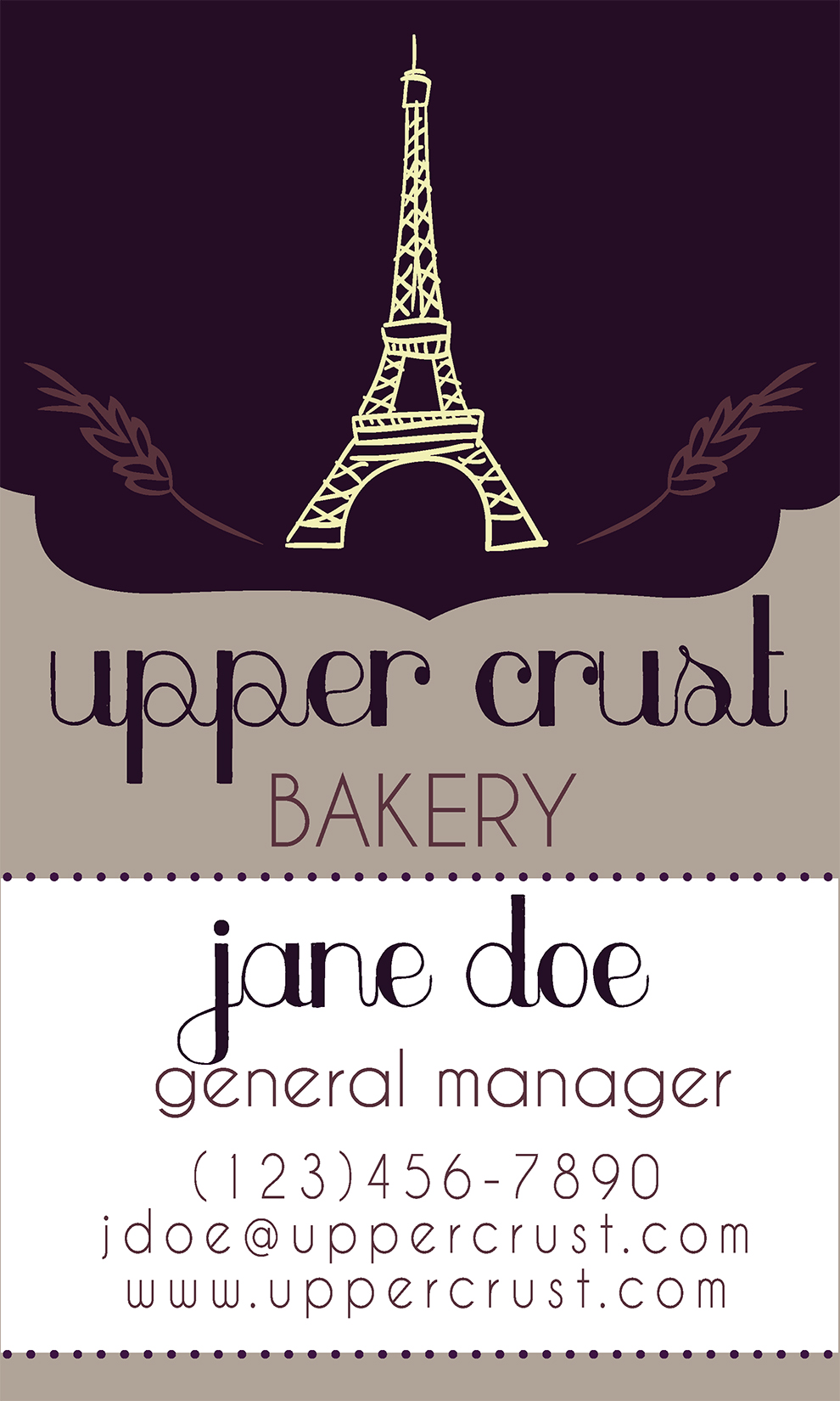

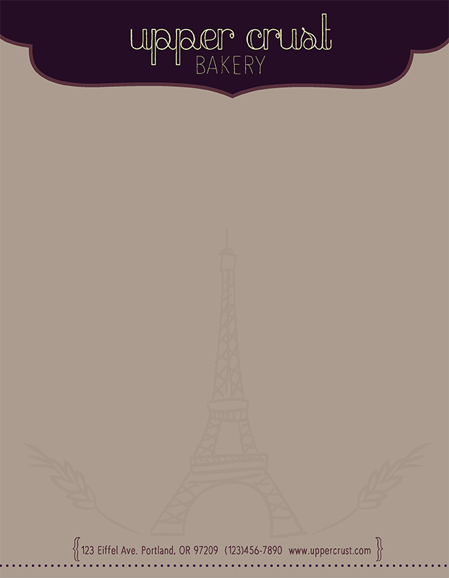
Upper Crust Bakery wanted a logo that would appeal to most adults, but also encompassed their origins in France. There was no better way to represent that than to include the iconic Eiffel Tower within the design. The wheat drawings are used on either side of the tower to stand for baked goods. These icons can be used independently of the text and still capture the essence of Upper Crust Bakery. The color palette was inspired from romantic and vintage feelings, reminiscent of the city of Paris. Thin, curving lines are used throughout the fonts and the drawings in the logo to show modern style and sophistication. The stationary utilizes components and colors from the logo to harmonize all pieces together in representing Upper Crust Bakery.