Project1b: Descriptive Statistics
Analyze a dataset and describe the situations using summery measures.
Dataset I chose presents U.S. Public Aid Recipients as Percent of population by regions and states in 1980, and 1990 – 1994.
Objective: a. Report any observed changes in the overall mean or median rates during the given time period.
|
|
|
|
|
|
|
|
|
|
Percent1980 |
Percent1990 |
Percent1991 |
Percent1992 |
Percent1993 |
Percent1994 |
|
Count |
60.000 |
60.000 |
60.000 |
60.000 |
60.000 |
60.000 |
|
Mean |
5.933 |
5.825 |
6.319 |
6.688 |
6.936 |
6.962 |
|
Median |
6.050 |
5.643 |
6.246 |
6.628 |
6.900 |
6.844 |
|
Standard deviation |
2.325 |
1.924 |
1.990 |
2.022 |
2.184 |
2.315 |
|
Minimum |
1.900 |
2.185 |
2.804 |
3.063 |
3.208 |
3.382 |
|
Maximum |
15.500 |
11.393 |
12.299 |
13.156 |
15.046 |
16.641 |
|
Range |
13.600 |
9.208 |
9.495 |
10.094 |
11.838 |
13.259 |
|
Variance |
5.404 |
3.700 |
3.961 |
4.087 |
4.771 |
5.361 |
|
First quartile |
4.200 |
4.541 |
4.844 |
5.143 |
5.324 |
5.347 |
|
Third quartile |
7.225 |
6.763 |
7.324 |
7.702 |
8.075 |
8.213 |
|
Interquartile range |
3.025 |
2.222 |
2.479 |
2.559 |
2.751 |
2.866 |
|
Mean absolute deviation |
1.771 |
1.478 |
1.525 |
1.525 |
1.623 |
1.675 |
|
Skewness |
1.165 |
0.767 |
0.697 |
0.697 |
0.953 |
1.313 |
|
Kurtosis |
3.682 |
0.678 |
0.681 |
0.858 |
2.036 |
3.958 |
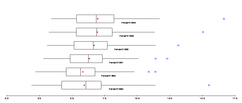
Let’s compare the years 1980 and 1990 first. Taking into consideration Skewness and Kurtosis of the data representing the year1980, we focus on median as a measure of central location. It can be concluded that percentage of population that were recipients of Public Aid in 1990 was less than that in 1980. After 1990 though, steady increase in number (percentage of US population) of Public Aid recipients is observed, (comparing both means and the medians for the dataset) reaching its highest in 1994. In order to present information graphically, we use side-by-side Boxplots that carry all summary measures for the dataset mentioned above.
b. Summaries findings of regional changes in the proportions of Americans receiving public aid.
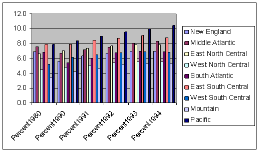
To observe an evidence of regional changes in the proportions of Americans receiving public aid in 1980, and then 1990 – 1994 time periods, we use bar chart below. It can be seen that various regions had different history of change in recipients of Public Aid. In 1980 the regions with the highest and lowest rate of recipients, were Pacific and Mountain. These two regions are experiencing steady grow from 1990 – 1994, while maintaining there positions on the chart in 1994 (Pacific highest, Mountain lowest). East South Central region has almost the same rate in 1990 and 1980. After 1990, rate rises in the region until 1993, and then drops in 1994. It can be seen on the chart that Public Aid rates went up and down from 1980 to 1990 in different regions, but in 1994 rates in every separate region exceeded rates of these regions in 1980.
In another example, a Job Data is given for selected metropolitan areas in the U.S. To find relationships among the variables and their change, Table of Correlations and Covariances is presented. Positive correlations between Recent Job Growth and Future Job Growth, and change in numbers of jobs for Blue and White Collar workers stand out on the table.
|
Table of Correlations |
|
|
|
|
|
|
|
Unemployment_Threat |
Recent_Job_Growth |
Future_Job_Growth |
Blue_Collar |
White_Collar |
|
Unemployment_Threat |
1.000 |
|
|
|
|
|
Recent_Job_Growth |
-0.102 |
1.000 |
|
|
|
|
Future_Job_Growth |
-0.239 |
0.643 |
1.000 |
|
|
|
Blue_Collar |
-0.023 |
0.352 |
0.503 |
1.000 |
|
|
White_Collar |
-0.142 |
0.023 |
0.307 |
0.619 |
1.000 |
|
|
|
|
|
|
|
|
Table of Covariances |
|
|
|
|
|
|
|
Unemployment_Threat |
Recent_Job_Growth |
Future_Job_Growth |
Blue_Collar |
White_Collar |
|
Unemployment_Threat |
0.511 |
|
|
|
|
|
Recent_Job_Growth |
-0.581 |
63.360 |
|
|
|
|
Future_Job_Growth |
-0.300 |
8.999 |
3.089 |
|
|
|
Blue_Collar |
-59.277 |
10315.461 |
3256.448 |
13555133.217 |
|
|
White_Collar |
-1591.402 |
2929.663 |
8488.423 |
35835667.424 |
247465217.871 |
In order to visualize the relationships of these variables we will use Scatterplots.
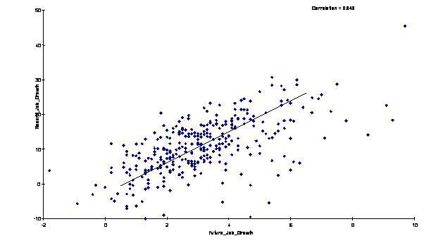
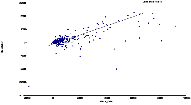
As it can be seen from the charts above, the relationship between the two variables, in both cases, is positive and pretty much linear.