The Aesthetic Beauty of Shogi
There is a certain aesthetic appeal to Shogi. The board is designed so that each "square" is not actually square, but a rectangle. This is so that when players are sitting in front of the board, they will actually look square (because of the parallex error). Which is a rather clever idea.
Then there is the appeal of the Koma (Shogi pieces). They have Chinese calligraphy, which has a certain beauty of their own. They look better than any of the "western" styled sets that I've seen.
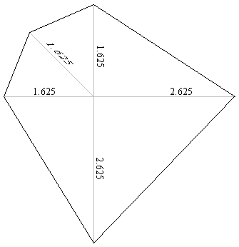
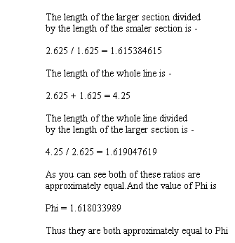
Koma are shaped in a shape that really catches the eye. I do not know how they came up with the design for the shape of the Koma, but they did a very good job. It is said that the golden ratio, is the most beautiful ratio. It revolves around the number Phi (1.618033989...). The golden ratio is when a line is divided so that the larger section of the line divided by the smaller section of the line is equal to the length of the whole line divided by the length of the larger section. One day I was just mucking around, drawing lines that are divided by the golden ratio. One such picture I drew looked suspicously like the shape of a Koma.
I probably should note that in his excellent book, "The Golden Ratio: The Story of Phi, the Extraordinary Number of Nature, Art and Beauty", Mario Livio writes, "In spite of the Golden Ratio's importance for many areas of mathematics, the sciences, and natural phenomena, we should, in my humble opinion, give up its application as a fixed standard for aesthetics, either in the human form or as a touchstone for the fine arts." [page 200].