PRINTING EXPRESSES
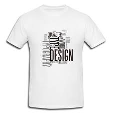
Think about what your design is going to represent. Maybe you are advertising your cleaning company, your rock band, or your favorite sports team. Maybe you’re using a personal illustration. The purpose of the design will determine the design. If you are advertising a company, band, sporting team, or brand, you will likely need to focus on logo. The Nike swoosh logo, for example, is a very simple but effective design. A design for a sporting team might feature the team colors or the team’s mascot. A design for your band might focus on an image of the band or a graphic that represents the band’s style or sound. If you are making a t-shirt to showcase a personal illustration or drawing, you will need to focus on how it will look on a t-shirt. Think about how original the illustration is and how the colors are working in the illustration. Consider using a photo in your design. Use your own photo, or a photo from the Internet, which are considered public-domain. You can also buy a stock image.
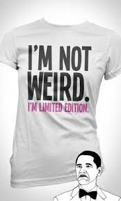
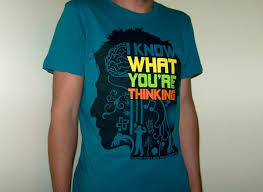
When designing a t-shirt, its important to think about color contrast. This means how certain ink colors in the design will appear against a lighter colored shirt or a darker colored shirt. Certain ink colors look more vibrant on a lighter or darker shirt on the computer screen than they actually do when printed.[1] When using lighter shirts, avoid pastel colors like yellow, light blue, or light pink. These colors will be visible on the shirts but may not be legible at a distance. And if you are designing a shirt with a logo, you want to make sure that logo is legible from far away! If you decide to use pastel colors, add an outline of a darker color to the lighter color to highlight the text and make it easier to read. Darker colored shirts look good with lighter ink colors, such as pastels. But be careful when using darker ink colors on darker colored shirts like cardinal (dark blue), maroon, or forest green. These colors may look great on the computer or in a drawing, but when they print, the shirt color sometimes distorts the ink color. As a result, they can appear more brown or dull. If you decide to use Adobe Illustrator to create your design, the Global Colours settings can help immensely with color schemes.
Would your design work better as a centered image, an image on the top left of the t-shirt or as a wraparound image? If you are designing a t shirt for a brand or company, a simple design in the center of the shirt may be the most effective. Don’t forget you can also use the back of the t-shirt to include a branding slogan (“Just Do It”). Or a song lyric from a song by the band you are designing the shirt for.
It’s best to sketch your ideas out before putting them on your t-shirt. Try out several different designs and color combinations. Keep in mind color contrast and dimension. Make sure the image is balanced and cohesive.[5] When in doubt, get a second opinion. Ask friends, family, or coworkers what design and color scheme they like best.