| D. X. Logan's Art Page |
| Finished works |
 |
| Anora is a design based around the drawing of a friend. We were both taking a character the other had come up with and modifying it to suit our own style. If it gives you any indication of how I work, I spent days playing with the pose on this and did research on the sword and other items in the picture... then turned around and ended up using the same exact pose and only adjusting the different devices of the picture. I like how it turned out though. |
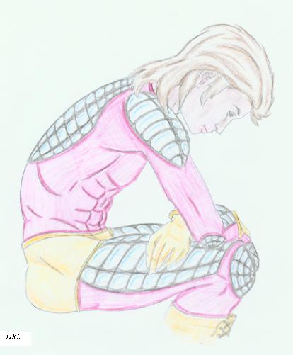
| Just a quick sketch done in crayon, but I ended up really liking how the colors worked togeather and how the body was set. The obvious musculature despite the small size of the creature helping to suggest a power to her deceptively alluring form. I liked it anyway... |
 |
 |
| This is actually an older work of mine. Back from highschool, but everyone seems to like it. Personally I see a lot of flaws in it, but the shading is pretty reasonable. I HATE that hair, but I was still learning, so no big deal. Since I seem to be the only person who feels it isn't worthy, I decided to put it up with the more finished works. I doubt I will ever revisit it to fix the things I see as flaws. |
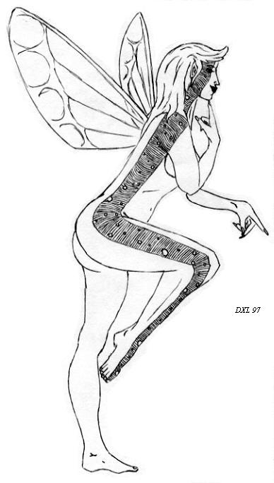 |
| For years I titled this 'Fairy Pointing' which was dull and uninspired. This was actually the fifth version of this picture, the first being done with pencil and shaded, the second with pencil and the tattoo you see there minus the lines. Third was done in marker. The fourth was done much as this one, but with a different foot positioning to imply flight, and this was the last where I finally did the full thing in ink and added interest with the lines among the dots. I like it. The new name 'Glitter' comes from a small fairy in a game I played. (If you know what a Mush or an RPG is, you will understand.) |
 |
| Nyx was a picture never meant for show. Odd isn't it? I drew her as part of a game I was running to add visuals. She was one of the three forms of a creature known as Nil-nyx. For those who care, it was a Void Elemental of sorts. Anyway, the theme was all dark colors so blacks, greys, and washed out colors were the way I went on all three. The other two didn't end up being worth showing, but this one came out nicely. I have no idea where I got this pose, so I am wary to claim it fully as my work, but regardless of that fact I came out quite good I think. |
 |
| You all probably know this creature quite well. I got the pose used in the drawing from a painting done for a comic and I modified it very little from that design. I mostly include this among this section due to the quality of the finished product. It was the first time I had ever tried using a painting as a model and I like the way it turned out. |
 |
 |
 |
 |
| The Raver is a work done in a college art class on a whim. Technically this is not a finished work, but since I never got around to doing it in pen and ink, this will have to do. I didn't have a model on this, but was looking at some random bit of junk in the room and noticed it gave the impression of a person dancing. I sketched up a rough pose and fleshed it out. This is the end product and I really ended up enjoying the movement of the picture. |
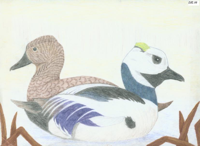
| Steller's Elders was a few week long project for a competition. Minor and local, but hey, we work with what is around us right? I came across a photo of these two in a bird book somewhere and thought they looked quite interesting. Took me a bit of time to decide the angles I wanted and where I wanted the placement, but in the end I went with a side view done in colored pencil. Looking back, I would have spent more time on their surroundings if I could, but deadlines and such on competitions don't tend to have any leeway. |
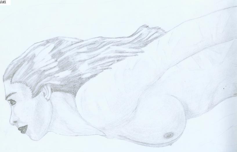
| This is just a picture of a woman swimming. Again, it is an older work and while I like the shading, I think the hair and face could use some work. Still, it ended up being well proportioned and seemed to follow the flow of the water well. Overall I like this one pretty well, flaws and all. |
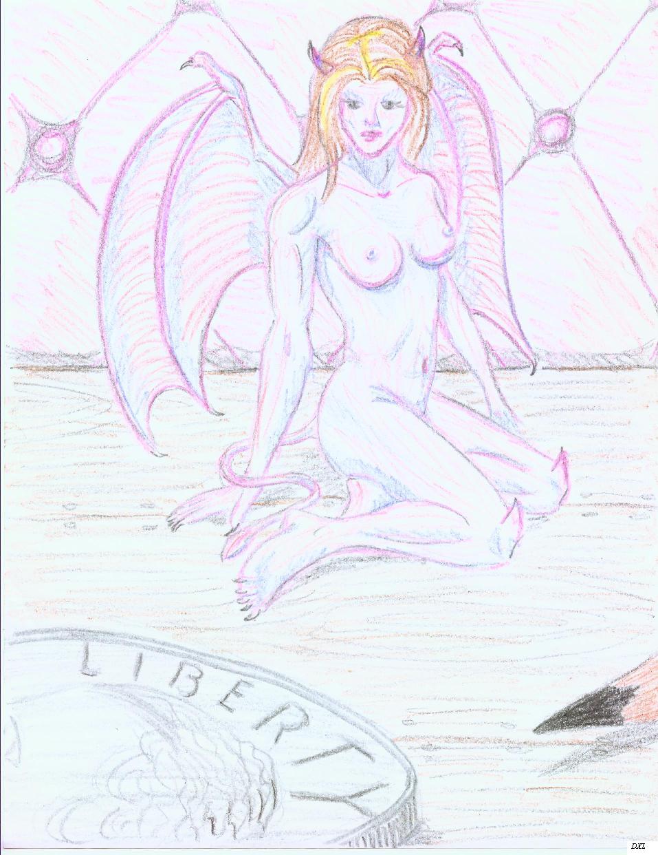
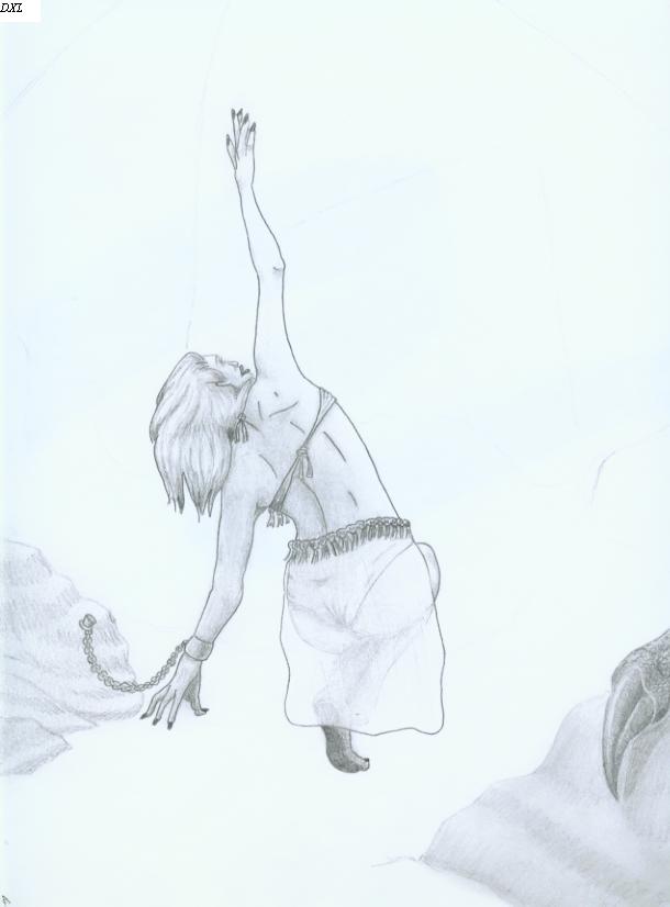
| Virgin Sacrifice evolved from a sketch of an unusual pose. When I looked at it, I saw the potential for something really interesting so I did a second version with shading and a loosely sketched in dragon. It was a nice picture, but it seemed too strait forward and needed something. I added a bit of clothing to her adding a bit of interest to her, then I removed the dragon and reworked the concept of him. Two days of working and finally I had that single claw the way I wanted it. I intended to eventually add more, but never did. Perhaps one day I will do so, but for now, this is the finished product of a lot of labor. |
| Other works These are works that are incomplete or which have origins I can't recall for where I obtained the models. For those who are wondering, this is where most of the males in my artwork reside. As such, even though some may seem like finished works, I either plan to return to them at a later time, or they are something I am not entirely certain I can claim is totally my own original work. Then again, some are just small doodles. Regardless of origin, enjoy. |
 |
 |
 |
 |
 |
 |
 |
 |
 |
 |
 |
 |
 |
 |
 |
 |
 |
 |
 |
 |
 |
 |
 |
 |
 |
 |
 |
 |
 |
 |
 |
 |
 |
 |
 |
| Tech and Sci Fi |
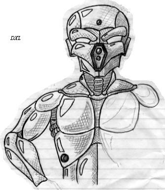
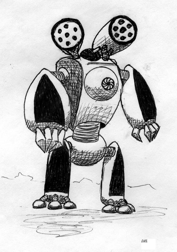
| This is the second version of the above warbot. I cleaned it up and refined a lot. I hated those feet on the original. |
| This warbot emerged from a random drawing of a dog. if you can believe that. The way the animal curled made me think of the arm design. I liked the eye in this, evem if it is impractical. |
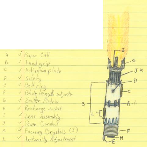
| Oddly, no, I am not a Star Wars fan of any great note. This was made for a game where I was playing a Jedi and I thought it was a nice little note on how to build his lightsaber from a list of component parts. |
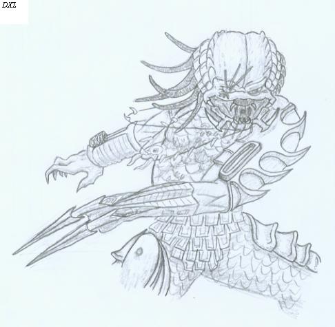
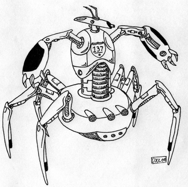
| Why is this in with the technology? Mainly due to the arm design. The armor is similar to a lot of robotics in a way and the arm design clearly get's its origin in the bot arm seen in other works here. |
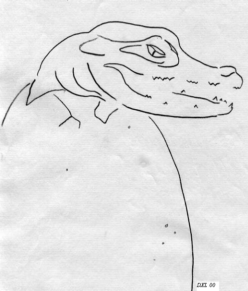
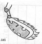
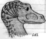
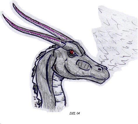
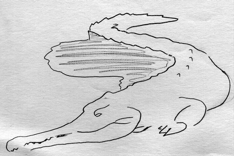
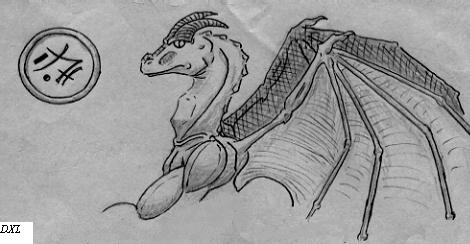
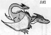
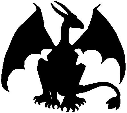
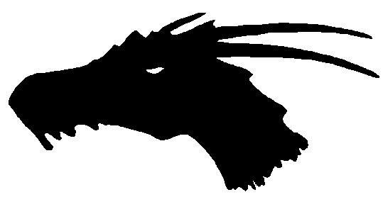
| These are just a few of the dragons I have done over the years. Unfortunately I lost a great many of my works of art to a leak in my storage area, so these are the ones that survived in good enough condition at the time I started scanning my works into the computer. |
| Dragons and Reptiles |
| Humans (or close enough) |
| Lotas Amanodel. What can I say? Another drawing based on a character. Not my best, but it says a lot about him if you look closely at the objects in the work. |
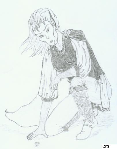
| Noticing a pattern? Another RPG based character. No idea where I got the pose, so can't in good conscience claim it is mine. He has an interesting story... and a very odd fashion sense. |
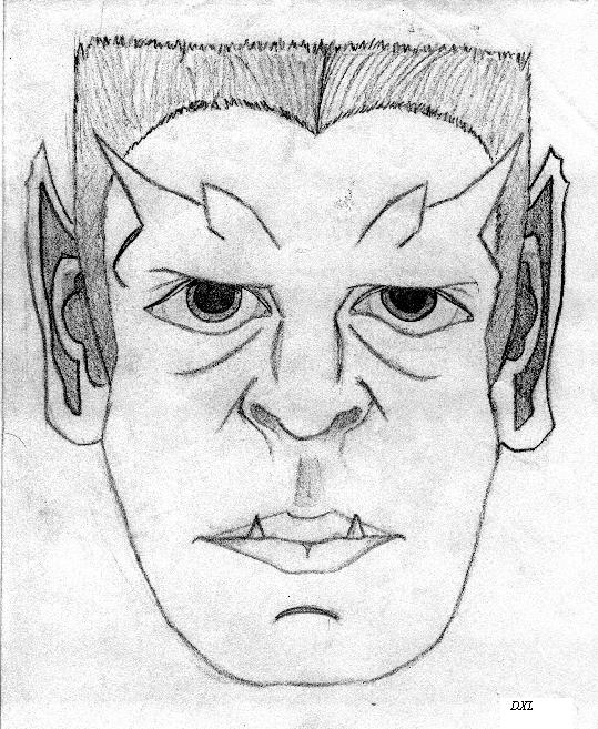
| Like looking in a mirror... or not. This is a self portrait, after a fashion. Sure it is scary, but that is exactly how my eyes looked back then. Part of a study of the TV series Gargoyles, for those who recognize it. |
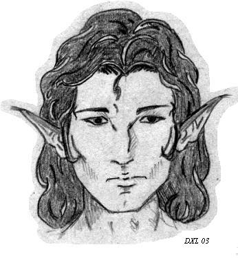
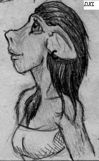
| I have this listed as an elf head, but it came from a centaur. I had a profile that I never shaded as well. Pretty standard face drawing really. |
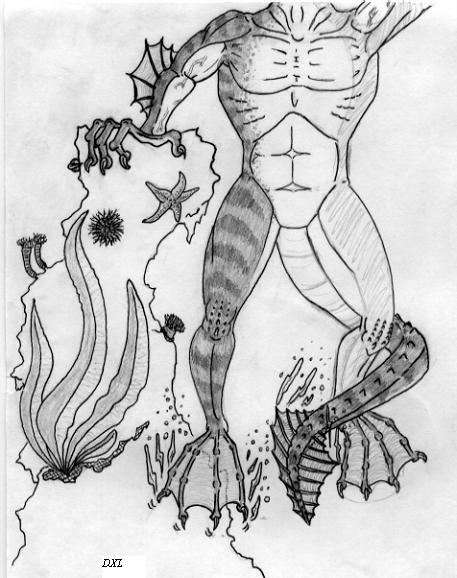
| The better part of my tech drawings have never survived to the current day. I am honestly more adept at organic structures, but every now and then it is fun to do a bit of science. Especially when you merge tech and flesh into a single entity. |
| Not quite human |
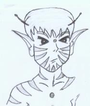
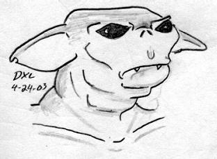
| Okay, you have to know the story to this little goblin because I still find it so sad where I can find my inspiration sometimes. I will spare you the details and say I was in a restroom for obvious reasons and was looking at the tiles on the floor. For some reason, a pattern caught my eye and I sketched it out on a piece of paper (no not toilet paper!)with the pen I always keep handy. I then reworked it a bit until I had a version I liked. This little fellow is the end product of that. |
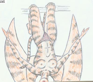
| She isnt much, but I liked this picture for some reason. Cute little girl with tiger stripes. still have no idea what color scheme I would use on her, but she is interesting none the less. |
| Another of my random studies of humanoids. I wanted to see if I could find a way to make a creature such as a troll, still look aesthetically pleasing. The most common comment about this picture is: Unsettling. The second most common comment: Disturbing. |
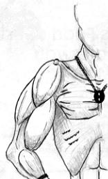
| I think the biggest problem with starting a sketch where your intention is just to do one part of the body, is that you don't plan your space out to deal with what happens if you end up enjoying the drawing. Thus.. decapitation. I need to treat sketches like I do finished works. |
| Again.. headless body. Unfinsihed work at that! I was originally just doodling an arm during a muscle study series I did and ended up getting an interesting idea from it. I may one day finish this, and if so, I will change those horrible hands and feet!!! |
| Strange Creatures |
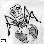
| An alien creature much like a flytrap, but animal instead of plant. I still have absolutely no idea where I got this idea, mostly just random squiggles on a page originally and noticing how they sort of looked like a creature from an alien world. How I saw it in the squiggles is a mystery |
| What is it? Um.. scorpion sort of maybe? Something you don't want to come at you, that is for sure. I believe this little fellow would make another nice addition to some alien ecology, but I never really came up with more than this picture. |
| This little fellow evolved from the Goblin picture in the 'not quite human' section.. I needed to work out how a Hormunculous might look. Following a few basic guidelines, this is the odd little thing I came up with. FYI: no the wings don't come out of his head. There is an extra joint that is unseen from this angle. |
| A very rough sketch. This creature came from a story I worked on at one point where a race of people used a strange symbiot to enhance their bodies. Those who were from other places thought they were monsters, but the creatures were peaceful despite their appearance. |
| Artifacts and Items |
| Icons and outlines |
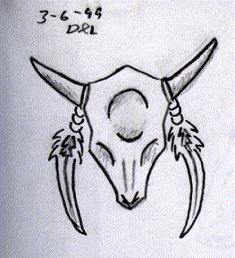
| Three of these came from the same series of sketches done for the Raver that is among my finished works. Avoiding details and stylizing the things based on outlines and shapes was the key element to that particular series. The steer skull I did years before from a ceramic one attached to a dreamcatcher in my room. I revamped it a bit later and added a bit of shading to make it stand out a bit better. Overall I really liked it best of all my icons and outlines. |
| Spare Parts |
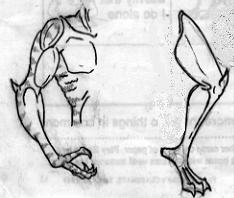
| I debated putting this among the Sci Fi pictures, but since it was more organic and really didn't suit that section, I decided to put it here. No, I have no clue what it is outside of being some sort of claw. |
| I am very proud of the way this turned out. It was a part of a study where I was merging various animal traits with those of humans. This original sketch was Less than an inch tall, so considering it was done with pencil and ball point pen, I feel good about the look. |
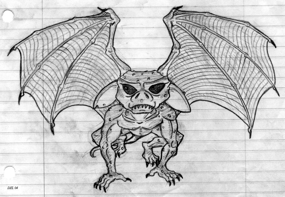
| Ever see the Grimlin's movies? This was something inspired by that. Rather random, but I liked the way it turned out so I went ahead and added it to my collection of things worthy to show. If I had it to do over again, I would use good paper and I would rework the foot some. |
| Okay... first let me say that I see many things wrong in this picture. That said, I found the sharp contrasts in the muscles drew my attention to it for some reason. I debated putting it on here, but I suppose it pays to show the bad with the good. |
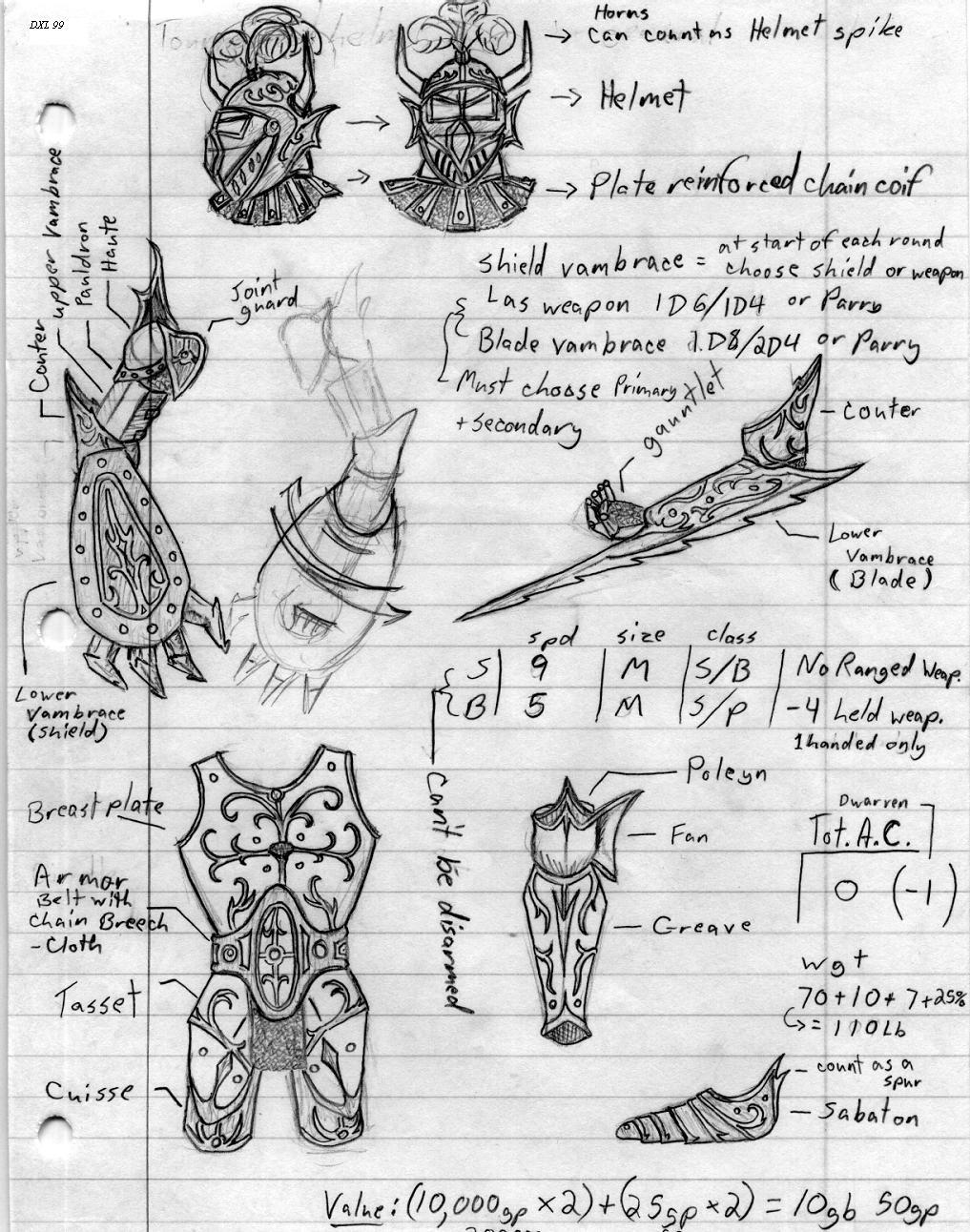
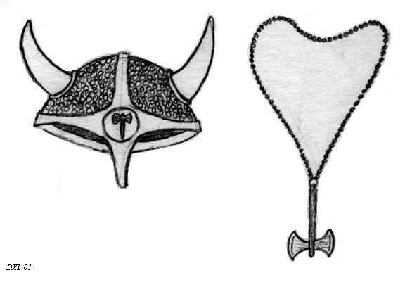
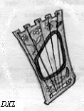
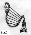
| Two harps and a few bits of barbarian gear. What can I say really? The pictures of the harps didn't scan well, but the helmet and necklace did wonderfully. I may expand this section later if the muse strikes. Maybe some swords, amulets, staffs and other items. For now, you will have to settle for these three. |
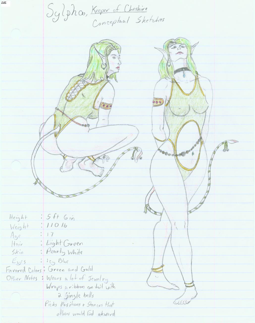 |
| Sylpha, Keeper of Cheshire. Loony as they come and nuttier than a fruitcake. This was yet again a character from a game. Planescapes as I recall. I used real women as models for this, but dear god it was hard finding women with hips to match the style of that game world. (Look at the art from it sometime and you will see what I mean.) I actually used two seperate models for this instead of the same one from different angles, but I think it turned out quite well. I was a little upset with myself for doing it on lined paper and using cheap colored pencils. I may someday revisit it and touch up a few mistakes as well as do it in better quality materials. Good multiangle dynamic going on this one too. |
 |
 |
 |
 |
 |