Web interfacing with Photoshop --
Part one
Section: workshop >
photoshop
Author: Trevor Morris
Posted: 28/10/2002

Some of the best Web sites use one of the most basic
navigation devices: tabs. This first part of a two-part workshop will show
you how to exploit the power of Photoshop's shapes and styles to create a
completely extensible tabbed interface.
Laying the foundation
Create a new document named "Tabbed Interface" that is 640 x 86 pixels
(W x H). Since the image is destined for the Web, leave the resolution at
72 pixels per inch and set the Mode to RGB Color; choose Transparent for
the Contents.
 Begin by creating the gradient background
for the tabs. Set the foreground colour to R45, G158, B240 (#2D9EF0), and
set the background colour to R6, G24, B38 (#061826). Select the
Rectangular Shape tool (U). To ensure that all shape layers have crisp
edges (that is, no anti-aliasing), turn on Snap to Pixels in the Geometry
Options drop-down (the downward-facing arrow to the right of the Custom
Shape tool button). Begin by creating the gradient background
for the tabs. Set the foreground colour to R45, G158, B240 (#2D9EF0), and
set the background colour to R6, G24, B38 (#061826). Select the
Rectangular Shape tool (U). To ensure that all shape layers have crisp
edges (that is, no anti-aliasing), turn on Snap to Pixels in the Geometry
Options drop-down (the downward-facing arrow to the right of the Custom
Shape tool button).
Draw a rectangle from the top left corner that is 48 pixels high and
the full width of the canvas. Use the Info palette (F8) to see the
dimensions of objects while you draw them. From the menus, choose Layer,
Change Layer Content, Gradient. Choose Foreground to Background from the
Gradient drop-down and enter 0º for the Angle.
Choose Stroke from the Effects button at the bottom of the layers
palette (the one that looks like a stylised "f"). In the resulting dialog
box, set the Size to 1px, the Position to Inside and the Color to black
(R0, G0, B0).
Press Ctrl+R (View, Rulers) to turn on the canvas rulers and drag two
guides onto the canvas: a horizontal guide at 199 pixels and a vertical
one at 29 pixels. Also, ensure that View, Snap is turned on
(Ctrl+Shift+;).
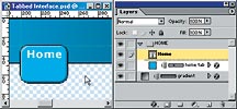
To keep things organised, create an individual layer set for each tab.
For the first tab, add a new layer set named "HOME" (Alt-click on the
button that resembles a folder, at the bottom of the layers palette). Set
the foreground colour to R45, G160, B243 (#2DA0F3).
Select the Rounded Rectangle Shape tool (U) and, in the Options
palette, set the Corner Radius to 8px. Beginning at the intersection of
the guides you added, draw a rounded rectangle that is approximately 50 x
40 pixels.
Choose Stroke from the Effects button menu. Enter 1px for the Size and
choose black (R0, G0, B0) for the Color. Before closing the Layer Style
dialog box, select the Bevel and Emboss effect from the list of effects on
the left (click on the name, not just the checkmark).
Establish the following values (leave all other values set to their
defaults): Depth: 170%, Size: 2px, uncheck Use Global Light, Angle: 135º
and Shadow Opacity: 50%.
Place another horizontal guide at 42 pixels to use for aligning the tab
labels. To precisely place guides, zoom in and hold the Shift key while
dragging to force the guides to snap to the ruler increments.
Press D to reset the colours to the defaults and then press X to
exchange the foreground and background colours -- this is the fastest way
to set the foreground colour to white. Select the Type tool (T) and use
the Character palette (View, Character) to establish your preferred font
for the labels (I used 11pt Verdana, Bold with a tracking of 50pt and
anti-aliasing set to Crisp).
Click to place the type cursor on the new guide, over the tab. It
doesn't matter how precise the initial placement is, you can reposition
the layer after. Type "Home" and then press the Enter key on the keypad to
commit the text (or Ctrl+Enter on the keyboard -- or click the checkmark
in Options).
Cover layer
Add another layer set named COVERS. Select the Rectangular Shape tool
(not the Rounded Rectangle tool) and draw a rectangle that fills the
remaining transparent region of the canvas. Add a black stroke effect set
to Outside.
This new cover layer works well for the normal states: however, you'll
need to hide the black stroke for each tab's click state -- this will
become more apparent when the time comes to animate the interface. On a
separate layer within the COVERS set, create a white, single-pixel
horizontal line that is the same width as the interior base of the tab
(i.e., the width of the tab not including its stroke).
Use any tool you like to create the new cover. I used the Rectangular
Shape tool. If the new layer has any effects applied to it, delete them
and then turn the layer off.
If you're up for a challenge you can use
animated channels in conjunction with the Layer Mask Hides Effects option
(under Advanced Blending options in the Layer Style dialog box) instead of
creating the extra cover layer for each tab.
Reuse and recycle
Duplicate the HOME set by dragging it onto the New Set button at the
bottom of the Layers palette (or right-click on the set and choose
Duplicate Layer Set). Name the new set "PRODUCTS" (or whatever you wish)
and then use the Move tool (V) to position it to the right of the Home tab
-- add the Shift key to constrain movement to the horizontal axis. Leave
about a one-pixel gap between the tabs.
In the Layers palette, double-click on the type layer thumbnail
associated with the new set and change the label to "Products". Hold down
the Ctrl key (or use the Move tool) to position the text.
If the label
is too large for the new tab, use the Direct Selection tool (A) to select
the right-most four points of the tab and (Shift-) drag them to the right.
Do not use Edit, Free Transform as this will result in elongated corners.
If, while trying to select the four points, you keep inadvertently
selecting other layers, simply turn them off (that is, toggle their
visibility via the eyeball icons).
One more thing: press Ctrl+Shift+H (View, Show, Target Path) to toggle
the visibility of paths/shapes.
Repeat the above procedure to create as many tabs as you want in your
interface. Remember to keep all the tab sets below the COVERS set.
Also, don't forget to create the single-pixel cover layers for each tab
-- name them to avoid confusion.
Wrapping up
Complete the interface by adding your own personal logo or watermark in
the upper left corner. You may also want to dress up the gradient or
change the colours.
Next month, you'll use ImageReady to slice the interface, create click
states for each tab and then optimise the interface for the Web.
.gif)
|