    Layout
   Here are a few guidelines we follow to design the forms.
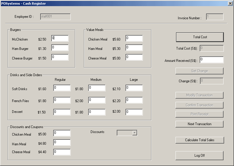
 · Consistently group related controls together – for example, all the fields regarding
   burgers are placed together. Grouping saves valuable space on your form and improves
   the flow when maintaining data.
 · Use rectangles and lines to separate groups of related controls. This helps the user
   associate the controls with the topics they relate to.
 · Use space between controls to indicate relationships. For example, little or no space
   between controls shows that the controls depend on each other to describe a particular
   piece of information.
 · Use alignment to help indicate related controls. Staggering groups of related controls
   gives a visual clue that they are included in a group.
· Align controls both horizontally and vertically to give the form an orderly appearance.
 · Balance the placement of controls on the form, so that they are evenly distributed over
  the form.
· Large rectangle controls can be used to either frame or separate information on the form.
  Font
  There are some guidelines when we are regarding fonts.
· Mixed uppercase and lowercase text is easier to read than text set in all-capitals.
| 