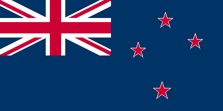
Over the years, a number of alternative designs have been suggested. This is mainly because our flag looks so much like the Australian one. However, a lot of people also want to have something that is focused more on New Zealand as it is now, rather than the colonial past. The most recent well-publicised suggestion was a black flag with a Silver Fern motif. While our sports teams use black (refering to the All Black rugby team), as a flag it has an unfortunate historical link to piracy.
I remembered that the 1974 Commonwealth Games in Christchuch had a logo that used the letters NZ to look like the Union Jack. I always thought it was a particularly good, strong design, so I wondered what it would look like if I replaced the Union Jack on our flag with this logo. The logo was square, so took up the whole left hand side of the flag rather than the corner as the Union Jack had. This left the right hand side for the Southern Cross - and that's a good, clear design too. The logo had very vivid colours - a little too bright for my taste. I took the opportunity to choose new colours, as I thought the existing flag looked faded.
It doesn't chuck away all our past, but it does look to the future.

If you like it, take a copy. I think it's a good design.