Lesson 3 consists of four topics. To see their titles, click on the Contents tab in ActivStats.
Please complete all activities for all four topics, including the exercises. Notice that the first activity of 3-1 (the lecture "Categorical Data") includes some study questions. Don't skip them - see if you can answer them. If you are unsure of your answer, write down the question so you can bring it up before the quiz. The quiz will test you over your understanding as measured by the exercises and study questions.
Pay particular attention to word usage; for example, the use of "proportion", "percentages", and "distribution" in the 3-1 lecture. You must internalize the exact technical meaning of the vocabulary words of statistics, otherwise you will not be able to understand what you will hear or read about this subject, nor will you be able to communicate your own ideas effectively.
Section notes:
3-1 Categorical Data*: The narrator uses the term observed
counts. Another term for that would be frequency.
The term relative frequency has been defined here to mean the percentage
of individuals in a given category. It can also stand for the
proportion,
as defined here. The distribution of a variable summarizes
its values by describing the actual or relative frequencies of each of
its distinct values. The distribution of a categorical variable
can be described in two major ways : as a table, or as a bar chart.
*the format here is to state the Activstats section-subsection
(3-1), and then name the activity within the subsection, in this
case, the exposition titled Categorical Data.
3-1 Bar Chart: The book uses the term bar graph
for what is referred to here as a bar chart.
3-1 Data Desk: Notice that Data Desk displays the raw frequencies (observed counts), as opposed to the relative frequencies, as in the "Categorical Data" exercise. Does it matter? Double click on the haircolor dataset icon at the lower left to see what the data looks like. Note that it contains one entry for each of the 5387 individuals studied. Creating a bar chart "reduces" this data to frequencies of each category. But you can't read the exact number in each category from the bar chart!
We now move on to how to visually summarize quantitative variables (variables whose values are measurements or counts).
3-2 Stem-and Leaf Displays: Such displays are not practical for large sets of data, and will not be a major tool as we proceed, but the lectures use them as a teaching device, so we need to know what they are.
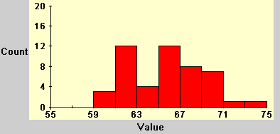
3-2 Histograms: The histogram (sometimes called a frequency histogram) is the graphical (as opposed to tabular) representation of the distribution of a quantitative variables, corresponding to the bar chart for categorical variables. Notice the use of the word bin. This word is not used in the textbook, but stands for what the text refers to as classes (p. 15). Each class or bin contains measurements within a particular range of values, e.g. 3.5-6.5. This bin would have width 3. All bins must be of the same width. Be sure to play with the slide to see the effect of the number of bins on the shape of the histogram. This is not a Data Desk demonstration, however. Later on, I will show you how to change the number of bins of a Data Desk histogram.
Notice that histograms as shown by Activstats put the horizontal axis "tick marks" at the left edge of the bar representing the bin. See below the tick mark at 59. The bar to the right of it shows that there are 12 individuals on the range 59-61 (the bin width is 2):
In the book, when the width is 1, those tick marks may appear in the middle of the bar. See the graph on page 23. Activstats never places the tick mark in the middle. For your work, either style is acceptable (but only when the width is 1).
This lecture does not show you how to create a histogram using Data Desk; that will be shown in a later activity. However, it should provide you with enough information that you could create a histogram by hand, which you will be asked to do in the homework.
3-3 Displaying Distributions with Dotplots: Dotplots are similar to stem-and-leaf displays, and like them, will not be a major tool. But they are useful for use with small sets of data, and are used by ActivStats as a teaching device.
The first activity is a lecture. The second activity is a Data Desk activity. Notice that the dotplot shown from Data Desk doesn't look like the one shown in the first activity. That's because Data Desk doesn't "stack up" the dots as does the lecture. Too bad! But you can see "how many" individuals are represented by a single dot in the Data Desk dotplot by using the "?" (query button) on the Tool Bar.
3-4 Describing Distribution Shape: The last activity in 3-4 shows you how to create a histogram from data using Data Desk. While that window is open, practice varying the bin widths to see its effect on the appearance of the histogram. Here's how:
| Practice (keep) | Credit (hand in) |
| 3.1 | 3.2: In ActivStats, click on homework and select "6. Accidents". |
| 3.3: (1) make a dotplot in the style shown
in the first exercise of ActivStats Lesson 3-3
(2)-(5) answer 4 questions Note: Please use the labels shown here in red to label your answers, so I can identify them. |
3.4: By hand*. (1) create
dotplots in the style shown in the first exercise of ActivStats
Lesson 3-3 (2) answer the question *"By hand" means to do it without using statistics software (like Data Desk). You need to be able to do most analyses by hand on small datasets so you understand what the software is doing when you use it for large datasets. |
| 3.5 By hand (1) make a histogram for Normal Corn only - use a bin width of 10, starting at 270 (2) answer (b) | 3.7, part(a) By hand (1) make a histogram - use a bin width of 1 (2) answer the question |
| 3.9 | 3.8 |
| 3.11 ActivStats H/W 10. (1)graph
(histogram) - use a bar width of 80 (2)
answer question
Note: For ActivStats H/W, unless "by hand" is specified, use Data Desk to do the analysis. You may print the Data Desk graph, and paste it into your H/W. |
3.13 ActivStats H/W 11. (1)
graph (histogram) (2) answer
question
Note: For ActivStats H/W, unless "by hand" is specified, use Data Desk to do the analysis. You may print the Data Desk graph, and paste it into your H/W. |
| 3.15 ActivStats H/W 13 (1) histogram
(2)-(3) questions |
3.14 ActivStats H/W 14 (1) histogram
(2)-(3) questions |