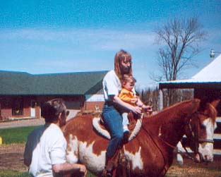
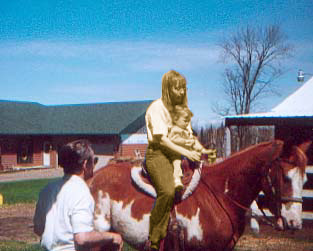
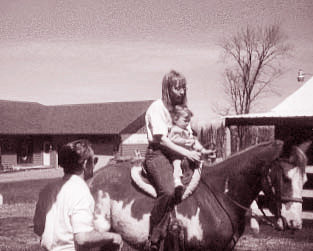
| This is the original picture. That's me on the horse, with my 14 month old niece and my dad standing next to us. My niece's first ride! :) |
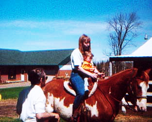 |
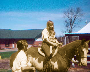
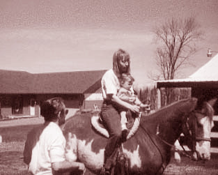
With this picture, I simply overlaid (or multiplied) a copy of the original. It brightens the picture somewhat, and shows more contrast, I think.
|
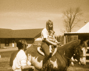 |
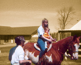
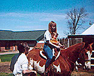
For this, I had to play around for a while to get the colors I wanted. There is a VERY wide variety that can be done, and I'll try to get one or two of them up here too. I call this "sepia tone", though I'm sure there are other names for it. |
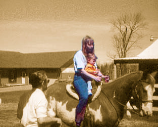 |
In this picture, I made a "mask" in the sepia tone and had it cut out so that the color could show through. |
 |
Basically the same as the last one, only this time leaving my niece and myself in sepia tones. Kind of interesting... |
 |
Again, basically the same as the last two, only with a larger selected area to allow the color through. |
 |
An inverse of the last picture. I think it makes it look like a composite of an antique photo and a recent one.
|
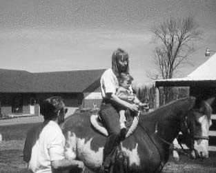 |
Instead of sepia tones, I simply discarded all color information, making it a black/white picture.
|
 |
This one uses a burgandy tone set, instead of sepia.
|
 |
This is very similar to the burgandy tone, however it is a slight variation - red. There are aqua, green, brown, blue and purple variations as well, but I thought these two were the most pleasing to the eye.
|
 |
This was a "just for fun" picture. It makes it look more like something that was painted, rather than a scanned photo. There are many variables associated with the "filter" I applied, but I liked these results best. :)
|