|
|
a look into the past and present of this site ...
|
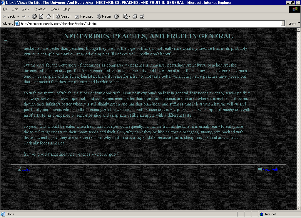
version 3.0
winter 2001 -
what's new:
1. cascading style sheets formatting (though there is still quite a bit of table usage for positioning)
2. switched to png format for most graphics
3. new site structure with 'news' appearing on the main page a menu to other places
added 'about me' and 'links' pages
4. switched the title images' font to 'international chunkfunk' and made them anti-aliased (so they look smoother)
general comments:
this is probably as advanced as my site is ever going to look. usage of cascaded style sheets somewhat makes standardization easier but touching up some types of site styling is still a pain to do; and while i like the transition to png from gif, some browsers unfortunately don't render them correctly so things are kinda ugly if you're using an old internet browser. but overall, i like it, i think it looks cleaner than before (and a clean looking site is what i'm mostly going for in terms of styling and usability) and the background hue is starting to grow on me.
|
|
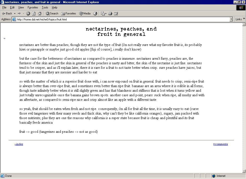
version 2.0
fall 2000 - winter 2001
what's new:
1. ditched a lot of the little iconic icons that came with each link
2. ditched the background mainly because of readability issues
3. changed color scheme to basic black and white
4. added 'updates' page
5. made my own (somewhat based on a generic one) form mailer script
6. added title images instead of just text
general comments:
i was pretty happy with this design for quite a while. it looked nice and simple (though having the topics on the main page was getting kinda annoying as i added more views). the un-smoothness of the title images was the main thing that pissed me off, and the fact that it was a real pain to do any updates to the site. this is what i guess most people would think of if they had to think of what my site looked like because this is the only version they have really seen.
|
|
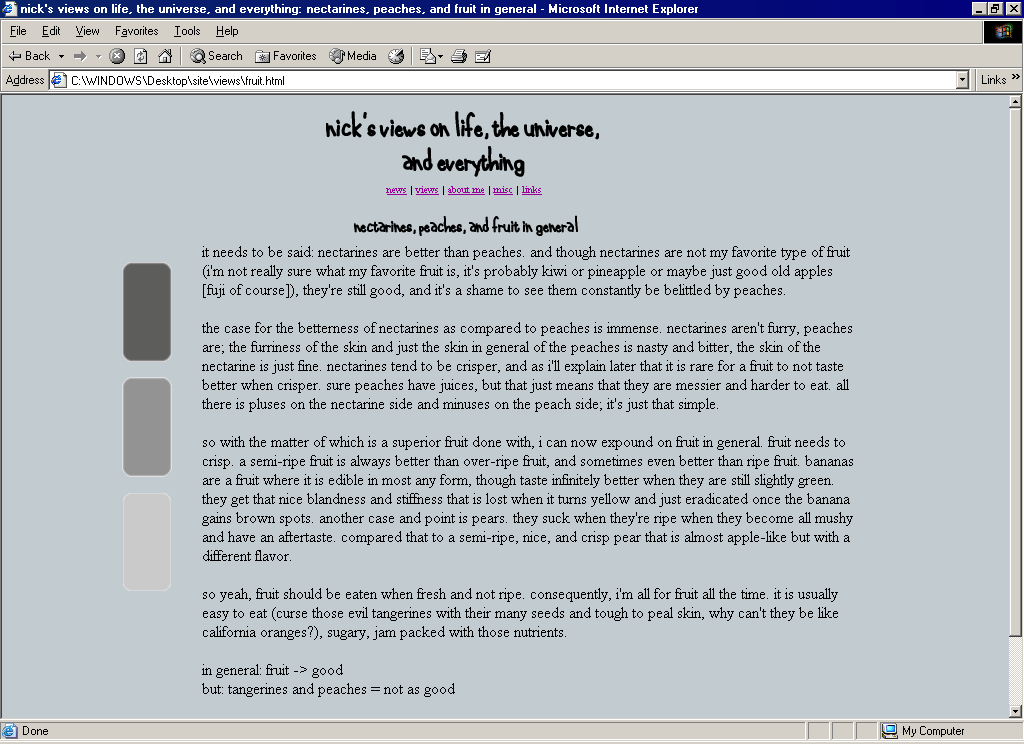
version 1.0
summer 2000 - fall 2000
what's new:
1. everything, it's all brand spankin' new
general comments:
i had the content, but the styling was sorely lacking. it's not too ugly though it's not even close to looking good. this is the sort of site that i think most people end up making and living with (well it's the way most people's personal sites look like if they aren't artists or web designers or something). it's got some sort of garish background, some text, and some links. sure it works ok, but things are kinda hard to read with the background and the choice of unique font colors doesn't exactly help either. overall a pretty mediocre site, but i did put a lot of work into it (writing stuff and making that background and all the little icons and stuff) so it was a decent start.
|
|