Some output predictions:
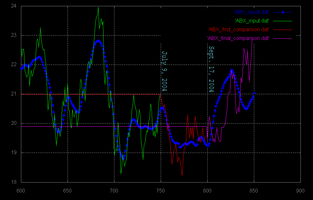
The thin lines are the actual closing price data,
the thick blue lines are the output results of the artificial intelligence.
The thin green lines make up the only data that was shown to the AI. These data points are needed to train the AI.
The red and purple lines are the actual price data, plotted here to compare how well the AI was able to predict the movement of the magnitude.
others to be posted soon..
...