 |
|
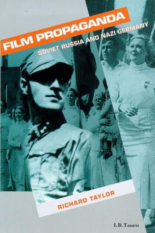
| The main difficulty here was that the book was about both Russian and German totalitarian cinema, so one image alone was not going to be adequate. Budgetary restrictions prevented us from sourcing images beyond those that were going to be included in the book and these were not thought to be good enough quality for the cover. When I came to the company, the designer had produced a design using just one, rather vague and irrelevant image, that was completely unsatisfactory to the editor. I proposed a collagist approach with text at diagonals in the manner of the Russian constructivist photographer Rodchenko. This allowed us to include images from both cinematic |
| traditions in a way that was relevant. I also proposed the use of blocky red text and a grey background as an aesthetic common to both Soviet and German propaganda imagery. Finally, I selected two of the images from the book and roughed out a layout using photocopies of them. There was strong opposition to using these images because of their poor quality - no transparencies were available. I argued that as long as the image was not too greatly degraded, any graininess would usefully reference the materiality of film. The designer was dubious about all of these suggestions but reluctantly agreed to try them. He produced the above design very quickly and it was enthusiastically accepted as an ideal solution. |