Carved Frame Tutorial
made for Paint Shop Pro 6
This tutorial uses lots and lots of layers and the color adjustment feature. In the past, while trying to learn new stuff and experiment with PSP6, I have gotten error messages while trying to do the pattern or gradient fill on in image. The error message I received comes up as follows: "Gradient/pattern fills can only be performed on 24 bit color or greyscale images". The problem is that PSP works with 16 million color..when this error message comes up, it means that the image you are working with is set at less colors. Simple huh? It baffled me for so long! The answer is here, in this tutorial! I could put the instructions for the color adjustment thing here but I am going to leave it in the middle where the problem happens incase any of your "inquiring minds" want to check out the legendary error message for yourself..=) I should mention too that I have put two different ways of saving this image once you are done...The one I used at the top of this page is the transparent gif way..the one at the bottom will be just the plain save. I will warn you in advance that this is a very long tutorial. Before you start, you might want do download and install the font that I have included. You will need it to make the little design on the frame. To install it, you need to unzip the zipped file and copy and paste the Fleurons font to your Windows/System/Fonts folder. And now, here goes!
Get the font Fleurons here
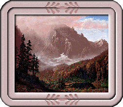
1) Open the image you would like to frame. I have included the one I used. (Note: if you use your own graphic, you most likely won't have to do the color adjusting portion of the tutorial)
(Just a note: I wish to thank Al Dawson for the use of his artwork for the purpose of this tutorial. Please respect his copyrights.)
2) Go to Image/Add border. Under border size, check symmetric, and enter 30 for the size.
3) Open the rose colored pattern image I have included below.

4) Using the magic wand tool, click inside the border you just added. This will put the "marching ants" around the outside and inside of the border.
5) This next step is where I got my error message so it it would be a good time to do the color adjusting step, I left it till here in case you want to check it out for yourself =). Go to Colors/Increase Color Depth/16 Million Color (24bit). Now, your image is workable, but you might notice that the quality of the picture has really decreased.
6) Now, we are
ready to flood fill the frame. Click on the flood fill tool. In
the tool options box, the first tab, the settings should be as
follows;
Fill style = Pattern,
Blend mode = Normal,
Paper texture = None,
Match mode = RGB Value,
Tolerance = 200,
Opacity = 100,
Sample Merged = checked.
Now, click on the second tab, the checkerboard one, and in the
New pattern source, click on the arrow and choose the rose grain.
Flood fill the frame.
7) Go to Layers/New Raster Layer. The layer Properties screen will pop up. I would highly recommend naming the layers in case you need to go back for whatever reason, you will know what is on each layer at a quick glance. Name this layer Cut1. Click ok.
8) Click on
Image/Effects/Cutout. Settings should be as follows:
Fill interior with color should be unchechecked throughout this
entire tutorial, Shadow color = White; (click on the rectangular
box beside shadow color to bring up the color chart)
Opacity = 100%;
Blur = 10;
Vertical = 2;
Horizontal = 2.
Click ok.
9) Click on Selections/Invert. The "marching ants" should now only be around the picture part of the image.
10) Create a new layer (all layers in this tutorial are raster layers) and call it Cut2.
11) Go to Image/Effects/Cutout.
Change the settings to the following:
Shadow color = Black;
Opacity = 100%;
Blur = 5;
Vertical = 2;
Horizontal = 2.
Click ok.
12) Create another new layer. Call this one Shadow3.
13) Go to Image/Effects/Dropshadow.
Change the settings to the following:
Shadow color = White;
Opacity = 100%;
Blur = 10;
Vertical = 2;
Horizontal = 2.
Click ok.
14) Go to Selections/Modify/Expand. Set at 15px.
15) Add another new layer. Call this one Cut4.
16) Go to Image/Effects/Cutout.
Change the settings to the following:
Shadow color = Black;
Opacity = 100%;
Blur = 5;
Vertical = 2;
Horizontal = 2.
Click ok.
17) Add yet another layer. Call this one Cut5.
18) Go to Image/Effects/Cutout.
Change the settings to the following:
Shadow color = Black;
Opacity = 100%;
Blur = 5;
Vertical = (-2);
Horizontal = (-2).
Click ok.
19) Create another layer. Call this one Shadow6.
20) Go to Image/Effects/Dropshadow.
Change the settings to the following:
Shadow color = White;
Opacity = 100%;
Blur = 5;
Vertical = 2;
Horizontal = 2.
Click ok.
21) Go to Selections/Modify/Expand. Set at 15 px.
22) Create a new layer. Call this one Cut7.
23) Go to Image/Effects/Cutout. Change the settings to the
following:
Shadow color = Black;
Opacity = 100%;
Blur = 5;
Vertical = 2;
Horizontal = 2.
Click ok.
24) Create a new layer. Call this one Cut8.
25) Go to Image/Effects/Cutout.
Change the settings to the following:
Shadow color = Black;
Opacity = 100%;
Blur = 5;
Vertical = (-2);
Horizontal = (-2).
Click ok.
26) DO NOT GET RID OF THE MARCHING ANTS JUST YET! Click on Layers/Merge/Merge
All (Flatten).
27) While we have the outside edge of our picture selected still,
we are going to clean up the edges. Click on Edit/Copy. Then,
click on Edit/Paste as a new image. This should open your image
in another window with a transparent background behind the little
corner pieces of your frame. Close your original image and do the
following steps on the new one. Here we go!
28) Now we are going to add the little design on the frame. Choose your text tool by clicking on the bottom center of the frame. Set the font to Fleurons, size 36, Floating checked, Antialias unchecked. Set the color to the light pink square on the left side of the black square. Over from the color choice, choose the align center button. Now type your text. I used Capital C and small c side by side. Click ok. (I had to run my curser over the text on the image and when the mover tool came up (the red 4-way arrow) I set mine to the coordinates 164 x 218 (bottom left hand corner) Leave the marching ants marching.
29) Create a new layer. Call this one cut1.
30) Go to Image/Effects/Cutout.
Change your settings as follows:
Shadow color = Black;
Opacity = 50;
Blur = 10;
Vertical = 2;
Horizontal = 2.
Click ok.
31) Go to Selections/Select None.
32) Now, choose you text tool again by clicking in the center of
the top portion of the frame. The settings should stay the same.
Once again, I had to move the text down when it came up. I moved
it to the coordinates 164 x 29. Once again leave the marching
ants marching.
33) Create a new layer. Call this one Cut 2.
34) Go to Image/Effects/Cutout. Change your settings as follows:
Shadow color = Black;
Opacity = 50;
Blur = 10;
Vertical = 2;
Horizontal = 2.
Click ok.
35) Go to Selections/Select None.
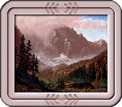
36) Now, if we Merge all of our layers, the 4 little triangles in the corner of your image are going to turn white. If that is ok with you, then Go to Layers/Merge/Merge All (flatten) and skip to step 38. My example of this way is at the bottom of the page. I should mention that the positive side to saving your image this way is that you can get the quality of your image back at the end of the tutorial. You can always cut the little bits out of your image with the lasso tool if you want to be rid of them too...If however, you would rather have the corners stay transparent so you can use it on any color background without white colored triangles around it, we need to save it as a transparent gif...if this is the way you wish to save it, Go to Layers/Merge/Merge Visible.
37) Ok, now we want to save our image as a Transparent gif...click on File/Export/Transparent GIF. Down in the bottom left hand corner you will see a button "use wizard"..click on that one. Ok, on the first screen, you want to select "Use existing transparent area's"...Click next. On the second page, I leave the color set at white. Hasn't made a difference so far as I have seen. Click next. On the third page, I always play it safe and use the web-safe colors only..click ok. On the 4th page, is the quality of your image page. You can play around with this one to see how different setting effect your graphic..so far, I have only used the "better image quality". At last you are at the final page of our venture. Click finish to save your image. Voila! You are finished! The last two steps are for people saving the other way!
38) Now it is time to get the quality of our picture back. Click
on Colors/Decrease Color Depth/256 Colors (6 Bit). When the pop-up
screen comes up, check optimized median cut, check nearest color
and everything else should be unchecked. Click ok.
39) Save your image as a gif and voila! You have a carved frame
image!